Gallery Wall

NYC: Wall Street Architecture


When I was in New York earlier this month working on the Upper East Side Reno I spent an afternoon walking around the financial district on a sweltering hot Saturday afternoon.   Although I happened to have my DSLR with me it wasn't a pre-planned photoshoot destination but once there I was simply overwhelmed by the architecture that surrounded me.   I had never been to Wall Street before nor did I know much about this iconic eight blocks except for the image I had in my head from movies, television and the media in general.  I've been to the city many times but honestly I had never really had any interest in visiting Wall Street or given it much thought at all (what can I say, I live in the world of Design not not high finance!).  You can imagine how ecstatic I was to discover this haven of architectural beauties.  How did I not know about this!?

Its difficult for me to find the right words to describe my impression of Wall Street,,,because it was so unlike anything I had imagined it was or expected it to be.  The sheer towering scale of the buildings viewed from the very narrow streets is sensational, the neighborhood is strikingly charming and quaint in a way (?) with its centuries old architecture, cobblestone walkways, a Tiffany's,  and the historic Trinity Church holding court at the end of the street.  The street is a pedestrian only zone with no vehicular traffic and facades are void of signage or advertising only flags, all this completly evokes a feeling of being in a world of another time and is so unlike a typical urban streetscape.   Since I'm really not doing a good job here of describing what I saw, how about I just show you a few of the photos I took.....


What I love about the buildings here is that the colours are all so grey toned that even when you shoot and view the images in colour its very monochromatic looking.  All the images above are shown in colour except one!


I'm a complete amateur photographer but it is a passion of mine.  I love to shoot landscapes and streetscapes particlarly, I don't use photoshop or edit my photos in any way except to convert to black and white or crop images.  When I want high quality prints made for framing I send the image off to Elevator Digital and they take care of all the technical issues for me (resizing etc.).  Mostly, I like my images to remain true to the way I shoot them without any enhancing or special effects.  Sometimes I like to shoot slightly overexposed, sometimes underexposed depending on the mood I'm trying to capture.  What I love to do with my photos the most is have them printed and framed for wall art, sometime for myself, sometimes for clients.  When you frame an image it takes on an entirely new dynamic, I'll be getting several of these printed and framed and they'll be something like this...


Unless I'm doing one large oversize print, I try to group images into groups of 2, 3 or 4's combining both landscape and portrait orientation as I did above.  Once I've decided on which images I like grouped together, I'll decide if I want them printed in black and white or colour.....


....and then I figure out my final image sizes, matt sizes and decide on frame colour by doing mock-ups similar to these (very rough above!), often I do this on a scaled elevation of the wall and I'll normally include the frame too (not shown on the above).  For frames I always do a simple rectangular profile in white, black, silver or natural wood.  Lately I've been doing a lot of white framed coloured photography, which I LOVE.  Then once all this is figured out I send the original image files off to Kevin at the printing lab who takes care of printing, matting and framing for me.


If you ever visit NYC I highly recommend a visit to this neighborhood whether you're passionate about architecture or not, its simply an experience like no other.


All Photos:  Carol Reed

Art Gallery Inspiration


Last week on Canada Day I made an impromtu visit to the McMichael Gallery in Kleinburg, just north of Toronto.  You can read about the inspiration for this visit here.  I love to visit art galleries of any kind and I'm a particular fan of Canadian art so it was a wonderful way to spend Canada Day afternoon.  This past May marked the 90th anniversary of the Gallery's Group of Seven Collection and to celebrate this, they re-designed the exhibit and rehung pieces from their permanent collection and added some rare pieces from private collections.  The new exhibit is called The Group of Seven: Revelations and Changing Perspectives.  What impressed me most about the gallery on this visit (aside from the masterpieces!) was the wall colours - as you walked from gallery to gallery throughout the exhibit the wall colours changed with each series of collections.  The walls had all been freshly painted just prior to the opening of the exhibit this past May in a wide range of colours from deep rich jewel tones to light watery greens and blues, to neutral taupes.


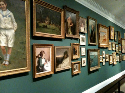
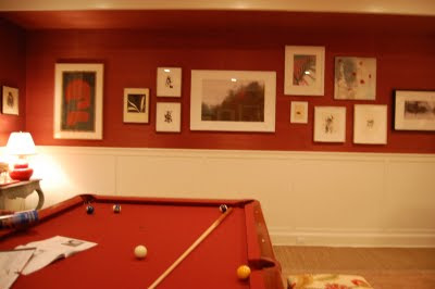
Salon style exhibit of Canadian historical works.

Upon entering the exhibit galleries you're greeted by this powerful and dramatic long wall of 19th century Europoen inspired landscapes and portraits arranged salon style on a deep teal coloured wall.  I've always loved artwork hung in this manner there's something about it that just draws you in and captivates you and even though there's an abundance of art on the wall the individual pieces aren't lost - somehow the mass arrangement makes you want to stop and look at every single one like its part of a story.   In the same manner there might be some pieces that on their own aren't to your liking but when they're hung collectively like this you have an appreciation for all of them.

Here's a couple of similar paint colours from Benjamin Moore,,,I'm not crazy for teal because I have not so fond memories of it from the 80's (!!!), these are a slightly bluer version of teal than the wall colour the gallery used.  (I inquired about the paint colours but no one was able to provide them to me on that day and I havn't yet received any follow-up response yet so these are just my own interpretation.)


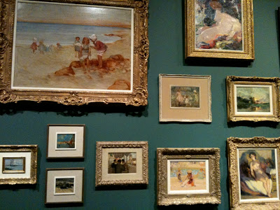
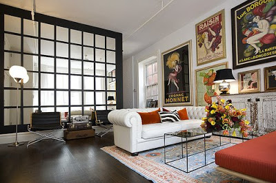
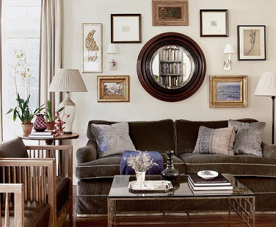
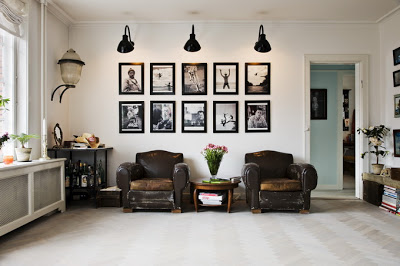
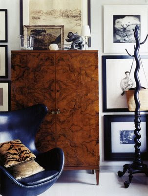
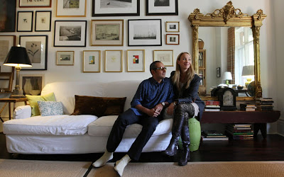
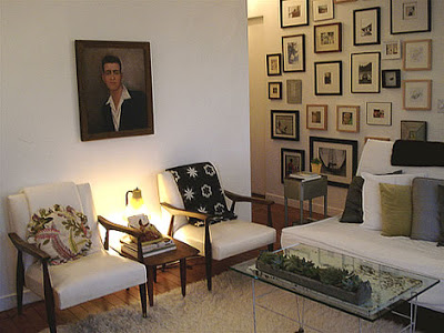
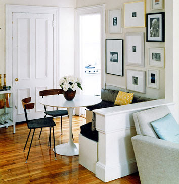
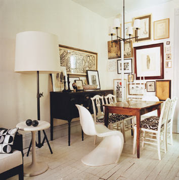
I often come across articles with tips on how to hang a gallery or salon style wall and I've read all kinds of different 'rules' many of them contradictory, regarding the spacing, the framing and the subject matter.  But the only consistent thing I've noticed about my favorite salon walls is that there really is no rhyme or reason to the hanging.  As I stood back and studied this wall, again I couldn't detect any overall consistent spacing but I did notice there was a definite 'invisible' horizontal border at the top and bottom of the wall which all the painting where hung within (looked to be about a foot below the crown moulding and about 2 feet above the floor).  Also all the pieces were all paintings from the same era and all were in gold toned antique style frames.  So I think these consistencies added to the powerful impact but I could easily envision varying works of art and frames incorporated in this hanging and I think the result would be just as effective.   My two favorite pieces on this wall are seen in the photo above, the beach scene in the top left and the smaller beach scene on the bottom right - romantic summertime images I can imagine in a room full of white linen, nautical stripes, sisal, wicker and painted furniture, they're simply gorgeous and not something most people would typically associate with Canadian art.

I will always be a fan of the traditional rugged landscapes that are symbolic of the Group of Seven's work, but what I really enjoyed about this exhibit were the paintings that are so different and in such contrast from those iconic images.  My favorites included many of the colourful still life flowers and portraits that I would love to design a room around!


Arthur Lismer, Summertime c.1918.  Oil on Canvas.
This painting reminded me of the two beach scenes on the salon wall.   Soft, pastel and beachy.


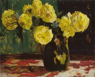
AY Jackson, Dahlias 1913.  Oil on board.
This painting just grabbed my eye, it literally popped off the wall.  The wall it was hanging on was painted in a browny/plum colour similar to below.  

There were a lot of purpley taupes and plum/browns used.  The paint colours don't translate accurately on the computer but looking at the fan deck  Benjamin Moore's Driftwood colour is similar to what the Gallery used based on my memory.   The other two colours are my own picks for a deeper taupe. 


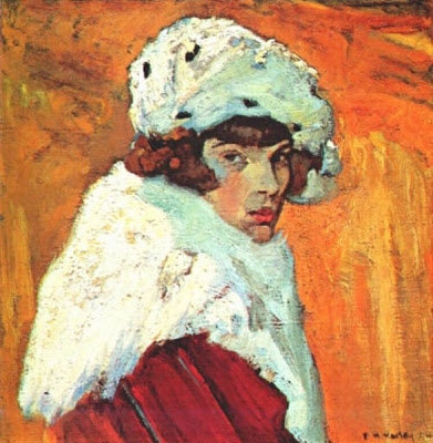
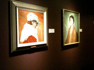
F.H. Varley, Girl in Red c.1920-22.  Oil on Canvas.
Portraits have always been a favorite of mine, the colours of this one are stunning.  This was hung on a purpley/red painted wall similar to the paint colour below.  This would be a gorgeous colour to display artwork in a dining room or cozy den.
Going by memory this colour in person was a purply red but a bit on the brown side.  I managed to get a photo and its looks quite brown in the image below but I remember being more purple than brown.  I selected a few similar colours from Benjamin Moore above.  My least favorite colours are dark purples and burgundies so I don't tend to use a lot of these colours, I have used Amazon Soil and its a very livable earthy purple which was a beautiful backdrop for artwork.


wall colour was more purpley than brown as it appears in this photo.


Edwin Holgate, The Cellist c.1923.  Oil on Canvas.
This was so dramatic hung on the same dark red/purple wall as the portrait above.


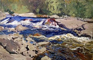
J.E.H. MacDonald, Thomson's Rapids, Magnetawan River,  c.1910.  Oil on Paperboard.
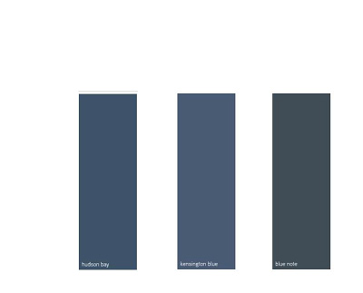
There were a series of landscapes hung on a deep navy blue, one of my favorite wall colours in the gallery.  The look would be similar to these paint colours I've selected below....
Beautiful deep blues from Benjamin Moore any of these would provide a classic backdrop for artwork.


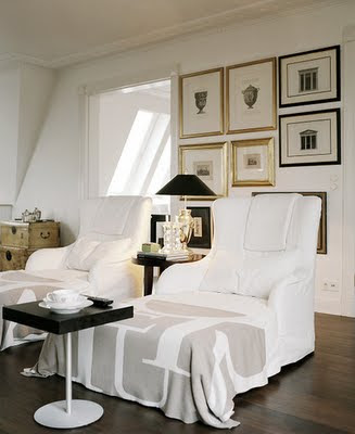
My favorite wall colours in the gallery for displaying the artwork were definitely the deeper richer tones. To my eye these colours made the paintings pop and truly highlighted them.   I'm not one for using these really deep colours throughout an entire house, they can be heavy and moody, but if you have a definitive accent wall or a seperate room they're beautifully suited to dining rooms, library/dens or powder rooms where they can be dramatic and cozy.  


Of course I love the look of classic gallery white walls, but my next personal favorite is a deep grey or black for displaying artwork.  On the second floor where the Inuit art exhibits were there was a beautiful black wall that looked stunning as a backdrop to glass display cases and there was a brighter less brown red.   Benjamin Moore's Black Beauty is a black I've used several times, Kendall Charcoal was my own bedroom colour for years and I loved it (Chelsea Grey is another fave),,,and Northern Fire is an orangey red that I find more cheery and fresh than darker browner reds.


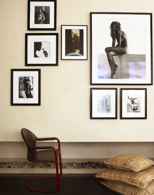
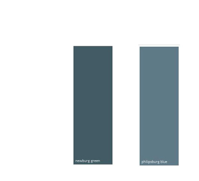
My least favorite colours were the lighter wall colours they used in the gallery ranging from light sky blue, soft watery greens, taupe and mossy green.  I found that the paintings seemed dull and bland when displayed on these colours, maybe because so much of these tones were in the paintings themselves or maybe because the frames were painted in muted tones?  With light coloured and neutral walls I think artwork with lots of white, like black and white photographs with white mats, or white line drawings work really well because they look very crisp on these backgrounds, especially in metal or black frames.


If you haven't visited the gallery before its a great way to spend an afternoon, they have beautiful grounds with lots of picnic tables if you'd like to pack a lunch.  If you're looking for something to do with the kids this summer the gallery offers lots of children's day camp programs and art classes, (including spin art!) the kids can learn something new while having lots of fun and you can take home some masterpieces of your own to hang on the walls!  


Hung Up on Gallery Walls!!

Photograph by Anson Smart, via Desire to Inspire.

I admit - I'm obsessed with gallery walls.  I had to acknowledge this the other day while I was searching thru my archive photos and discovered an unusually large quantity (hundreds!) of photos illustrating gallery wall installations, I just can't get enough of them!  But they also happen to be one of the most common requests I receive from clients when addressing the finishing details of their homes, to create a gallery wall - actually, I've yet to work with a client who hasn't had it on their wish list!  Its easy to understand the appeal of these installations, much like how flowers and books instantly make a room feel lived in, a gallery of photos or artwork has the same effect.  A display of any collection gives the feeling that these things were collected over time and the fact that they've been put on display shows that these things provide a great sense of pleasure to their owners. Even more so, when you really get down to what is dearest and nearest to our hearts,,,,our photos, our collections of memories, and our ties with the past hold the highest material value to us as they truly express who we are as individuals, where we've come from, what we've experienced and who we treasure most in our lives.

No matter how many thousands of dollars or hundreds of thousands have been spent on renovations, for stone countertops, new floors, to-die-for soaker tubs,,,european faucets, state of the art appliances,,,and no matter how many months you searched for that perfect sofa or light fixture, or maybe even taken delivery of brand new furniture for your entire house - in my experience, nothing gets a more positive response or a bigger reaction from homeowners than when their personal photos or personal collections get hung on the wall! Its that 'transformation' moment.......when their space becomes a home.  Its no wonder in the event of an emergency like a fire or flood - these are the things that everyone will desperately try to save, forget about the $10,000 sofa. 

This week one of the things I'm working on is a small photo gallery wall for a client which will be installed on a tall staircase wall and comprised of travel photos she's had stored in boxes and on CD's for many years.  When I started planning out the image sizes and the frame finishes last week I searched through my image archives for photos of some of my favorite gallery walls to help me communicate with my client what I was envisioning.  As you'll see from the images below - there really aren't many rules with this process, whether its all photos, or a mix of various media, all black and white, all colour,,or a mix of both, each installation is always unique (which i think is another reason why they're so appealing to everyone). I do think certain interpretations may appeal more to some than others and the approach can be be either contemporary or traditional.   So if you've always loved the idea of creating a wall of your favorite photos or artwork but never dreamed you could put one together on your own, browse the images below and see how they all make it look so easy.  But be warned,,,,, you may soon become as obsessed with them as I am!

An eclectic collection of what looks like mostly old photos.  Photo source unknown.


Contemporary Grid style gallery wall.  Show home by Canadian House & Home.

All black & white photo gallery on chocolate brown wall.  Photo source unknown.


Gallery of vintage colour posters.  New York Apartment photo via Desire to Inspire blog.


A traditional grouping that integrates a mirror and wallsconces.  Despite the irregular shape, the arrangement is very symmetrical with each side almost mirroring the other.  Room design by C.W. Eisner.


A graphic grid style display of black and white photos.  Image by Photographer Morton Holton, via Desire to Inspire.


I'm CRAZY for this!!!!  Its like the armoire becomes part of the grouping of art.  Apartment of designer Thomas O'Brien, via House & Garden.


Classic and gorgeous.  Gold & Black & White.  Patric Johansson via Desire to Inspire.


Modern and dramatic black with colour.  Living Etc. July 08.  
The dark sofa helps to keep this balanced.


Modern and eclectic grouping of b&w photos mixed with some oil paintings, all cleverly arranged around wall sconces.  Room design by Katie Hume.


Black and whites surround a single coloured image.  Room design by Alexandra Rowley.


Elclectic gallery wall in the living room of Canadian House & Home editor Suzanne Dimma.


Photo source unknown.


This kitchen gallery wall just oozes LOVE & Happiness!  Photograph by Mark Lund.


Domino April 07.

Domino.

Colour images on coloured wall.  Designer Show House, room design by Carrie & Co., via Habitually Chic.


This one is probably my all time favorite!!  Its also very similar to the look we're creating for the current gallery wall I'm working on as we have white walls and a large Moooi Random light fixture exactly as shown above.  Patric Johansson Photographer, via Desire to Inspire.


Black & White on an accent colour, stunning.  Domino magazine.


Modern black, white and graphic.  Photograph by James Tse for Canadian House & Home.


TIPS FOR CREATING YOUR OWN GALLERY WALL:

1.  Rules of thumb - there really aren't any hard rules,,,,but if you've never attempted a gallery hanging before try this no fail method of combining pieces that have at least one consistent theme ie; all b&w photos, or all white mats, or all black frames or keep all your spacing equal. Obviously this rule of thumb can be broken (see images above) and yield fantastic results but often takes more confidence and a keen eye.
2. Starting point - start with your largest or your strongest piece first then work out, up and down from there.
3. Lay it out - if starting with 3 or more pieces,,lay them out on the floor first until your happy with the configuration, then note the dimensions of each piece in relation to the other so you can recreate that placement on the wall.  While its still laid out on the floor, it also helps to measure the overall width, and the overall height of the grouping which will give you a centre point to use for reference.
4.  As Seen on TV - this Hang & Level gizmo is a fantastic tool for hanging artwork and makes quick work of hanging multiple pieces.
5.  One is enough - pick one location for a gallery wall in your home, unless your home is incredibly expansive, more than one will look too busy.
6.  Renting - if you're weary about putting dozens of holes in your landlord's walls, you can create a gallery effect by layering and leaning multiple pieces of art along a shelf, a bench, a mantle or a credenza.
7.  Instant & Inexpensive - if you've got a lot of blank walls but not a lot of collections or cash......go for high impact with a grid style installation by purchasing 9 or 12 inexpensive ready made frames with mats and insert a series of prints or photocopies or book pages.  These can always be replaced in future with more significant images but in the meantime, you'll have an instant and dramatic gallery wall.
8.  Grid vs. Random - A random grouping can look extremely interesting and eclectic and is in my opion more casual looking than a grid layout, but some may find the concept intimidating to lay out and or install, although as you can see from the photos above its hard to go wrong.  The benefit of this method is you can start with only a few pieces and continue to grow and grow as long as you still have wall space.  A symmetrical grid installation is classic and can be a bit more formal looking.  The multiple use, repitition, of the same frame creates a dramatic graphic effect which in itself has a lot of impact.  This method is ideal if you have a collection of similar items or series of items, or as noted in no.7 above, if you need an instant completed installation using a set of frames rather than accumulating a collection of different frames and pieces over time.