

Happy New Year! I wish I could say my lack of blogging and tweeting lately has been because I was taking some leisurely time off to enjoy the holidays........but sadly, no, it's been just the opposite - since the day after boxing day I've hit the ground running full speed again working on client projects. Its been particularly hectic this week because with so many people off from work,,,the furniture, lighting and fabric stores have been crazy busy with shoppers! If this is any indication of what's ahead in 2010 on the home improvement and decor front, I'd say things are looking brighter than ever.
If you're planning a home renovation or intend to purchase some new furnishings for your home this coming year you'll definitely see some bright and colourful options among your choices of tile, fabrics, furniture and accessories. In fact, the Pantone colour experts have selected TURQUOISE as the tint of the year for 2010. I have to admit I don't pay much attention to trends when it comes to planning a new design for a room or home, my approach is to keep the bones and fundamentals classic and timeless (ie; neutral!) but add in the latest accessories or accents of colour to make the space look current and fresh.
While I do see more individuality and less trend following than ever before,,,,we can't help but be influenced by trends when we hit the shops and scour the latest design mags. This is why I'm surprised to learn that the tint of 2010 is tourquoise - because that's not the newest colour I'm seeing in the showrooms right now. To me, I think turquoise has been so prominent in interiors over the past 2 to 3 years, especially popular in Domino and the world of design blogs, that I wouldn't describe it as a new trend, in fact its already becoming a bit predictable. The trend for tourquoise we saw the past few years was it being used in new unexpected ways (modern glam), in other ways it will always be classic (cottage, tropical, country). For those who can't get enough turquoise you can check out the House of Tourquoise, a blog devoted to all things, tourquoise. Never the less, I think its a colour that people will always be drawn to but now, I see it being used in tandem with what I think is the hottest new 'statement' colour - YELLOW. (more on that below)
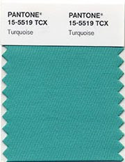
Pantone 15-5519 Tourquoise - the colour of 2010
The popularity of tourquoise is enduring, its universally appealing and most everyone reacts positively to this colour. Its understandable why it was chosen as the colour of 2010, it represents protection, compassion, healing, faith and truth. Inspired by water and sky it evokes a sense of escapism and tranquility. During these trying economic times and world conflict, its easy to understand our current attraction to turquoise. Personally, I find its a colour that has a true vintage personality and evokes a sense of nostalgic charm....its definitely a pretty colour that I find undeniably feminine and would describe as 'sweet' - but that's my own perception. I particularly love to use it on ceilings, and in bathrooms and laundry rooms where it looks so fresh, crisp and clean. With black and white its glamorous. With white it can be beachy, cottagy, preppy, or tropical. With black and dark grey or brown its glamourous and dramatic. But my favorite way to use bright accent colours like this is with light natural neutrals, like linen and stone colours - its makes the neutrals look so new and current.

On line retailer One Kings Lane
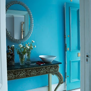

Turquoise door - Domino Magazine.

Domino Magazine
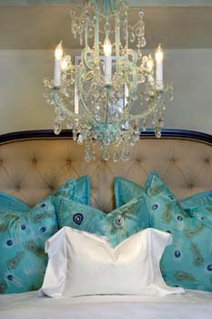
Turquoise accent pillos on linen headboard, via House of Tourquoise blog
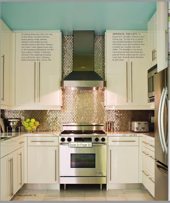
Turquoise painted ceiling, kitchen design by Timothy Mather, in Canadian House and Home.

Turquoise floor, kitchen design by Windsor Smith.
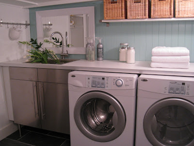
Turquoise painted beadboard, laundry room by Carol Reed Interior Design.
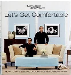
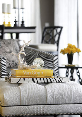
There's lots of turquoise eye candy in this book by Mitchell Gold.
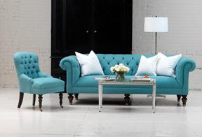
Turquoise upholstered furniture by Mitchell Gold.
Those are just a few of my favorite images of turquoise interiors but I could literally post hundreds of stunning turquoise inspired rooms from the past couple of years, as I said - its already experienced quite a run of popularity as the latest 'it' colour.
But over the past two months what I'm seeing in every showrooom I visit is a bold display of bright YELLOW. Vases, pillows, area rugs, candle stick holders, stools, bowls, lamps, you name it, the stores are decked out in bright yellow accessories. Call it canary yellow,,,or lemon yellow,,,or racing car yellow, its not a muted gold or ochre,,,its clear bright yellow. Maybe it was the photo below that started this trend in interiors? Who didn't fall in love with this living room - its the home of trend setter Jenna Lyon's, creative director behind J.Crew. Yellow, just like turquoise when paired with black and white is a glamourous, high fashion look.
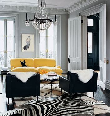
Jenna Lyon's living room, Dominon Magazine.
Yellow sofa, via Desire to Inspire
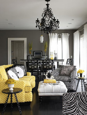
Its no coincidence that the latest issue of Canadian House & Home, the annual trends issue, features the home of Victoria Webster and its bold use of bright yellow and turquoise.
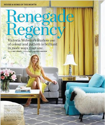
Canadian House & Home, January 2010.
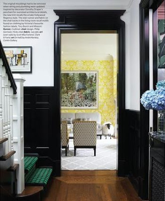
Canadian House & Home, January 2010.
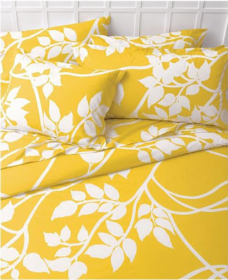
New Merimeko bedding at Crate and Barrel.
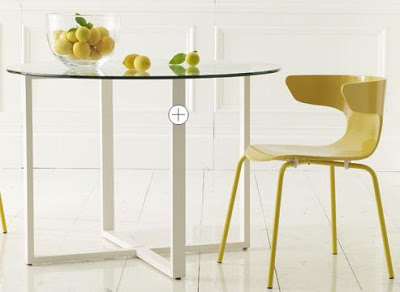
New Wrap Around Chair at West Elm.
The entire West Elm website has been updated with Yellow!
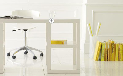
A simple way to add hits of yellow to your home - books and flowers and small accessories.
image via Desire to Inspire.
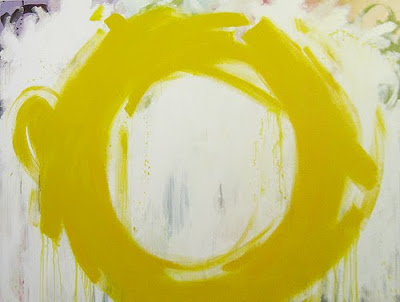
My favorite yellow item of all - I spotted this painting at Canvas art gallery last week. If you love yellow, this the perfect way to add the hottest colour trend to your home that will never go out of style.
The Bright One by Meredith Bingham, Acrylic on Canvas 60 x 48.

Acrylic on Canvas by Meredith Bingham.
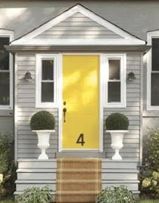
A old house gets a fresh modern facelift.
Given the characteristics of turquoise and understanding why Pantone has named it the colour of 2010, I can see this bright yellow being equally appealing during these times and a complimentary companion (for those who are bold enough!!). Yellow is sunny and bright, joyful, young and vivacious yet represents caution and safety, it evokes feelings of optimism and stimulates the intellect. I think we could all use a dose of yellow in our lives right now - let's hope things are looking brighter for everyone in this New Year!
Joy, Peace and Good Health to all in 2010.