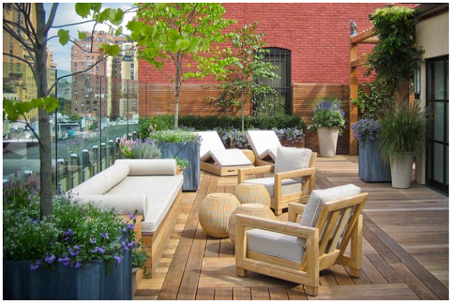

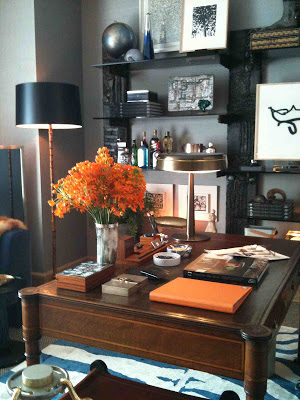
"Gentleman's Study" by David Scott Interiors.
I'm passionate about all genres of design, I'm always looking to experience and inform myself (and my eye) more about design whenever I can.........so the opportunity to tour a house full of designer rooms is irresistible to me. And lets not forget its a charity fundraiser, for children. I'm more than happy to support the cause and the design community while expanding my design data base. : )
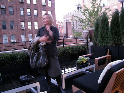
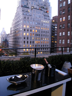
There are many reasons why I enjoy touring the show house. The rooms are designed by some of the most respected and highly published Designers in the US and some of the newest up and coming talent. I love to see other Designer's work because its often in a style not like anything I've ever designed or had the opportunity to explore. I particularly love the chance to see designer spaces IN PERSON which is a completely different experience than seeing them in print, its the full sensory experience including touch, sound and smell. Many of the rooms have music playing and scented candles and flowers and textures that enhance the design concept in a way you could never achieve just through photos alone.
Below are a few glimpses of some of my favorite details.

"Gentleman's Study" by David Scott Interiors.
This room was both Michelle and my favorite. Its amazing how the smallest amount of colour can have so much impact, we both referred to this as the blue and orange room and you really remember the orange even though the orange was in very small doses. I could have spent hours sitting in this room taking it all in, it was exquisite, the furnishings, the art, the objects - it was a master class in the art of display.

"Master Ensuite" by Charlotte Moss LLC
I assume the bathrooms were pre-existing as built by the developer and the designers decorated around what was already there. What I thought was interesting in this bathroom was how a very contemporary bathroom was decorated with very (old world) traditional art and accessories, it worked beautifully and I loved this look. For all those trad loving empty nesters looking to downsize, this is a good example of how you don't have to abandon your traditional style if you move into a modern condo.
"Master Bedroom" by Charlotte Moss LLC.

"Master Bedroom" by Charlotte Moss LLC.
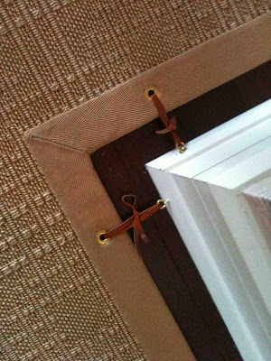
Carpet runner with leather tie downs. My absolute favorite detail in the entire house. Loved this.

"Bedroom": by Mark Hampton
There was a lot of high gloss lacquered walls throughout the show house. In this room I really liked the simple detail of how these prints were hung, each were hung by a decorative hook/ring fastened to the top of the frame.

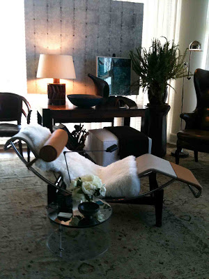
"Le Bureau Prive": by RM & Associates
This is a terrible shot because of the direct sunlight streaming into the room,,but that in itself is the issue I was interested in as I deal with this all the time on projects. Selecting window coverings for privacy, for sun control and/or as a decorative element is a huge challenge whether you have stellar views or not so stellar views, it can get complex. You might have a million dollar view, but direct sunlight is a killer on fabric, wood and artwork. So I always like to note how the designer treats the windows. A sheer roman shade is one of my favorites and one that I've specified in my NCY reno project.
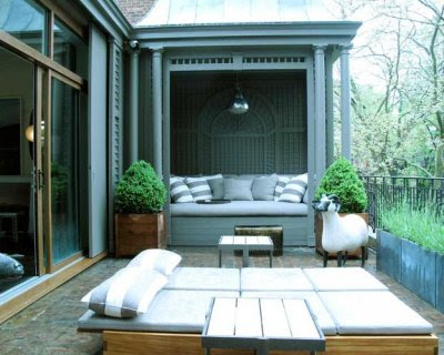
"The Conservatory": by Neal Beckstedt Studio

"The Conservatory": by Neal Beckstedt Studio
Another favorite room of mine, I was really drawn to this mix and all the various layers in the room and again how the designer dealt with 2 walls of windows in a very small space. Where do you hang art!? In this space, they suspended it in front of the window, placed it on table top easles and leaned the art casually around the room.
The good and the bad thing about this type of show house is that every room or area is designed individually, done in the designers chosen style and concept for their given room. There is no single design concept flowing thru the house, the rooms don't necessarily relate to each other so you have to keep in mind its more like viewing a series of 'show rooms' than a show house. While most of the rooms weren't done in a style that I'm partial to, I do appreciate any style of interior when its well done. With no client to deal with, these spaces are the perfect opportunity for designers to experiment, take risks, and have fun. And if you have an eye for detail, there were loads of great details. Regardless of specific room styles, they are chock full of great design lessons by the pros such as; scale, proportion, furniture placement, colour, accessorizing, display, hanging artwork, dealing with windows, unsightly hvac units and integrating home technology.
Logistically there are a lot of challenges the designers have to work with - time, donations, and existing elements in the spaces that can't be changed. When I look at any of these rooms, I always first try to understand what the designer's challenges were so then I can appreciate how they solved them. I also appreciate the amount of personal time and funds each designer put into their rooms and the efforts they make to drum up and work with donated products, labour and services. The best part is, in many of the rooms the designer will be there. They truly love to talk about their room design and answer your questions - I guarantee your impression of the room will change after hearing about their process and vision.
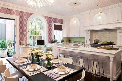
A couple of other highlights that I don't have photos of was the room designed by Bunny Williams, Brian McCarthy and David Kleinberg which was a tribute to the late Albert Hadley, complete with some of his framed original sketches (Michelle spotted these instantly, his drawings inspired her career). Another was the kitchen designed by Robert Schwartz and Karen Williams,,,,it was so interesting to see the kitchen counters built in front of a floor to ceiling window wall. I currently have a kitchen being installed at a clients summer home north of Toronto, similarly, its designed with counters in front a low window, intentionally, the window is new but placed and sized to look as if it was part of the original house, maintaining the original character of the home but also creates more of a furniture look.
*EDIT*
For Virginia ; )
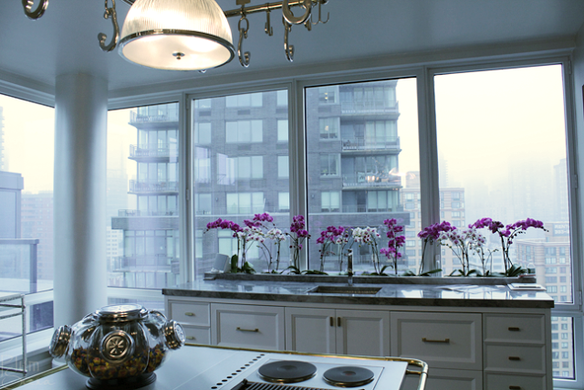
Kitchen Design by Robert Schwartz and Karen Williams. Photo via www.plumsiena.com
If you are in NYC the show house tours continue through Thursday, June 14th. For those of you who can't make it in person you can check out some beautiful photos of some of the show house rooms at this site.
All photos above: Carol Reed