
DESIGN DRAWINGS: Part of what I’d like to use this blog for is to share some of my work, not only before and after photos but also the design drawings, sketches and inspirational concepts. They represent all the months and sometimes years of work that have had to take place before those lovely ‘after’ photos can be taken. For past projects, I’m going to start by going back about 6 years, or about as far back as the files date on my current computer. Anything older than that,,,,and I’ll have to start digging thru the boxed archives. Which i’m sure I’ll do eventually but in the meantime,,,,, I’ll start circa 2003 with one of the oldest living projects on my hard drive now, it also happens to be the FIRST time I had the opportunity to design a home for myself! If you haven’t read my earlier post or seen some after photos of my condo you can check it out here.
BEFORE: When my boyfriend and I decided to buy a place together, our search for our ‘dream’ home didn’t last long, I don’t even remember how we ended up looking at condos, that certainly wasn’t my intent, but it is true when they say that location really trumps everything else..... and, that men really don’t like change. Did I mention this condo we bought was located directly below the unit my boyfriend was renting at the time. Oh yes you could say,,,we searched high and low for our new place. ; )
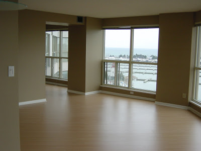
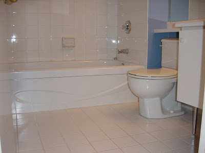
And this is the condo we bought .......
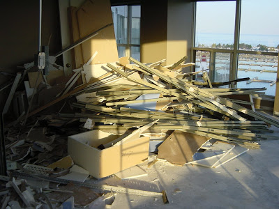
DEMO: And about one week after taking possession,,,,,this is what our condo looked like!
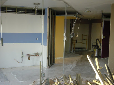

THE AFTER SHOCK: This is the stage in every reno project when the homeowners feel overwhelmed with anxiety, it marks the beginning of many sleepless nights. Your home, typically your single biggest investment, has suddenly become a pile of rubble and you can't imagine it ever being livable again within the time frame or budget you've allocated.
It was after the demo stage that most of the design plans for the condo got reworked and finalized. We discovered all sorts of conduit and telephone/cable risers in places we didn’t expect, right smack dab in the middle of our new wide open plan living spaces. Discouraging to say the least. They weren’t indicated on the base building plans that the management office had provided so we had no idea what we'd find once the walls came down. And when they did, I had to quickly figure out how I was going to work around all these obstacles without chopping the place up again and building bulkheads everywhere. All that conduit you see hanging down from the ceiling and sticking up thru the floors,,,,had to stay, but i wanted clean, high ceilings.
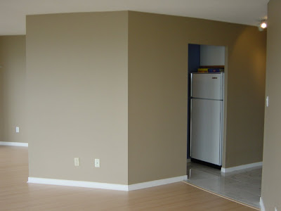
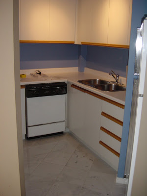
Despite all those 'surprises' I was excited to see the place demolished. Aside from the view, there was nothing I liked about the unit. I hated the layout. The tiny kitchen on the interior of the unit was completely enclosed with full height walls, essentially blocking a spectacular view - which made no sense to me at all. As for the 45’s, I can’t even begin to tell you how much I hate 45 degree angles (I’ve always thought they’re a lame way of trying to making something fit that otherwise doesn’t fit - and people might think its a ‘creative’ solution, but i think it just looks like something was lopped off.) And then there’s that interior bedroom with sliding patio doors,,,,,and the fact that there was no balcony.
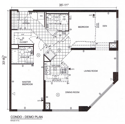
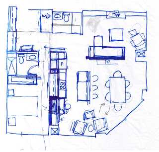
Here’s a look at the demo plan - it shows what the existing layout was like when we purchased it, and everything we planned to remove is indicated by dashed lines. Basically, we stripped it back to the concrete shell leaving only the plumbing stacks and conduit in place.
PRELIMINARY PLANNING: Before we even submitted an offer to purchase the place, I took a site measure, drew up the plans and starting sketching. We had to satisfy ourselves that we could make the space more useable for us, and do some quick estimating on the costs and time involved. This only took a day or two. Below are some of my really rough sketches (and I mean rough), probably done in a coffee shop. Despite how rough the sketching looks, when i look at these now i can clearly see my thought process and how the final plan evolved. I always freehand sketch dozens of ideas before I ever start to draft anything up on the computer, i had piles of these rough layout sketches. To this day, that condo remains one of the most challenging spaces I ever worked on. A huge angled wall, very little wall space,,,,foor to ceiling glass,,,,,,furniture placement was impossibly awkward. I never was completely satisfied with the layout but for us, it was a a big improvement to what was there before.
SKETCHES: We wanted to maximize the views of course, I love to cook and have dinner parties so I wanted a kitchen that was condusive to entertaining large and small groups, I wanted undercounter, side by side washer & dryer set up, not a tiny stacked unit squeezed in an even tinier closet,,,I wanted a separate cozy tv/library area, a small home office space and an entry way that was inviting, private, and could accommodate 3 or 4 people comfortably with lots of storage for coats and boots.
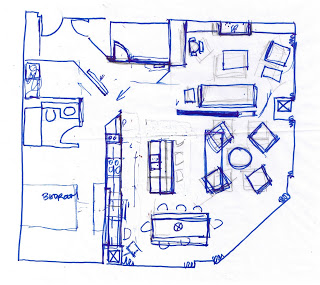
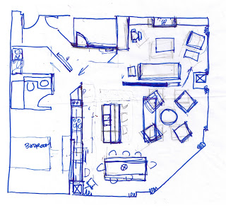
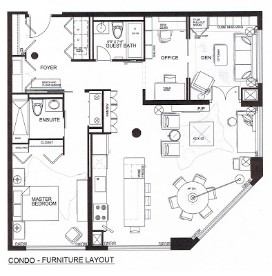
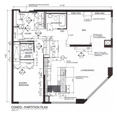
PARTITION PLAN: Here’s the final partition plan which shows where all the new walls, cabinetry and bulkheads were to be built. The Den area ultimately underwent a second phase of construction a year or so later when we added walls and doors to create a more separate tv/bedroom and office area (shown in the final layout at the top of this post).
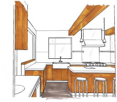
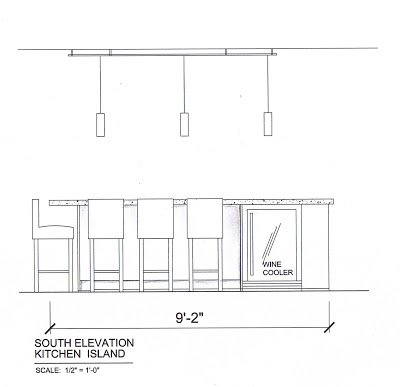
KITCHEN DESIGN: I love to cook and the newly designed kitchen was truly one of my favorite kitchens I’ve ever cooked in. I really like the single lineup against the back wall, if i could have added a second prep sink to the island it would have been ideal, but that wasn’t possible. It took me a while to get used to the size of the island,,the day the concrete counter was installed, I couldn't help but think it was so big it looked like a landing strip, the only thing missing was a stripe down the middle. It was big. But I adjusted to it quite fast and once the rest of the space was furnished it didn't seem so big anymore. It was awesome for entertaining, we always had 3 or 4 people sitting at the counter enjoying wine and cheese while I cooked and chatted. On a daily basis we ate all of our meals there and it was great having a flat panel tv mounted on the opposite wall.
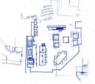
Here’s a look at some of the kitchen elevations.
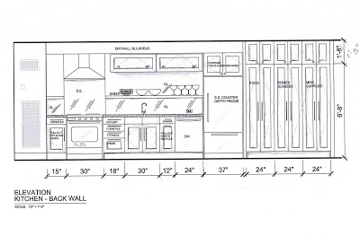

HIGH & LOW: The entire renovation was an excercise in mixing standard off the shelf stock products with custom elements and details. The kitchen is a great example. The cabinets were all from Ikea but I custom finished the cabinetry in a dark brown stain and the pantry and fridge cabinets I painted in white ( back in 03/04 they didn’t have as many door options as they do today). I went with a counter depth fridge and had full gables istalled on the sides with a cabinet above to give it a true built-in look. From the money i saved by going with stock cabinetry, I splurged on good quality stainless appliances and then pretty much everything else about the kitchen was custom. Custom concrete counter top on the island, a stainless steel back counter with integrated custom single bowl sink, custom back painted glass backsplash, custom stainless steel floating shelves and stainless steel back panel on the cooktop. Which all took an incredible amount of precision planning and co-ordination, the smallest oversight or miscalculation easily becomes a really costly mistake.
I had no choice but to drop the ceiling over the kitchen to accomodate electrical conduit so i designed a low profile, two tier bulkhead that looked like it was integrated with the design of the kitchen, it followed the shape of the island then returned back to the wall so it lined up with the range and rangehood.
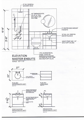
DETAILS: When i look back now, I’m surprised at how much custom work went into the condo because we really had a modest budget. I'm also surprised at how much the marketplace has changed and the range of products that are now readily available at big box stores that we didn't have just 6 years ago. In addition to the custom elements we installed in the kitchen, some of the doors, all of the baseboards and casings and even both vanities in the washrooms were custom made based on my own designs. Some of those designs were planned before construction started,,,some were designed on site and sketched up by hand.

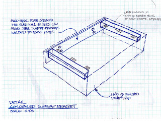
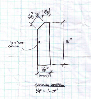
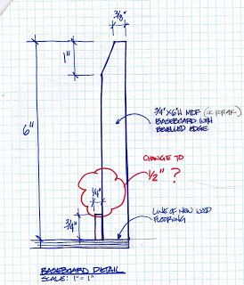
Both of these casing and baseboard profiles I’ve used a few times since this project. I couldn’t find a supplier who had these profiles in these sizes so my contractor just milled them for me. Today I still don’t know of anyone who makes a paint grade baseboard in this profile that’s less than 7-1/4”. But i’m pleased to say that Brenlo recently added a new casement profile to their catalogue and its exactly like this one I’ve been having custom made.
Just think, all of this and we havn't even touched upon colour, finishes, lighting, fabric or furniture!!! My next and final post on this condo renovation will feature more of the after photos and the House & Home photo shoot.