My East Coast House: Kitchen Before & After Plans

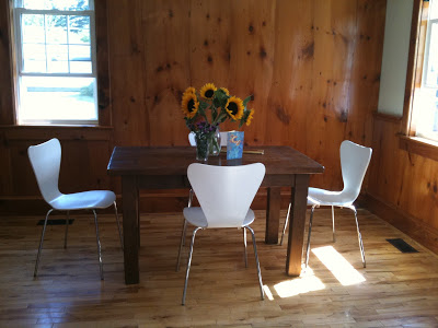
Before - the dining area of the old kitchen

The Kitchen in my new old house

on the East Coast is the second last room in the house to be renovated, today its near completion except for a ceiling light fixture and some furniture for the eating area. Renovating this kitchen was a long and painful process that has taken more than a year to complete thus far. This is what the kitchen looked like when we bought the house and how it remained until the ktichen reno started last year. (Dining area seen above, kitchen area below)

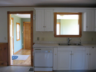
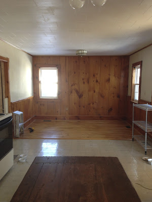
The kitchen was ugly to say the least. It came with no appliances other than an old electric stove. The exhaust hood was not vented nor recirculating (thus useless), the dishwasher didn’t work, the water was not drinkable and the sink leaked out the bottom of the cabinet when the faucet was turned on. The plastic coating on the cabinets was peeling off in large sections held in place in some spots with shipping tape. The floor was covered in peel and stick vinyl tiles which were broken in places and mis-matched patched in others. The ceiling like the rest of the main floor was acoustical tile, complete with stains. 

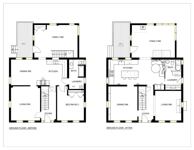
Before & After Floor Plans

When we purchased the house I had re-designed the kitchen as part of an overall master plan that we would implement in 2 phases. The kitchen would be in the second phase about a year after phase 1. Over the course of that year while the second floor and front part of the house were being renovated I continued to re-think the new kitchen. The biggest challenge is the space itself, I really hated the old placement of it in the centre of the house.  Like most old houses the kitchen had so many doorways it was like being in a hallway.  One thing I knew for certain is I wanted to flip the kitchen to the other side of the room so it would be on an exterior wall with windows.  

My first kitchen design plan involved moving windows and adding double french doors to the deck and incorporating a wood stove. More than a year later, far behind schedule and already over budget before phase 2 started,,,,,the priority became to re-work the kitchen without changing any of the window locations or putting in new patio doors. There were a lot of unexpected but necessary ‘blow-outs” in phase one so minimizing the work and costs for phase two was critical but I was ok with that because i felt ‘the simpler the better’ approach suited my vision for the kitchen anyway.   A week before the new wood stove was to be delivered I decided to have it installed in the back sun room (family room) which would make that room useable all year and still provide heat for the kitchen.  Without the wood stove in the kitchen I was left with ample room for a seating area which currently is planned as a built-in banquette. 

Looking at the rest of the ground floor, the other change I made was creating separate dining and living rooms.  I intentionally wanted to keep individual rooms, having lived in an open concept space once before I definitely prefer not having my living or dining room open to the kitchen, however, I do love an eat-in kitchen and open concept family rooms.  I intentionally didn't build any cabinetry on the wall between the kitchen and dining room so that it could easily be opened up should any future owner want an open concept.  As it is the separate dining room maintains the flexibility of becoming an office, or a bedroom if not used for dining.  Figuring out what to do with the existing laundry and bathroom was key in determining my new kitchen layout.  In the end moving the laundry or bathroom was not an option for many reasons besides budget, so those rooms will stay where they are and will be the next room(s) to be renovated after the kitchen.

The old combined laundry and bathroom will be divided into separate rooms, the laundry room will get a new exterior glass door to what will be a patio on the sunny west lawn of the house with views over a meadow to the beach beyond.  The washer and dryer will be under counter and behind a fabric skirt, with a sink and wall cabinets this area will also function as a servery/pantry which will be convenient between the kitchen and patio area (future screened in porch).  Being able to come directly into the laundry and bathroom from the yard is also a great bonus feature when you have more than an acre of lawn to mow each week - tick control means stripping down and showering after yard work.  : /

The family room at the back is a single story addition to the original house, its concrete foundation has no insulation and even with ducted heating in the space it was an extremely cold room, unbearable in winter.  The new wood stove keeps it toasty warm and was the best addition ever because this is not only the biggest room in the house but it also has the best views and the most sunlight - now its useable all year long.  

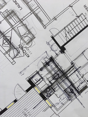
Despite the numerous kitchen layouts I came up with none of them were ideally what I wanted and it became a very frustrating cycle of trying to decide which layout I hated the least rather than loved the most. Very. frustrating.  I have piles of scrapped plans like this one.

I'm happy with the plan I decided on and know that a new layout wasn't worth making drastic or extensive changes for.  I struggled with the fridge placement the most, debating over putting it to the right of the dishwasher but I just didn't want the large bulkiness of a fridge blocking the openness of the kitchen directly as you entered it.  The back door is the main in/out entrance where everyone enters the house (no one uses the front door here).  The compromise was to put the fridge away from the cooking/prep area but add under counter fridge drawers to the island.  

With those agonizing decisions over with we moved forward in clearing out the old kitchen and putting in all new finishes.  The ceiling, like the dining and living room had the original wood beams which we  uncovered from under layers of tile and plaster.  The floor is another story which I'll post about next…...

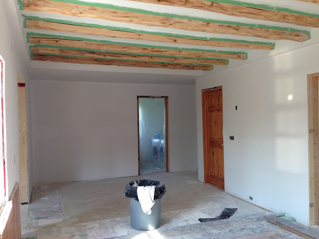
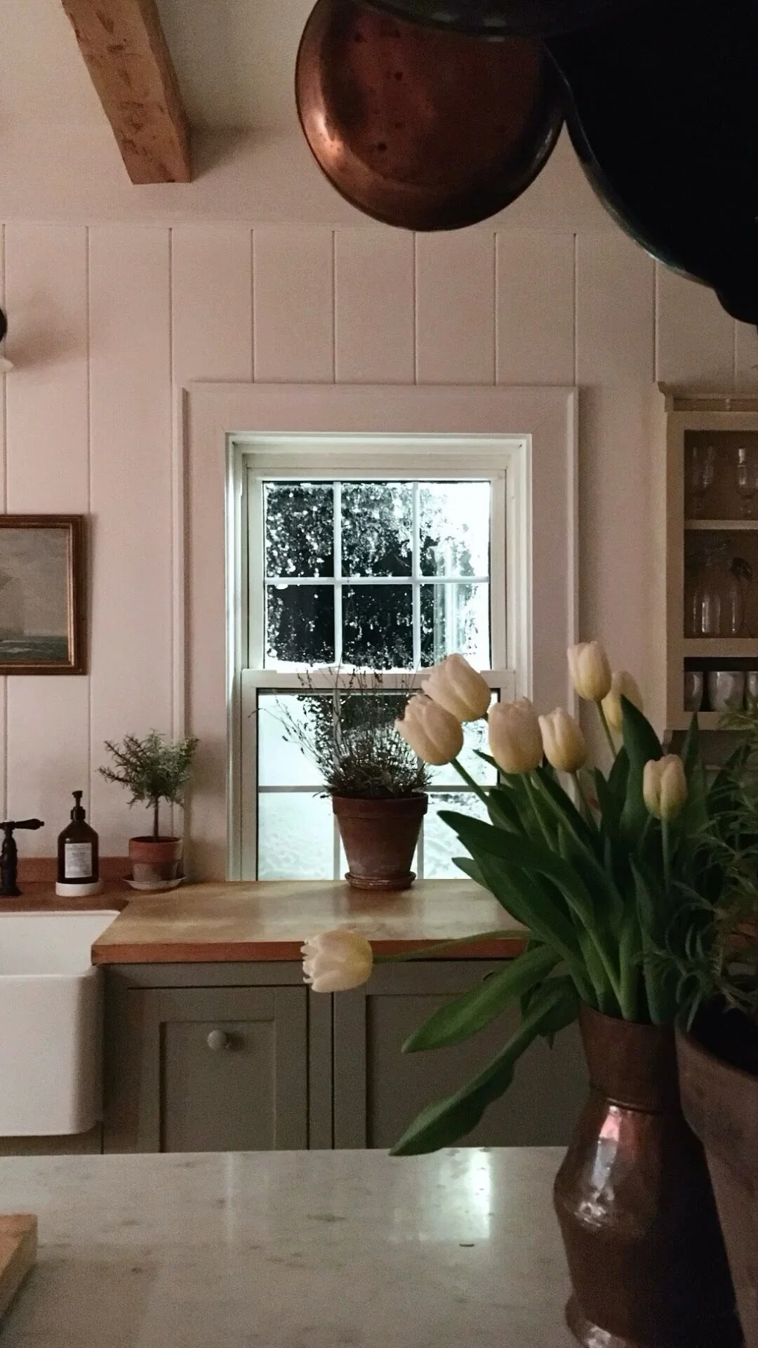
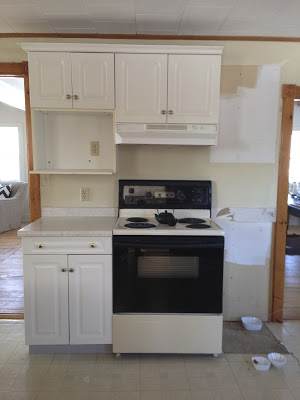
Kitchen reno progress.

The kitchen really is the heart of the home,  I have to say that renovating this one has given me a new perspective on renovating and the reality of what is truly necessary, what matters and what doesn't matter, what brings you joy in its day to day use.  A make-shift kitchen with no running water and no large appliances for months on end while endlessly waiting for trades to show up (like waiting 3 months for the electrician and 6 weeks for a plumber) was enough to make me never want to renovate again, ever. At least this house. ; ) But it also was truly revealing in many ways.  For the most part, when we were here we ate as well as we did with a full functioning kitchen, and even had lots of house guests and visitors - I just had to shop very selectively and plan meals more creatively.  Having survived all of that, I'll confess I'm finding the new kitchen to have an excessive amount of space compared to what I'd become use to, but for now that's one problem I'll happily enjoy living with.

For more post on my East Coast house Reno progress:

Dining Room Before & After

Staircase Before & After

Framing Pressed Leaves

All Photos & Drawings by:   Carol Reed

Framing Pressed Leaves


Each June the huge chestnut tree on the front lawn of our East Coast house in Nova Scotia puts on a spectacular show.  Spring arrives late in the Maritimes so its usually June before its gigantic leaves open up, and then immediately after, the cone shaped blooms appear.  This majestic old tree has a huge canopy that reaches low to the ground and spans at least 30 feet wide and when its at its peak by mid-June, its a stunning sight, between that and the sprawling lawn it creates a view of brilliant green out all the front windows.  Sadly the white blooms on the tree barely last 2 weeks so I try to enjoy every moment of them while I can.  I'm really not into DIY posts on this blog but I wanted to share this small project which I just did for my own house because it was so easy and turned out so beautiful.


This species is known as a horse chestnut tree, the leaves are enormous with five or seven petals, they kind of have a tropical palm-like vibe to them (which is probably why I love them so much).   Last June when the tree was blooming in all its glory, I was inspired to preserve its beauty somehow as I'm so in love with this gorgeous foliage.  I've always had a passion for natural elements and found objects that I always come home from a walk or outing with my pockets full of rocks, shells, branches, bark or anything I find to be beautiful or interesting.


The idea of framing these chestnut leaves had been in my head for a long time so last June when they were at their peak I decided to give leaf pressing a try.  I absolutely love botanical prints and have installed them in client's homes but I've never pressed leaves before so this entire project was/is an experiment. I picked about a dozen or so perfect looking specimens hoping that at least a few of them would turn out.  BF quickly made a press for me using multiple layers of plywood, I carefully placed the cuttings between sheets of cardboard and paper towels layered between the plywood, we clamped it all down and let time do its thing.  After about a month or so I took them all out and moved them into flat drawers where they stayed until just a couple of weeks ago.  

My plan was to hang a series of botanicals in my new kitchen and finally ….. finally (!) a year later as the kitchen is slowly finishing up, I was ready to get these leaves framed!   After a lengthy search for some affordable ready to hang frames I decided on these simple black gallery frames from Walmart that I found online. 


Black Gallery Frame 16 x 20

There are very few retail options available in Nova Scotia outside of Halifax, and I'm sure anyone who lives in rural Canada can relate - basically your in-store shopping options are Walmart, Canadian Tire, Home Hardware, the grocery store and the drug store.  Online shopping is great but there's always a 2 or 3 week wait plus exchange rates and shipping charges,,,and as I was experimenting here, I really wanted to be able to try one first before purchasing 9 of them, and I also didn't want to drive 3 or 4 hours to purchase one trial frame.   I considered Ikea's Ribba frame which I've used many times but it wasn't available to buy online in the size I needed and ultimately I really wanted something a bit more traditional. My search didn't net too many options on that front though so on my next visit to the nearest Walmart (its the only place I can get the cat food my diabetic cat likes, so I make regular trips) I checked out the frame in person and decided I could make it work.  They didn't have the size I needed in stock but the best part was, I could order them online and they arrived at my door in 4 days, free shipping.  (note, this is not a sponsored post, I'm just sharing the facts and also, I had no idea you could shop on-line with Walmart).


Because I didn't really want a modern frame, I also purchased some gold metallic acrylic paint, again, from Walmart, so I could experiment with making the frame look less new, less modern.   I used a foam brush to apply the gold paint along the inside and outside edges of the frames by just dipping, dabbing off excess, then dragging the brush up and down the edge.  It just took that *new* off the shelf department store frame and made it look a bit more like a custom frame moulding.  


The hand painted gold edge gave the stock frames an aged look and I loved the effect.  It took about 15 minutes to do all frames.  (The fabric looks like it has stripes in this photo but it doesn't, its just the reflection of the beam ceiling seen on the glass)


The frames came with a fairly nice, wide white matt but I knew I wouldn't be using them, partly because the leaves were so huge and partly because I had envisioned them mounted on borderless sheet of watercolour paper or a linen.  On my next shopping excursion I found a wonderful linen fabric at Atlantic Fabrics (which is the maritime equivalent of Fabric Land).  I needed 2 yards and it was only 7.99 a yard, easily affordable for experimenting with.  To make the linen mats I took the backs off the frames and used the backing as a template to cut fabric rectangles, each slightly larger than the frame. Then I pressed each piece of fabric using starch.  To mount the leaves I simply removed the contents of the frames and placed the leafs right side down, directly on the glass, then I carefully laid the linen overtop and proceeded to layer the original mats and all the backing back into the frames.  I didn't use any glue, tape or adhesives, the fit was very tight and everything is held in place by pressure.


Here's a sneak peak of the collection in progress.  I was able to use all the frames I pressed which filled 6 frames but I'm planning on pressing some ferns and wild flowers this month which I'll add to this grouping later in the summer.  I should point out the glass is regular glass, its not non-glare and its not UV glass which means they shouldn't be hung anywhere that's exposed to direct sunlight or the fabric and leaves will be effect by fading.


If you're looking for a super easy, fun and inexpensive way to create some personalized (and beautiful) wall art this is a wonderful way to display some of your prized specimens from your own garden or keepsakes from a favorite destination not to mention a great project to do with your kids.  Anything that grows can be pressed - flowers, leaves, herbs, moss and you can mount them in so many different and interesting ways.  I'm so thrilled with how the chestnut leaves turned out, I already have the press ready for some ferns and wild flowers but after that, what I really can't wait to try is a series of seaweed which is plentiful on our beach and just a great excuse to go for even more beach walks.  


All Pohtos:  Carol Reed


Cottage Ensuite: Before & After


Cottage Ensuite - After  |  Carol Reed Interior Design

This client's cottage in Kawartha, Ontario, underwent a complete facelift that included updating 5 bathrooms a kitchen, a bar and a kitchenette.  (You can check out links to previous before and afters of this cottage at the end of this post).  One of the biggest issues to address when planning the updates was that not only did the bathroom finishes look dated, but the style of the bathrooms looked more suited to a suburban house rather than a lakeside cottage.  Dated or not there was a lot of quality there in custom built-ins and solid materials.  No question it was built with every comfort of an all season urban home, as its located in a premium area of high-end cottages.  The main objective in this 'gentle' reno was to work with what was there but infuse a more modern cottage style - while retaining a high quality level of finishes.  I felt this could be accomplished through a series of strategic changes as opposed to gutting everything and starting from scratch. 

For the master ensuite I recommended leaving the walk-in glass shower untouched except for replacing the faucet set from polished brass to brushed nickel and I also recommended leaving all the floor tile which was a neutral taupe ceramic.  This then put the focus of the facelift on the feature wall, a large double vanity that was the centre of attention when you entered the room.  We would also remove the wallpaper and all the wall mounted polished brass accessories leaving us with a very neutral base to work with and allow most of the budget to be directed where it would have the most impact.

Ensuite Vanity - Before
The Before:  The existing long double vanity was superb custom quality and was in excellent condition.  It sported a peachy/tan corian countertop, oval sinks, polished brass faucets (although it doesn't look brass in the photo, all the fixtures in the room were brass), painted knobs, a frameless wall to wall mirror and a dropped bulkhead with recessed pot lights. The vanity was made from solid woods, the framed cabinetry had inset flush door fronts with a bead detail and raised moulding.  There was loads of storage and counter space and each end of the vanity had countertop mounted cabinets that extended all the way to the ceiling - the only negative was it was all very dated looking and lacked that cottage style  the new owners were looking for.


This is what I envisioned for the new finishes and fixtures, keeping in mind everything had to be readily available from the small local town nearby or available for quick delivery from an out of town source.


Cottage Ensuite - Finishes & Fixtures Concept  |  Carol Reed Interior Design

The starting point for the fixture replacements was the hardware.  The pine doors throughout the cottage were all updated with new distressed bronze lever handles that gave them a modern country look.  Continuing with this aesthetic, I introduced new bronze knobs and wall sconces to add contrast and vintage charm to the vanity wall.  For the plumbing fixtures we looked to the shower set first - because we were only replacing the trim not the rough-ins we had to work within the same mfg's product line in order for the new trim to be compatible.  The finish options were chrome or satin nickel, easy choice, the darker 'patina' of the satin nickel is a much better pairing with the bronze so satin nickel it was in a classic bridge style faucet and gooseneck shower head.

Ensuite Vanity - After
The After:  The entire vanity was refreshed with a new coat of paint in a crisp warm white, new low maintenance cararra look engineered quartz counters, new rectangular undermount sinks add a contemporary vibe, satin nickel bridge style faucets add a vintage country vibe as do the oil rubbed bronze hardware which also adds a sharp graphic contrast and ties in with the oil rubbed bronze lever handles on all the existing interior doors.  Other key updates to the vanity wall included; removing the bulkhead with pot lights, replacing the sheet mirror with a pair of framed mirrors above each sink,  installing a crown moulding and breadboard wallpaper on the wall between the upper cabinets and flanking the mirrors with new bronze wall sconces with parchment shades. Painting out the mirror frame, the beadboard paper and the crown moulding the same as the vanity unified the wall and cabinetry to read as one continuous built-in.


Ensuite Vanity - After
On this visit last Spring I was there to do a final walk-thru and make a list of recommended accessories and finishing touches, what would really finish off this room would be a graphic black and cream geometric patterned area carpet and a large woven towel hamper.  (Those should now be in place for this coming season. ) I'd also like to see a more rustic cache pot or planter with something less formal than orchids so we will work on that….


Ensuite - Before
The wallpaper and brass towel rods were removed and all the trim work was painted in the same white paint as the vanity.  


Ensuite Vanity - After

The walls received a new coat of paint in a dark brown/grey, similar but lighter shades of this found in the tile.  This dark colour really anchors the room and it neutralizes the pre-existing wall and floor tiles in a way that a light colour on the wall wouldn't have done.   The earthy colour also added a natural organic tone to the space and really accentuated the painted woodwork and all its charm.


Projects like this can be much more exciting to work on in ways that designing from scratch or all  new aren't, also evident in the way people are so drawn to Before & After story's.  Its literally a transformation before your eyes, making something out of nothing per say.  Taking a space that is uninspiring and working with it rather than ripping it all out - this is when vision and seeing potential really comes in to play and when the true value and power of design is realized.

For more Before and Afters of this cottage reno check out the following links below for older posts:


All Photos by:   Carol Reed