NYC - Kips Bay Show House 2010


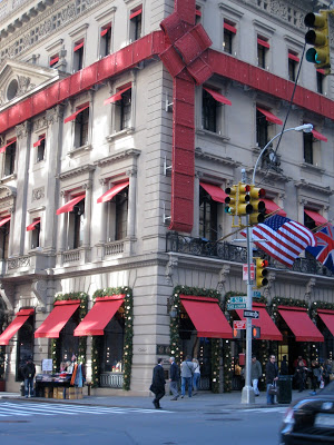
Day 2 of my trip to NYC included a visit to the 38th annual Kips Bay Showhouse, as luck would have it we arrived in the city just in time for the final day of the event.  The 5 storey, single family townhouse is located on a beautiful tree lined street in the Upper East Side of Manhattan just one block from Central Park.  Its currently for sale with an asking price of $28M.   Before the renovations for the showhouse took place, the house was previously divided into 2 separate dwellings, and I think even prior to that it had once been divided up into multiple apartments, this place is huge!


Even with an elevator, I think the current layout of the house would be challenging for the lifestyles of today's modern family living.  The kitchen was on the main level but the living room and dining room were on the second floor and the third floor consisted of 4 very small bedrooms.  So even with a price tag of $28M, I think most prospective buyers would need to consider some remodeling....


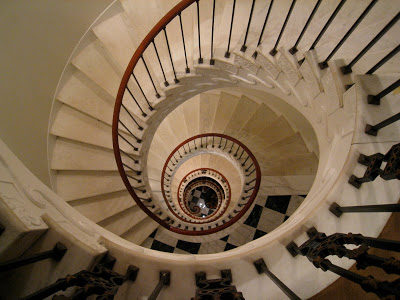
The 5 storey circular staircase was a favorite of mine even though it made me pretty dizzy and I nearly fainted every time I looked straight up or down the centre of it (I don't like heights!), check out the photo at the top of this post, my palms were sweating when I took that one.  The walls were adorned with framed black & white images.  If you concentred enough on not being dizzy,,,,you couldn't help but feel glamorous as you made your way up or down this staircase.


  Michelle patiently waiting for me as I'm obsessed with taking photos of it....
Staircase decorated by Rod Winterrowd Inc.


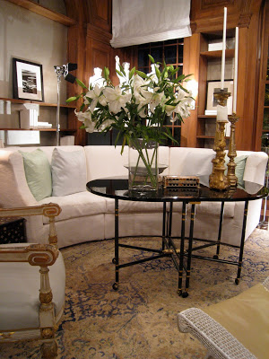
The living room on the second floor was a show stopper!  The colour of the walls was magnificent (Benjamin Moore's, Blue Suede Shoes) it showcases everything in the room like a jewel box.  The space was glamorous but tailored + classic at the same time, every corner and every surface was soo beautifully styled.  The lighting.....was perfection.  


The flamestitch pattern carpet was simply stunning.  The collection of artwork gives the room soul, and you can see the art just pops on that wall colour.


I think I was so drawn to this room because it reminded me of the colour pallette I used for the Sico shoot I designed for House & Home a couple of months ago here.  Whenever I use a bold colour as the main colour in a colour scheme (particularly walls) I love to pair it with lots of black and white and natural wood tones then add in an accent colour.  This room is an example of that same concept.  Notice that except for the centre ottoman,,,,,all the furnishings in the room are white or black.  You could change the wall colour without having to change a single other thing in the room and have both a completely different colour scheme with a new look.


Room design and carpet design by Sherrill Canet Interiors Ltd.


I admit the highlight of the showhouse and my entire trip to NYC was experiencing this room - to just sit in this space and take it all in, *in person*.  I wasn't disappointed, there's nothing I didn't love about it.  Its classic Vicente Wolf.  I'm a huge fan and admirer of his interiors and his books, I gush.


The entry into the Library designed by Vicente Wolf.


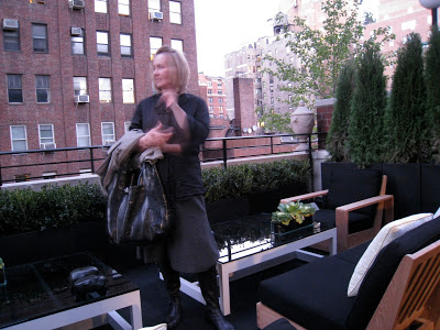
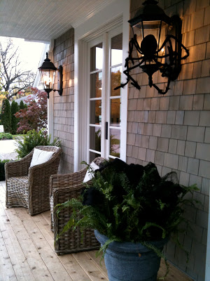
The next favorite space for both Michelle and myself was the top floor of the townhouse, it was designed as a media lounge space with adjoining spa room (complete with his/her massage tables) and a walkout to this luxurious rooftop deck that was so elegant looking furnished in teak and black and white.  Yes, again me raving about black and white with wood!  I especially adore black with natural greenery.


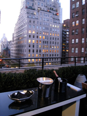
Michelle and I were tempted to pop the cork on this champagne and just kick back....seriously, I don't think anyone would have noticed we had this deck all to ourselves. : )


The jawdropping view.....
The entire top floor and rooftop deck was designed by Jennifer Post Design Inc.


As I mentioned the house is for sale, the broker for the property has a wonderful on-line listing where you can view more images as well as the floor plans, check them out here.  (Note that the floor plans on the listing don't represent the layouts of the rooms designed by the designers for the Showhouse event.)  Photography wasn't allowed during the showhouse tour but many of the volunteers were gracious enough to permit it when asked.  Thank you!  Below are a few more photos of some of my favorite rooms, these photos (except for the shower close-up) are from the realtor's listing and are much better quality than what I was able to take with my phone camera.


Another look at that rooftop deck.


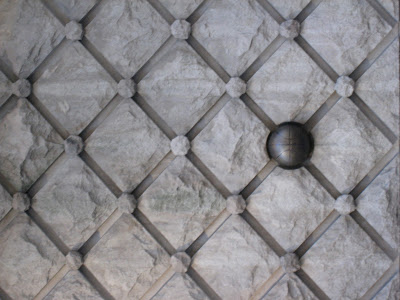
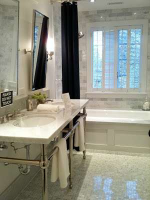
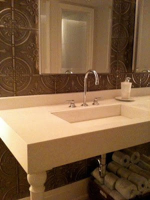
This bathroom was STUNNING!  
"Bubble Bath", Bathroom design by Coffinier Ku Design.


I snapped a close up of the shower tile detail to show a client,,,this is the same limestone tile I specified for their guest bathroom a while back so I was thrilled to show them an installation that used the same tile.  This tile is also used on the floor throughout the bathroom in a larger 12 x 24 but not so visible in the previous photo.


The library by Vicente Wolf.  (the wood panelling was all existing).


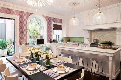
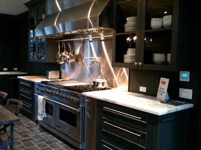
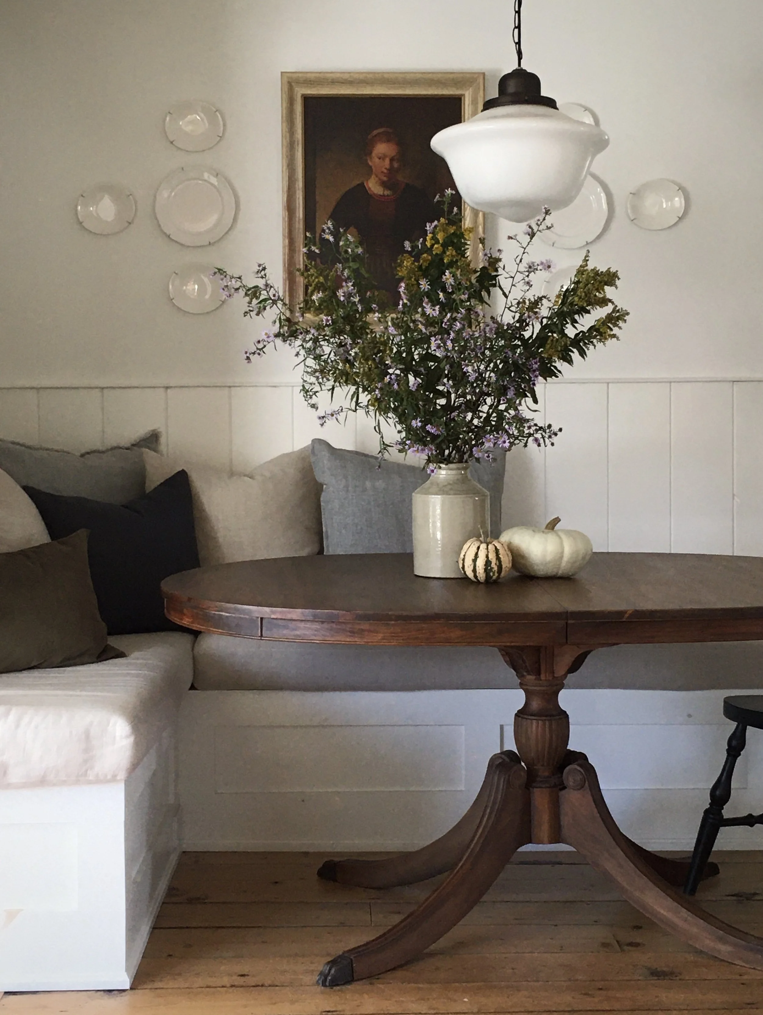
The kitchen cabinetry was existing too but I believe they were all refinished, the room was a great example of what I call modern traditional.  The architecture and all the built-ins are traditional in detail but the furnishings and decor are modern (my favorite combination) this is how you keep traditional looking fresh and current.  The counters and backsplash were calacutta marble, the ceiling and walls were papered in modern graphic wallpapers.  


The photo above shows two of this rooms highlights (for me anyways!) the vintage modern fixture over the table and the artpiece over the fireplace, a photo depicting black ink drops falling on water.  
(the above image, its a photo of a photo).
Kitchen Design by Eve Robinson Associates Inc.


I hope you enjoyed my personal highlights of the Show House, if you're EVER in NYC during this event its a must see and you'll be supporting such a wonderul cause!!  All proceeds from the Show House benefit the Kips Bay Boys & Girl's Club.


Photo Credits
Images 1, 3, 4 thru 13, 16 - Carol Reed
Images 2, 14, 15, 17, 18 - Corcoran Real Estate
Image 19 - original photo by Peter Margonelli for Eve Robinson Assoc.

NYC - Sightseeing


I'm still on a high from my trip to NYC last week, It was the most incredible experience meeting up with Vancouver designer Michelle Morelan of A Schematic Life Blog to spend a week in New York taking in all the sights, theatre, visiting showrooms, museums, and best of all just sharing all that we have in common as busy independent designers.  I've never walked and talked so much in my life!!!  Michelle is a regular visitor to the city but for me, it was my first trip in over 20 years,,,long before I was ever a designer or even in design school.  Needless to say I was walking around gob struck most of the time, like a little kid at Disney Land, i just couldn't get enough of this city!

I didn't take my good camera equipment with me as I really didn't intend on spending a lot of time taking photographs but I did have my Iphone and my compact point and shoot so I managed to get a few.  I was seriously distracted and I admit to missing many great photo ops because I was just busy living in the moment and taking it all in.  Here are some of my favorite images taken while walking around the city streets enjoying the sights.


I loved this raw structure on the exposed sides of buildings that had been torn down..


I could hardly drag myself away from Central Park.


Black facade.


St.Patrick's Cathedral


I had the chance to tour the inside on Sunday, it's the largest cathedral I've ever been in and to say I was completely in AWE is an understatement.  It was mesmerizing and I could have sat there for hours staring at all the detail, but then I saw thru the open side doors that Saks was right next door, I truly believed it was a sign from God that I needed to go explore.... : )


I was so captivated by the graphic interior of this small narrow restaurant we passed by.


So many old buildings with great detailing.....


Rockefellar Centre,,, the tall red sign in the middle is concealing scaffolding around the humongous Christmas tree which was being all decked out for its debut this weekend.


Bryant Park was just beautiful, I was so impressed by how many quiet natural oasis's you can find throughout the city.


The Cartier store wrapped up for the holidays.


Versace. I've never seen so many beautiful store fronts in my life.


A typical weekday morning in Times Square.


About a year and a half ago the city turned some of the roadway along Broadway and Times Square into pedestrian boulevards.  Now you can sit at bistro tables in the middle of it all, 24 hrs a day.


Like the parks everywhere,,,I loved that you could turn off of a super crowded busy Avenue and onto one of these perfectly quiet side streets where you would be the only one on the block among these gorgeous townhomes.


A stunning display of simple branches and yellow orchids in the Holly Hunt showroom entry.


And this was my favorite sight at the end of every day,,,,our hotel's bar where we could sink into one of the vintage leather sofas and enjoy a glass of wine and rest our feet!


I can't wait to share some other highlights of the trip like meeting Patricia from PVE Design, touring the Kips Bay Showhouse as well as some of the great stores and showrooms I visited.   In the meantime you can read more about our NYC trip over on Michelle's blog here.


All Photos:  Carol Reed


Upload: November 7, 2010


Oh yes, Autumn is definintely my most favorite time of the year....but unfortunately as you can see the lack of blog posts is result of this love affair I have with the fall season and all its distractions - the changing colours,,,the incredible harvest of food, wine and birthday celebrations to enjoy.  Selfishly, I've opted for drives in the country, dinner parties with friends or an afternoon of making soups instead of blogging. : ) Not that I've had much leisure time to indulge in all of this fall fair,,,,,because I've been working 7 days a week, it seems impossible sometimes to find that work/life balance.  My Iphone's been burning thru its battery life every day as I photograph all the items I've been recording for various projects so I think I'm waaaay overdue for an Upload post!  This upload contains a selection images dumped off my phone over the past 6 or 8 weeks, I've eliminated a few hundred of the pics I had taken of tile and plumbing fixtures to spare you the repetitiveness (yes, I've been designing a lot of bathrooms and kitchens lately!).  Below are a few highlights such as,,,,,great finds at the big box stores,,,,whats new in the world of tile,,,,,and a sneak peaks into a couple of special parties.....


Bringing the outdoors in, this outdoor light fixture was a steal and a great choice for a modern rustic bathroom I was redesigning in a chink log cabin, the homeowners liked it so much they bought enough to use in all 3 washrooms.  Light fixture from Union Lighting.  


I make a point to regularly check out what's available in the big box stores like Home Depot, Lowes and Rona.  Often I can find the same or similar items to what I've seen in specialty showrooms - so don't ever exclude the big box stores if you're trying to create a designer look,  its not where you buy it but how you use it.  Sometimes I find things I havn't seen anywhere else and the bonus is the items are low priced and in-stock.  Check out these great finds, which all happen to be stainless.......


This simple rectangular stainless steel mirror is a favorite of mine, it would work perfectly in any of the bathrooms I'm redesigning in the modern rustic log home.  Its only $64 at Home Depot but Lowes has a similar version too.


I selected this rectangular mosaic stainless steel tile from Lowes for a client's laundry room backsplash.


This is a great oversize single stainless steel sink by Elkay that's perfect for small kitchens, it maximizes counterspace and its tight radius corners give you a chef style sink that accommodates large pots and pans.  Available at Home Depot and only $329.


Ohhh I love when a custom sewing order is ready - these custom pillows were made for a client using a gorgeous collection fabrics designed by Tom Felicia for Kravet.


There's not much that beats the beauty of natural stone tile, but...I have to admit its truly amazing what's being done these days with porcelain tile - the effects being created with texture, graphics, metalics and lazer cutting technology make these man made tiles not only hard to resist but hard to identify next to the real thing.


This one had me fooled,,,when I first saw this I thought it was a natural split face quartz tile, but its actually a porcelain.  Its super thin long lines and variation in thickness create a stunning textural surface.


This is a perfect example of why I think lighting is the most important aspect of any well designed space, you can see the effect the accent lighting has on the tiled surfaces above.  Without the lighting the texture of the tile would be completely lost, have no relevance.  The tile shown in the top right is the same tile shown in the previous photo (above) but in the black version.


You can even have floor vents custom cut from your floor tile.


Always a must stop,,,the flower shops at Avenue Rd and Davenport didn't disappoint on Thanksgiving weekend....


This is Max,,he's the showroom greeter and he totally approved the solid walnut hardwood I selected for the 70's bungalow redesign. : )  Its 3-1/4" wide, prefinished with a low sheen cashmere clear coat which makes it look like its been waxed - super elegant.  When I specify wood floors I always chose natural woods (no stain) with an ultra low-lustre finish,,,,to me the beauty of wood floors is the natural character of the wood itself.


One of the best deals out there is this selection of cararra tiles by Olympia Tile,,a timeless classic, they offer a great selection of sizes and all but one of these are less than $10 s.f.  Olympia supplies many retailers too so you can also find some of these at your local big box building centre or tile retailer.


A modern candelabra I'm contemplating for a client...


I think I love fall planters more than summertime ones,,,,this one proves that a hit of black always makes anything better!


I often stop and take note when I come across ready-made pillows, I think they represent one of the 'best buys' you can make.  Not only can a couple of these instantly transform the look of a room, buying them ready-made can literally save you hundreds of dollars and loads of time.   These feather filled silk pillows with velvet appliques were less than $60 each, if you've ever had custom pillows made, you'll understand what a great deal this is!!!  To have even a basic single fabric pillow made thru a designer will cost you in the hundreds of dollars....


Of course I was completely crazy for these felt pillows I came across at Home Sense - only $29.99, they had such an amazing hand-made quality about them and they were so modern at the same time.  If only red wasn't such a bossy colour..... : /


These green version were gorgeous too!


My client Gail hosted a wonderful Kitchen 'Kick-off' party where she invited the entire design and construction team along with all her friends to celebrate the completion of her new kitchen and family room.  It was such an amazing night - her friends were blown away at the transformation and Gail, well, she was in her element!!


As a home chef, Gail was in her glory cooking up a feast in her new kitchen and entertaining over 50 guests.....


This is a peak into the kitchen from the back deck during the late hours of the party,,,,I'll save the real 'after' photos for another post in the new year.  From now until then I know I won't have a chance to get any alone time with that kitchen, is party central now!!


Last week I had a chance to visit the Princess Margaret Show Home design by Linda Reeves and the team at Canadian House & Home.  The house was all decked out for Halloween,,,,,


There was an East Coast style to the architecture of the house which is hard not to love,,,,,although I took a lot of photos throughout the house, for now I'll just share a glimpse with you of three of my favorite rooms in the house.  The house will be featured in the magazine in the new year (probably the April issue) so I'll hold back the rest of my pics until after their own photos have been published. 


I know some visitors were not too fond of the all dark grey kitchen,,,but I LOVED it.  The counters in particular were my absolute favorite element of the entire house.   I inquired about the finish but there was some uncertainty, I think they were 'leathered' calaccatta marble but I'm investigating further.....


The laundry room was HUGE,,,,,this shot represents only half of it,,,imagine the image above completely mirrored and that's the size of the entire room.  The counter at the opposite end of the room housed the washer and dryer as opposed to the sink seen at this end.  This laundry room (despite its size) actually reminded me a lot of the laundry room I designed for my Victorian row house renovation where I used the same floor tile paired with white beadboard panelling on the walls....


This shared, 2nd floor hall bathroom of the show home has all the classic elements I love!  


A girlfriend and I both have birthdays in October so another friend hosted a birthday dinner party for a group of the girls,,,,,we hung out around her island and laughed and drank and ate,,,while she cooked the most incredible meal for us....


Homemade roasted eggplant salsa and cornbread...


We started with the most incredible black bean soup....(still waiting for the recipe!!) and then.... I stopped taking photos,,,ha ha.  Oh boy, it was a good time!!  I am so blessed to have such amazing girl friends, as I always say, to cook for someone is an expression of love!


A bamboo bike at a vintage store...


If you ever have a chance to visit this restaurant you'll see a great example of modern farmhouse interior style at Oliver & Bonacini's restaurant in Oakville.  The washrooms were especially gorgeous with the tin panelled walls and modern white sink consoles.  The entire washroom was a simple combination of white, cararra marble, and tin panelled feature wall with polished chrome hardware.


I'm off to New York City this week where I'll be meeting up and staying with Vancouver Designer/Artist Michelle Morelan from A schematic Life blog.  We have plans to tour the Kips Bay Show house and visit Moma among a loooong list of other designer destinations,,,,,,, not to mention we have dinner plans with Patricia of PVE Design next Saturday night (so excited to meet her!).  I don't plan on not having any time to blog during this trip (I'm not even bringing my laptop!) but you can follow my twitter updates for news on what Michelle and I are up to in NYC.