The Art of Planning: Karen's Kitchen


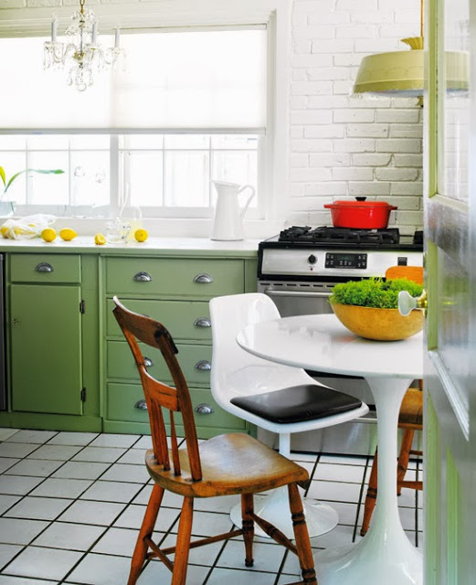
Photo by Donna Griffith, for Style at Home


You may remember last  year I prepared some design sketches for my cyber friend Karen’s chicken coop gates.   If you’re a fan of the Art of Doing Stuff blog, like I am,,,you know Karen doesn’t often need help with anything because she’s a master at figuring how to do stuff herself.  She has a wonderful character style house and over the years she’s done many home improvements and decor projects inside and out.  Not your average homeowner diy's,,,,Karen has an impressive archive of magazine quality 'afters', in fact the inside of her house and her backyard have both been featured in Style at Home magazine which you can admire here and here.

Clearly Karen doesn't need any help in the decor or handyman departments but one of the few things she hasn’t tackled is the house's original 1940‘s kitchen.  She's pretty attached to the old kitchen and its easy to understand why - it oozes an authentic nostalgic charm that’s hard to replace (top photo).  Even the editors at Style at Home couldn't resist photographing and featuring it just the way it is.  Yah, even the "before" picture of Karen's kitchen is magazine worthy. ; )  Inevitably the time has come to replace it and Karen knows enough to know this in’t something she wanted to tackle on her own because the consequences of making mistakes or oversights are daunting, and expensive.  So this is where I came in.  Karen hired me thru my  e-design services to work on the new kitchen plans.  As far as finishes and appliances went she knew what she wanted but what she was struggling with was how to fit all of the new elements together.  She needed a plan.  


ASSESSING...
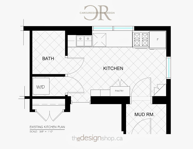
The first step I take is to review the existing space to assess what's working and what isn't.  The whats not working about her current kitchen might be obvious, but its not all bad.  There are aspects of this kitchen layout that Karen enjoys, particularly the huge expanse of uninterrupted counter space between the sink and range....and having a kitchen table and chairs. To be frank the shortcomings of the kitchen were easy to find solutions for but doing so and maintaining those elements that she loved was truly the challenge.  That and accommodating all of the other things on her wish list.


THE DESIGN BRIEF...
- 'not cookie cutter'
- no new construction
- non-custom cabinets
- more storage
- a range hood
- a glass door fridge
- a furniture style pantry
- a stand alone butcher block table
- a place to sit
- a fixed budget
- did I say 'not cookie cutter'..

Knowing that we couldn’t alter the bathroom, laundry room, mudroom or doorways,,,,,I recognized the biggest obstacle in Karen’s kitchen was the counter height window on the end wall.  It’s location was a prime spot for a range and hood, or a fridge,,,or wall cabinets.  Ideally it needed to be moved to best utilize the space. Unfortunately the window was fairly new and had involved re-stucco’ing the exterior of the house.  The option of moving it or changing it now was not in the budget so it was staying.  Had we not been able to find a workable layout that Karen loved, I would have suggested she hold off until her budget allowed to move the window because it would open up so much more layout potential. 


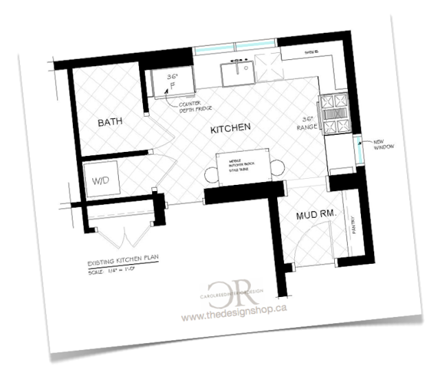
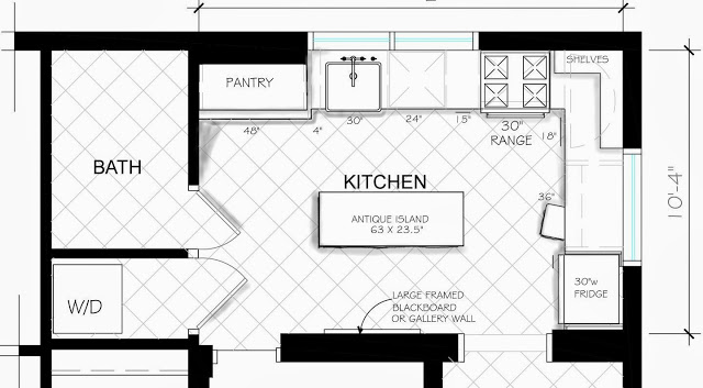
This is an example of how we could have utilized the wall had we moved the window. We quickly eliminated this option (and variations of it) for budget reasons and moved on.


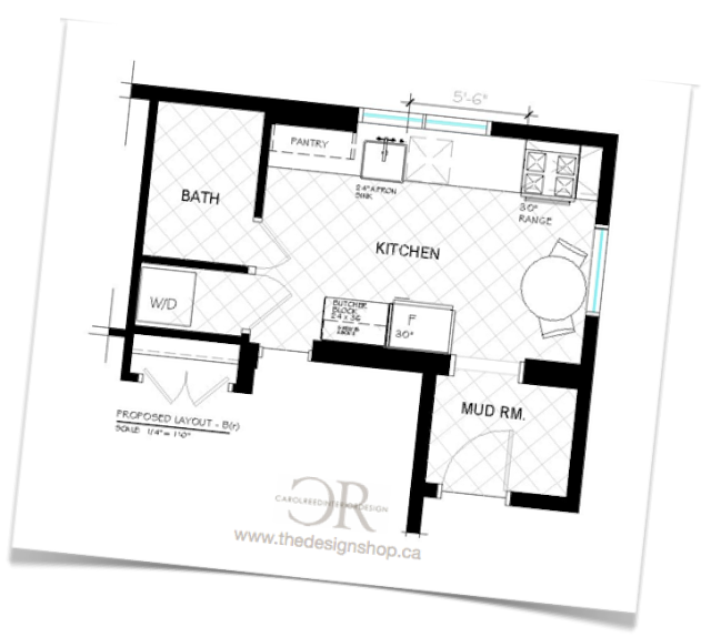
Even though this layout doesn't appear to be drastically different than the existing, the changes are significant enough that with new, more efficient cabinetry and appliances it would be a big improvement.  This option ticked all the boxes including a 36" range.  It was the front runner,,,,,until,,,, Karen came home with an antique butcher block island that she couldn't resist and that meant a change in plans.  But I've seen and completely approved,,,it's a beauty worth changing things up for.
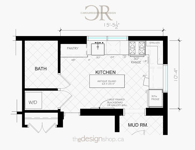


THE AFTER PLAN....
After exploring more than a dozen layout options we arrived at a final plan that Karen loves (shown above).   You can read Karen's first post about her kitchen reno plans here .......and you'll notice she received no shortage of opinions and suggestions from readers too. ; )   I'm confident in saying they can rest assured that the planning process was extremely thorough and not a single possible option was overlooked.  : )  (We are aware the fridge overlaps the window a tad in this layout but this is the worst case scenario and we're prepared for how to deal with it.  The fridge she's hoping to get is narrower than this but we're planning for the larger option just in case).

True to her vision “not cookie cutter” would be the design mandate and concept for Karen’s new kitchen.  This applies to the layout too. There are a LOT of kitchen design standards, rules of thumb and conventional layouts with their regulated work triangles - well this plan doesn’t necessarily follow all those rules.  And that's perfectly ok.  I can say from experience that the clients who do a lot of serious cooking are the ones who's kitchens stray from generic design standards the most because they have much more specific needs, usually simpler.

When I approach a kitchen plan from scratch I use spacing standards only as a starting point (which also is an instant way to gauge if your footprint is considered tight or generous).  From there I determine how and where adjustments can be made to suit the space and the users specific needs.  There's nothing wrong with conventional layout standards but they simply don’t always fit or work for every situation, that doesn't mean you can't still have a kitchen that's functional - it just means you need more adaptable solutions (while maintaining safety and functionality of course).


In addition to the floor plan I also worked out all of the wall elevations which detail Karen's new cabinetry and will facilitate getting it ordered.  The task of pulling this entire plan together is now in her very capable hands and I can't wait to see it all come together.   Karen has done some savvy networking to co-ordinate a few great collaborations and sponsors for this project.  The design layout reflects the products and publication opportunities that are anticipated thru the collaborations as well as some of Karen’s unique finds so it promises to be an interesting and beautiful transformation story for all parties involved.

You can follow the kitchen reno progress over at The Art of Doing Stuff and I'll post updates here as it starts coming together!


My House: Dining Room Progress


For the past 11 months we've had the front part of our East Coast house and the entire 2nd floor undergoing an extensive renovation.  The reno area consists of a living room, dining room, hallway/staircase, 2 bedrooms and a bathroom - in total less than 1000 s.f.  Its been 11 months and this new work is still not finished.  I expected we'd  have the entire house reno completed by now but reality is I'm dealing with Atlantic time here. Nothing happens quickly.  This first phase of renos is complete enough now that we've moved into the new area and its a huge relief to have the extra room and to have the tools and dust and daily trades gone.   

Its fitting that the very first room we used in the new part of the house was the Dining Room (even before the bedrooms).  What better way to christen the new space than a special dinner with family, our very first house guests.   I never imaged 3 months previous when we planned their visit that w'ed be scrambling to get the new space livable by July 1st.   It was a close call,  I'll be honest, new beds arrived for the bedrooms on Thursday, the plumber arrived on Friday to install the bahtroom fixtures, boxes were being upacked on Saturday and our guests arrived on Sunday.  I had hotel rooms reserved just in case but miraculously we didn't need them.   Shortly after they arrived we gathered in our "new" dining room for a big dinner.  To give you an idea of how far this room has come, here's a little before and after along with a peek at some of the progress.


Dining Room Before


Dining Room After (same view as "Before" photo)


The only redeeming feature about this room "before" was that it was a decent size.   Fake wood panelling, acoustical tile ceiling (its everywhere here), nasty pet stained carpet, mis-matched trim work - it all had to go.  With a house this old a coat of paint and a steam clean isn't nearly enough to bring the space up to todays standards.  Behind the walls and above the tile ceiling your likely to find no insulation, mould, loads of mouse droppings, critter nests, faulty wiring and water damage.  We found all of that and more.  The only way you could move forward with this interior was to go backwards first.


On the floor we stripped back a layer of carpet, a layer of vinyl and a particle board subfloor to reveal what I had suspected (and desperately hoped) was there. Original solid wood wide plank floor boards, complete with a solid wood subfloor beneath.  I was ecstatic when we uncovered these and that they were throughout the entire house.


These are what the floors looked like after stripping off layers of paint. 


The next most exciting discovery was uncovering these original timber ceiling joists in the living and dining rooms.  Just like the wood floors, these beauties hadn't seen the light of day in a looooong time and I had no intention of covering them up again.


Almost there,,,many months later here's the dining room just after the drywallers finished.  We reframed all the exterior walls, added insulation, new drywall and new wood windows and all new trim work.  The wood ceiling beams were left bare and new drywall was seamlessly fitted around them.

Below is a sneak peek of what the dining room looked like the day we used it for the first time with our guests, I literally took the building permit out of the window seconds before these photos were taken.   The room was far from finished; there are no light fixtures, no electrical cover plates, no vent covers and barely any furniture.  The table and chairs we moved into the room are completely temporary but work for now - it will ALL be replaced in the near future.  The fact that the room isn't complete and is a long way from where I want it to be, would never stop me from making use of it now as best I can.


This is how the table looked while I was half way thru setting it for our first dinner.  I filled the bottoms of the hurricane lanterns with sand from the beach and added wild daisies and ferns that I picked from the side of our road (there's no flower shop to run to).  In case you're wondering what was on the menu for this inaugural dinner - we had a lobster feed of course. : )

So that's a sneak peek of the new construction in the dining room, the furnishings and artwork are another story all together.  Stay tuned for sneak peeks of the other "new" rooms which I'll be posting soon.  You can also check out some before photos of the exterior on my first post about the property here and one other post on some of the demo progress here.


Room Design and all Photos by:  Carol Reed


Grey Scale: Powder Room


Clients powder room in various stages of progress.


I was sorting through room photos of past projects and came across these images of a powder room from a recent renovation, the 70's Bungalow project.  It dawned on me that I hadn't ever posted any photos of this room before, probably because its just such a difficult room to capture without a wide angle lens.  Like the entire house this room underwent a complete gut so we started with a clean slate - dark grey slate in fact which I chose as a wall colour for the small room.  


Small rooms are the perfect spaces to play up drama and scale - whether its a large print wallpaper, deep paint colour or graphic floor pattern, going bold will have lots of impact and kick the wow factor up a notch for your guests when they excuse themselves to powder their noses. It makes the entire experience a little more special.  : )    The drama in this little room doesn't come from the colour, its neutral in that sense but the walls are deep and dark and quite a departure from the rest of the home's all white modern interior.  The large calacatta marble floor tiles have beautiful dramatic veining.   


A bevelled tray mirror adds some elegant sparkle to the dark room but the floor to ceiling bare grey wall was crying out for a piece of artwork and I wanted large scale.   What I had completely forgotten about until I came across these room photos the other day was that we had one of my own photographs framed and hung on the wall.   For this room it was an affordable alternative to what would have needed to be a very large  original piece (or a smaller pair) of art.  I sent my file to Elevator Digital and once again, Kevin worked his magic on it to make sure when it was enlarged that the image quality was maintained and then the print was beautifully matted and framed.

The photo chosen was from a series I took of buildings on Wall Street when I was in NYC two summers ago. The homeowners have both travelled to NY for business over the years and now have a son who lives in Manhattan, they're pretty fond of the city and were quite taken with many of my architectural photos.   Its hard to tell from this not so great snapshot but the size of the framed piece is over 3' wide and over 4' tall.  Its not actually a black and white image but the colours are all monochromatic greys that it reads that way.  My favorite thing about this photo is the perspective,  its so dynamic that it brings an amazing sense of depth to the room. 


There's been lots of finishing touches and a massive landscaping overhaul happening at this house over the past year so they'll be more after photos coming soon.


Room Design and all Photos By:  Carol Reed