Paint Colours

Picking A Paint Colour: Style at Home Designer Secrets


Thank you to Style at Home, I was thrilled to be participate in their special 100+ Designer Secrets colour issue, which hit the stands a while back.  I have to admit I had some difficulty getting my hands on a copy, the first one I had was left behind at a girfriends before I even cracked it open (and I never saw it again) then it took quite some time to find another copy on the East Coast.  Inside you’ll find some tips from myself and other paint aficionados on how to pick paint colours.  Its a a great topic, one of the major components of every project I work on is selecting all the paint finishes, usually for an entire house. So I thought this would be a great opportunity to elaborate beyond my tips included in the issue.  How and where to start when picking a paint colour?

Many designers will say that they pull the paint colour from a fabric, or select a paint based on the exposure of the room or chose colours from the homeowners wardrobe.  All common approaches when decorating an existing room.  But what if the space a) doesn’t have any significant fabric, or b) doesn’t have a window or c) the occupants vary in age, gender, and fashion taste.  Many times you can be in a position to have to pick a paint colour without having a significant fabric or persian rug to work with.  You can still lay the groundwork for a beautiful palette - if you chose the right neutrals you can layer in the colour later.

Because most of my client projects are renovations, often the paint colours for the entire interior have to be selected long before the homeowners and I have even contemplated new fabrics or area carpets or before they've accumulated an art collection.  Sometimes newly furnishing the space will follow a year or so after move in, sometimes only a few main rooms are decorated with the remaining to be completed over time.  Aside from those situations that are driven by time and budgets, there are many spaces in a house that often don’t ever have fabrics in them such as; bathrooms, kitchens, hallways, staircases or laundry rooms. The paint colour can spin off of a fabric story from adjacent rooms but that colour, primarily, has to relate to the hard surfaces.

Finish samples for a clients kitchen (paint top right).  The paint selections compliment the wood floor and cabinets, the marble backsplash and quartz countertop and stainless steel.

My process for selecting paint is always the same. It never starts with fabric.  The approach I take with paint is that its role is to enhance everything in the space (and the views outside) not distract from it.  First and foremost I take direction from the permanent surfaces and architectural details like wood, stone, tiles, metal, mouldings and in some cases broadloom. These are far more permanent than any fabric or wallpaper but are the foundation of the overall palette and have to be considered with every paint selected.  Secondly, I take into consideration the style and character of the home (Heritage or contemporary).  Lastly, the natural light and views - what is the setting, what is the view outside the windows. (The only exception to any of the above is kids rooms, its all about their favourite colour and making it work for both mom and child!).

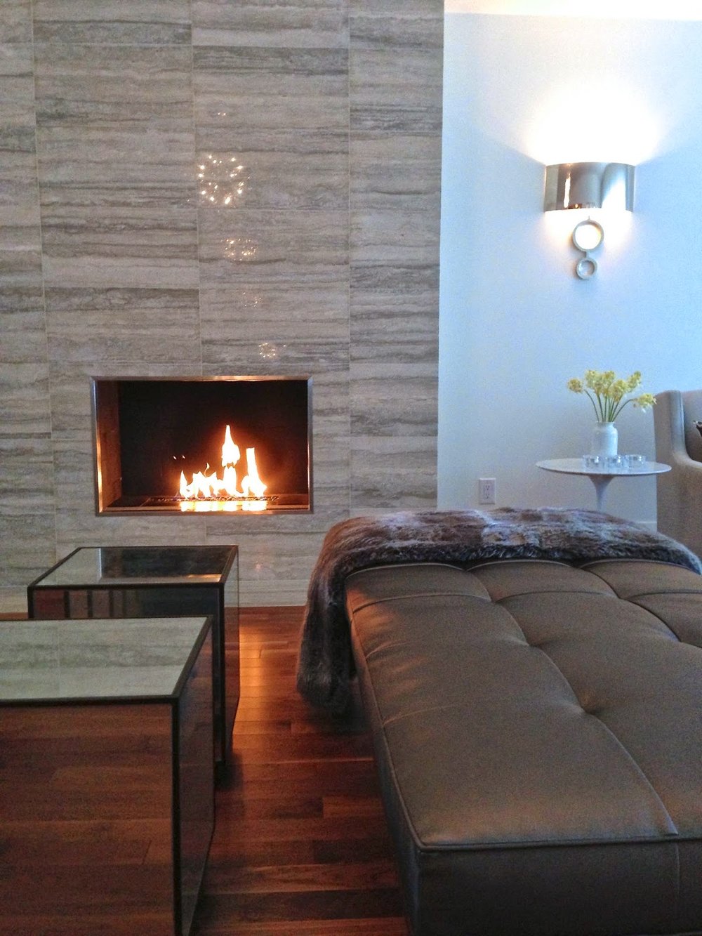
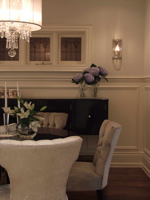
All the upholstery fabrics chosen for the living room in this contemporary home were pulled from the colours in the stone fireplace.  The travertine stone tile was also used in the entryway and a guest bathroom.

For 90% of the interiors I design, I could happily work from a paint deck of nothing but greys and when I say grey, my definition of grey covers a wide spectrum from warm to cool, from almost white to almost black , from clear to muddy and with undertones that can make them read green, blue, beige, purple or brown.  Light and airy, to dark and dramatic, its all there.  Its in this spectrum that I always find the perfect neutral that works beautifully with the finishes of the house as well as more vibrant colours that could be found in the garden, fabrics or the painting over the mantel.  For walls, when I'm not chosing white I'm always drawn to the mineral, sky and watery greys.  I am least drawn to anything with a red undertone or citrus colours because I don't think they pair favorabely with most natural wood tones (typically golden or reddish woods) they don’t compliment or contrast instead they can clash with these woods or suffocate the room in one note. (This is particularly the case in Canada where we use a lot of wood floors, wood cabinets, wood railings, and wood furniture.)  Contrary to this effect greyed neutrals do the complete opposite, to my eye grey makes all other colours and materials look better.  Grey is anything but dreary in fact I love how grey brings everything in a room to life - nothing enhances wood tones, complements colour and is crisper with white trim better than grey.  It has the ability to make anything paired with it look modern and sophisticated, and that's why it has been and will continue to be my go to palette for picking the perfect colour.

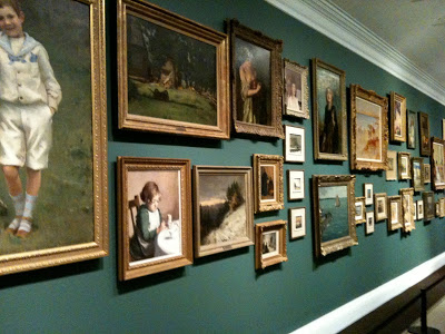
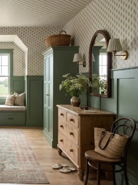
The natural walnut floors and various feature stones inspired the paint palette for throughout the home.  The paint palette was a range of off-whites and greys,  contrasted by black metal window frames.
You can never judge a grey by the paint chip alone,,,these chameleons only reveal their true beauty in context with the whole of the room. Sample, sample, sample.

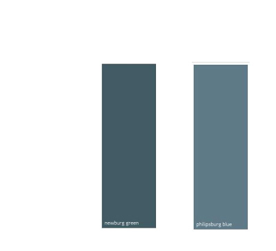
Whether you like your spaces neutral or colourful you'll find loads of great colour tips and advice in this issue, including my best tip on picking the right paint colour and what paint combo i'm coveting now.   If you haven’t see it yet its on stands until August 31st.


All Photos and Design (Except Cover Photo):  Carol Reed Interior Design


Style at Home: Living Room Paint Palette


I was thrilled to be asked by Style at Home to share a favorite living room paint palette for their readers to be featured in a special Designer's Secret's issue, on stands now (and on-line at Zinio).  The requirements were to provide them with a four colour paint palette to include a ceiling colour, wall colour, trim colour and accent colour.   You can see the first page of the feature below were my palette is shown.


Style at Home - Designer Secrets 2012, Page 59


A favorite palette of mine instantly came to mind, its based on Benjamin Moore's, Horizon OC-53.  It's not a palette I've just pulled out the air, its a palette I've used time and time again over the past 7 years -  if I had to name a 'go to' colour that wasn't white, Horizon would be it for me.  Its the palest silvery blue that reads differently in every space, its as light as a white so it highlights architectural mouldings and showcases artwork like a white and it pairs beautifully with all wood tones.  I've sampled it with dozens of other greys and off-whites and its almost always the unanimous choice.  I've used it in client's living rooms, dining rooms, bedrooms, bathrooms, and ceilings, in both traditional and contemporary spaces, urban and country.  The feature on p.59 illustrates one of my favorite trim/ceiling/accent paint combos with Horizon OC-53.  (not to be mistaken with Horizon Gray, a different colour completely). 


Below is my own breakdown of the colours and why I chose them, along with a photo of a client's living room and dining room painted in these paint colours (minus the accent colour).  The house is a grand old Edwardian in mid-town Toronto, home to a young family of 4.  If I had to describe this palette, I would say it exudes SIMPLICITY & ELEGANCE.

WALLS:
Benjamin Moore
Horizon OC-53
This pale silver grey is my favorite alternative to white walls but with all the same attributes - its simplicity compliments wood tones, highlights furniture silhouettes and enhances other colours.  I first used it about 7 years ago and its been a go to paint colour for me ever since, it works in any room.  Its undertone has just a whisper of blue so this grey reads clean and sophisticated, never drab.

TRIM:
Benjamin Moore
Swiss Coffee OC-45
A warm off-white that has an aged looked to it and is perfect for architectural mouldings in a traditional space.  Paired with HOrizon this tinged white trim work gives a room timeless and elegant character.  (pair with a white trim for a contemporary space).


CEILING:
Benjamin Moore
Chantilly Lace OC-65
A very neutral clean white, a good balance with the mix of cool wall paint and warm trim paint.  It provides a nice crisp definition against the antique white mouldings.  In a contemporary space, use this for the trim too!

ACCENT:
Farrow & Ball
India Yellow #66
What I love about Horizon is you can go any direction for an accent colour.  My favorite with it is a deep ochre yellow, its inviting and chic paired with pale blue/grey, use it on the backs of a bookcase, upholstery on a statement chair, silk pillows, ceramic lamps or on the walls of an adjoining room.


Wall Colour:  Horizon OC-53, Trim Colour: Swiss Coffee OC-45
Room Design and Photo by:  Carol Reed (2007)


Upper Wall Colour:  Horizon OC-53, Wainscoting and Trim: Swiss Coffee OC-45
Room Design and Photo by:  Carol Reed  (2007)


Art Gallery Inspiration


Last week on Canada Day I made an impromtu visit to the McMichael Gallery in Kleinburg, just north of Toronto.  You can read about the inspiration for this visit here.  I love to visit art galleries of any kind and I'm a particular fan of Canadian art so it was a wonderful way to spend Canada Day afternoon.  This past May marked the 90th anniversary of the Gallery's Group of Seven Collection and to celebrate this, they re-designed the exhibit and rehung pieces from their permanent collection and added some rare pieces from private collections.  The new exhibit is called The Group of Seven: Revelations and Changing Perspectives.  What impressed me most about the gallery on this visit (aside from the masterpieces!) was the wall colours - as you walked from gallery to gallery throughout the exhibit the wall colours changed with each series of collections.  The walls had all been freshly painted just prior to the opening of the exhibit this past May in a wide range of colours from deep rich jewel tones to light watery greens and blues, to neutral taupes.


Salon style exhibit of Canadian historical works.

Upon entering the exhibit galleries you're greeted by this powerful and dramatic long wall of 19th century Europoen inspired landscapes and portraits arranged salon style on a deep teal coloured wall.  I've always loved artwork hung in this manner there's something about it that just draws you in and captivates you and even though there's an abundance of art on the wall the individual pieces aren't lost - somehow the mass arrangement makes you want to stop and look at every single one like its part of a story.   In the same manner there might be some pieces that on their own aren't to your liking but when they're hung collectively like this you have an appreciation for all of them.

Here's a couple of similar paint colours from Benjamin Moore,,,I'm not crazy for teal because I have not so fond memories of it from the 80's (!!!), these are a slightly bluer version of teal than the wall colour the gallery used.  (I inquired about the paint colours but no one was able to provide them to me on that day and I havn't yet received any follow-up response yet so these are just my own interpretation.)


I often come across articles with tips on how to hang a gallery or salon style wall and I've read all kinds of different 'rules' many of them contradictory, regarding the spacing, the framing and the subject matter.  But the only consistent thing I've noticed about my favorite salon walls is that there really is no rhyme or reason to the hanging.  As I stood back and studied this wall, again I couldn't detect any overall consistent spacing but I did notice there was a definite 'invisible' horizontal border at the top and bottom of the wall which all the painting where hung within (looked to be about a foot below the crown moulding and about 2 feet above the floor).  Also all the pieces were all paintings from the same era and all were in gold toned antique style frames.  So I think these consistencies added to the powerful impact but I could easily envision varying works of art and frames incorporated in this hanging and I think the result would be just as effective.   My two favorite pieces on this wall are seen in the photo above, the beach scene in the top left and the smaller beach scene on the bottom right - romantic summertime images I can imagine in a room full of white linen, nautical stripes, sisal, wicker and painted furniture, they're simply gorgeous and not something most people would typically associate with Canadian art.

I will always be a fan of the traditional rugged landscapes that are symbolic of the Group of Seven's work, but what I really enjoyed about this exhibit were the paintings that are so different and in such contrast from those iconic images.  My favorites included many of the colourful still life flowers and portraits that I would love to design a room around!


Arthur Lismer, Summertime c.1918.  Oil on Canvas.
This painting reminded me of the two beach scenes on the salon wall.   Soft, pastel and beachy.


AY Jackson, Dahlias 1913.  Oil on board.
This painting just grabbed my eye, it literally popped off the wall.  The wall it was hanging on was painted in a browny/plum colour similar to below.  

There were a lot of purpley taupes and plum/browns used.  The paint colours don't translate accurately on the computer but looking at the fan deck  Benjamin Moore's Driftwood colour is similar to what the Gallery used based on my memory.   The other two colours are my own picks for a deeper taupe. 


F.H. Varley, Girl in Red c.1920-22.  Oil on Canvas.
Portraits have always been a favorite of mine, the colours of this one are stunning.  This was hung on a purpley/red painted wall similar to the paint colour below.  This would be a gorgeous colour to display artwork in a dining room or cozy den.
Going by memory this colour in person was a purply red but a bit on the brown side.  I managed to get a photo and its looks quite brown in the image below but I remember being more purple than brown.  I selected a few similar colours from Benjamin Moore above.  My least favorite colours are dark purples and burgundies so I don't tend to use a lot of these colours, I have used Amazon Soil and its a very livable earthy purple which was a beautiful backdrop for artwork.


wall colour was more purpley than brown as it appears in this photo.


Edwin Holgate, The Cellist c.1923.  Oil on Canvas.
This was so dramatic hung on the same dark red/purple wall as the portrait above.


J.E.H. MacDonald, Thomson's Rapids, Magnetawan River,  c.1910.  Oil on Paperboard.
There were a series of landscapes hung on a deep navy blue, one of my favorite wall colours in the gallery.  The look would be similar to these paint colours I've selected below....
Beautiful deep blues from Benjamin Moore any of these would provide a classic backdrop for artwork.


My favorite wall colours in the gallery for displaying the artwork were definitely the deeper richer tones. To my eye these colours made the paintings pop and truly highlighted them.   I'm not one for using these really deep colours throughout an entire house, they can be heavy and moody, but if you have a definitive accent wall or a seperate room they're beautifully suited to dining rooms, library/dens or powder rooms where they can be dramatic and cozy.  


Of course I love the look of classic gallery white walls, but my next personal favorite is a deep grey or black for displaying artwork.  On the second floor where the Inuit art exhibits were there was a beautiful black wall that looked stunning as a backdrop to glass display cases and there was a brighter less brown red.   Benjamin Moore's Black Beauty is a black I've used several times, Kendall Charcoal was my own bedroom colour for years and I loved it (Chelsea Grey is another fave),,,and Northern Fire is an orangey red that I find more cheery and fresh than darker browner reds.


My least favorite colours were the lighter wall colours they used in the gallery ranging from light sky blue, soft watery greens, taupe and mossy green.  I found that the paintings seemed dull and bland when displayed on these colours, maybe because so much of these tones were in the paintings themselves or maybe because the frames were painted in muted tones?  With light coloured and neutral walls I think artwork with lots of white, like black and white photographs with white mats, or white line drawings work really well because they look very crisp on these backgrounds, especially in metal or black frames.


If you haven't visited the gallery before its a great way to spend an afternoon, they have beautiful grounds with lots of picnic tables if you'd like to pack a lunch.  If you're looking for something to do with the kids this summer the gallery offers lots of children's day camp programs and art classes, (including spin art!) the kids can learn something new while having lots of fun and you can take home some masterpieces of your own to hang on the walls!