I had the pleasure of being invited to tour an open house this week of a beautiful victorian semi-detached house in Toronto. I'm fortunate enough to work with one of the best real estate agent's in the city, Kara Reed, who also just happens to be.......my sister-in-law of the past 20 years. (You may recognize her from HGTV's Sarah's House I, and Sarah's House II). Kara had the pleasure of listing this 1890's victorian house on mls this week and is preparing for a public open house this weekend, more info here. Knowing that I'm in house hunting mode myself and knowing my love and appreciation for great interiors of all styles, she insisted this was a must see for me -and I'm glad she did.
The house was designed by the award winning Toronto interior design firm, Powell & Bonnell during an extensive renovation of the house back in early 2000's. What's unique about this house is its one of the few (if not only) traditional, victorian style home this team have designed. If you're familiar with Powell & Bonnell's work, you likely conjur up images of clean, dynamic contemporary spaces when you think of their projects, however, a quick browse thru their portfolio reveals a diverse range of projects from clean and contemporary to modern rustic. I've always believed that the best designers have diverse portfolios and can apply their design philosophy to a range of styles and I can definitely see this diversity throughout their past projects. You can check out their on-line portfolio here.
Before the renovations began in early 2000's the house had been open plan and void of any original architectural detail and character. All of the walls that had previously been taken down and all of the mouldings and details that had been stripped away were painstakingly re-created from top to bottom. Today the house is a beautiful example of a traditional victorian home who's original character and architectural detailing has been well considered and thoughtfully brought back to life.
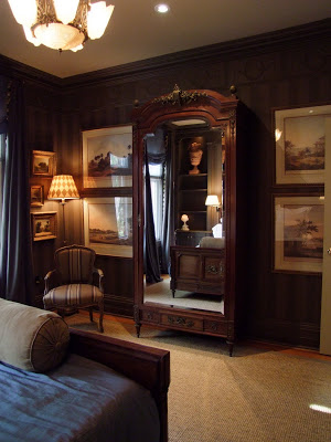
One of my favorite things about the house was the collection of artwork throughout and the manner in which it was displayed - it's masterfully done. You'll see in the photos to follow that every room and hallway has beautifully arranged groupings of artwork and objects in all shapes and sizes.
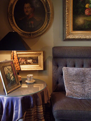
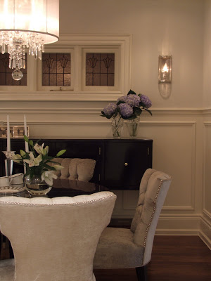
Living Room Vignette

Living Room
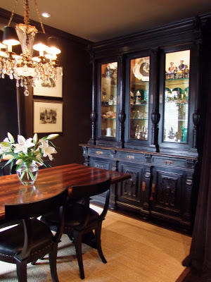
Dining Room
The dining room measures only about 12'w x 9' deep but its grand and impressive. The combination of the dark wall colour and the large mirror add depth and create a dramatic, inviting space. It was simply stunning.
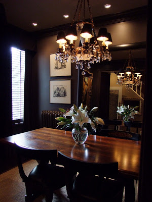

This is Kara in the hallway outside the dining room as she was pointing out the dining room's velvet parlour draperies that would have been an original detail in a house of this era.
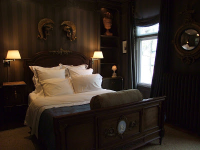
The master bedroom was striking and handsome with its dark walls, antique furniture and sisal carpet. The variety of light sources and use of mirror again make this room both sparkle and glow, creating an ambience that's so inviting and intimate.


The tone on tone stripe effect on the bedroom walls was actually so subtle that I didn't even notice it until looking at the photos afterwards.
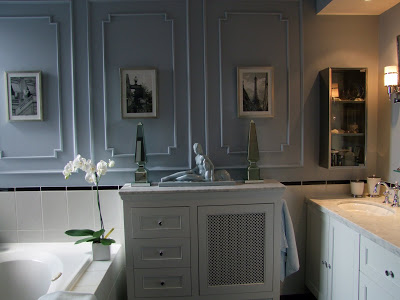
The main bath had some clever built-in storage around the radiator. There's nothing over the top in this room but there's a great sense of balance. You can see that the surface applied panel moulding, its repitition and the symmetrical display on top of the cabinet give this room a classical look. The gorgeous soft blue colour combined with all the white and polished chrome just takes your breath away when you walk in the room but yet the bathroom's tile and fittings are just very simple and timeless.


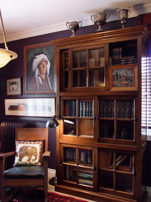
The Den
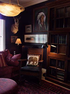
The second floor den was again, dark, inviting and intimate with a wonderful eclectic collection of pieces displayed on the walls and cabinets. Despite that most of the rooms in this house would be considered small spaces, the use of large scale furniture and dark colours make it feel luxurious and grand. The key to this,,,,,, is the great use of lighting.

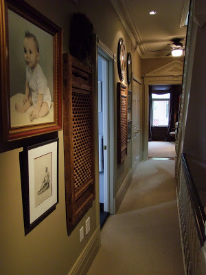
Second floor hallway

Main floor bathroom, again the use of simple white, pale blue/grey and silver metal gives you that refreshing sense of a nostalgic old world spa.
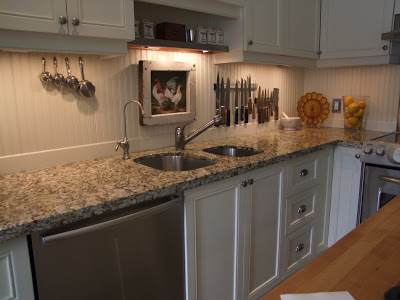
The kitchen was simple and classic with its beadboard backsplash and butcher block topped centre island.

Again a wonderful integration of storage with the rad cover. The use of metal apothocary style cabinetry and carts were used again here which I also saw in both bathrooms, this cabinet appeared to be vintage but the two small wall-hung ones in the bathrooms were newer.
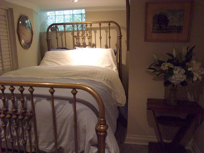
Basement bedroom.
This was an irregularly shaped small room but I love the fact that despite that, they went for maximum comfort by using a full size bed - its cozy and luxurious looking even though its placed in this tiny nook. The attention to the way the bed is dressed and accessorized would make any guest feel important and special.
I could notice from the reaction of those who were touring the house while I was there that the traditional style and detailing of this home was really resonating with all of them as they were were drawn into one room after another,,,,,,,,and not wanting to leave! I have no doubt this house is going to attract a lot of attention this weekend......
All photos: Carol Reed