NYC Reno: The Family Plan


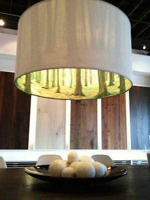
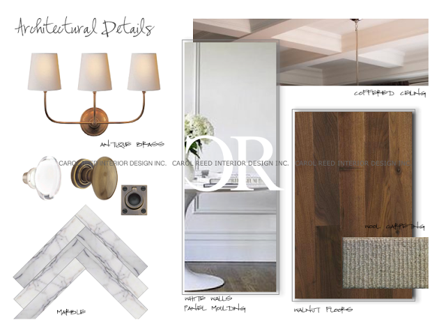
I started working on this renovation project in New York City last June, the scope of work was extensive as it involved converting 3 adjoining apartments into one single family residence. (Check out some of the before photos and my introduction of this project here.)  At the very onset of a project I usually formulate a vision for the bones of the space very quickly.  In this case, my clients who are parents to three young kids were in synch with this vision, represented in the collage above.   Timeless elements like natural wood and marble, fresh white walls with panel molding for classic character, fixtures with clean simple lines and vintage patina - would become the backdrop for this family's busy city life in the Upper East Side for the next 20 years or more.  It reflects their affection for tradition but will exude a young and modern edge, just like them!
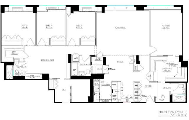
The 'Before' Plan


The existing three apartments had tiny enclosed kitchens and equally small bathrooms.  The biggest challenge in redesigning this space, aside from ALL the structural elements that couldnt' be moved, were the rules of the building.  It seemed the more layouts we came up with, the more the rules changed.  No problem.  I can design around anything - I was coming up with new layouts as fast as they were coming up with more rules.  : ) After weeks of marathon space planning the conclusion was -  NO kitchen or bathroom could extend beyond their existing footprint, NO plumbing drains or appliance locations could be moved, AND no additional bathrooms could be added.  Uh huh.  Did you look at the existing plan?  Soooo, Carol, good luck getting that dream kitchen into a closet, scrap the luxurious Master ensuite with double vanity, and forget about the convenient new powder room off the foyer.  : /  Discouraged yet?  My clients were.

I"m not gonna lie,,,the decisions from the Board were crushing to the homeowners.  As more and more restrictions were placed on them, they doubted whether this space could ever come close to suiting their needs no matter how extensively it was renovated.  Thoughts of scrapping the entire reno entered their minds,,,,,, until they found this plan in their inbox. 
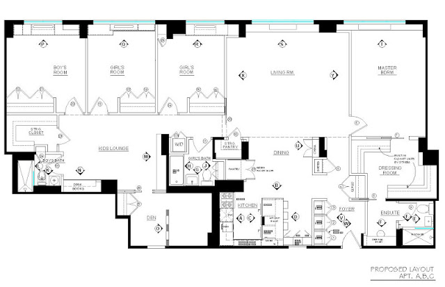


The Proposed Plan


At first glance this plan may not look super impressive, but this really was a triumphant success. We have a 'spacious' open concept kitchen!!! A decision was made early on that the kitchen in the middle Apt. B would be the new kitchen, and the main entry would be thru Apt. C, this allowed for a split bedroom plan.  All good, except the kitchen in Apt. B had a column in the middle of it and no where to put a fridge if we took down the walls.  (It was so space challenged the existing kitchen only had an 18"wide dishwasher.)  

Two key elements allowed this plan to happen,,,,,,,#1 we were permitted to move the washer/dryer out of the kitchen to a closet within the footprint of the main bathroom, and #2, even more crucial - under counter refrigeration!!! I've been using under counter refrigeration for about 10 years and it's been the 'hidden' key to many successful kitchen redesigns.  I was able to place 3 fridge drawers and 1 freezer drawer in the peninsula, equivelant to a standard fridge.  All plumbing and appliances remained within the footprint of the original kitchen = Board approved!  The compromise as you can see, the column is still there and it falls right in the middle of the peninsula - but that's one small compromise in exchange for this expanded family style kitchen.

When my clients received this plan the single sentence response I received by email was "you are my hero"!  An exaggeration, a wee bit ; ) yes, but I was thrilled they liked it.  They loved it.  For me it was so satisfying to know I was able to help turn this space into everything they had hoped it could be instead of it becoming their biggest disappointment.  That's the value of design.    


Custom Details & Elevations


This plan indicates where all the custom built-ins and custom details will be located and identifies all the new interior doors.  Well planned built-ins and well appointed doors will take advantage of every square inch and integrate awkwardly placed obstacles into useable space. 

What I love most about this new layout;  the open concept kitchen lets mom interact with the kids and benefits from the natural daylight, the dining table can extend into the living room when needed, the master gets a luxuriously large dressing room and the kids have a separate lounge area, in fact the entire kids 'wing' can be closed off from the main living areas whenever the parents chose.  To make the most of a tiny master ensuite I created a spacious vanity area outside of the bathroom which will be finished in the same materials as the bathroom so it all reads as one larger space.  There's a lot of great features packed into this 2200 sf home.  A 4+ bdrm, 3 bath plan - in manhattan,,pretty sweet.


Preliminary Furniture Plan


This is how this new family apartment will be used.  To help clients visualize if the proposed layout will meet their particular requirements I draw up a general furniture plan so they can see if that king size bed will fit or how many dinner guests they'll be able to seat.  The furniture is generic and except for sizes, the pieces are not specific unless the homeowners have existing items that must be used.  Otherise I create a generic layout like this which then becomes the basis for the electrical and lighting location plans.

Each of the kids rooms will have built-in desks with storage and the Den will do double duty as a home office and guest bedroom, we'll be creating some open niches and shelves into the dividing wall in the Den but unfortunately it can't be moved. 

 All of the Interior Design plans were completed last September and construction started on site about 4 weeks ago.  Currently I'm finalizing the paint and wallpaper specs (yes there will be some colour and pattern!) and dealing with the daily issues and changes that come up.  That's the nature of a renovation,,,,expect the design plans to go thru a round of changes after demolition is completed.


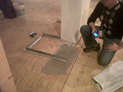
Like the change to this small hall closet that apparantly will be even smaller due to the unexpected size of the column. yikes.  That's the contractor, with a set of my drawings, explaining to the homeowner why this framing is not jiving with my plans...  


I'll take you thru the design plans for the kitchen and the individual bathrooms in future posts. 


All images, drawings and photos are the property of Carol Reed Interior Design Inc. and may not be reproduced.


IDS: 2012


Snob Stuff Exhibit Space

The annual Toronto Interior Design Show is on this weekend and I had a few hours to tour the show during Trade Day yesterday.   I have to confess I don't get too excited about trade shows in general, especially ones that are local for me and take place once year - its hard to exhibit new ideas, products and concepts every 12 months that consumers or designers haven't already been exposed to.  As a working designer I see these suppliers and products on a regular basis throughout the year.  What I do enjoy at trades shows are keynote addresses by Industry leaders from Canada and other parts of the world speaking on design and I love to see 'Concept' spaces designed by or in collaboration with Designers (I really wish there was more of that!).  I love to see the works of independent and emerging designers in the Studio North section of the show - this popular 'show within the show' never disappoints.  Overall, based on what I see when I tour IDS I know its only a small glimpse of the Canadian or Toronto design scene -  more apparant to me than who IS there, are all the fantastic products, designers and services (and trade only suppliers) that I know AREN'T represented at this show.  

While many of my favorites suppliers and products aren't exhibiting at IDS, some certainly were.   What I chose to capture photos of were products that I haven't seen before or products that were simply exhibited in a way that impressed me.  Here's a glimpse at what caught my eye-phone this year.


Always one of the most beautiful spaces at IDS with the most interesting pieces.  All their products are handcrafted in South Africa.  The brass ring pendant lights were a favorite of mine, a series of them floating over the table was captivating.  I'm always drawn to spaces that have a graphic quality to them, that contrast of black with white mixed with natural materials always resonates with me.  I think even the most simple objects looks sophisticated against black, as these primitive handmade pieces do set against a black accent wall and black dining table.  The impact of the oversize b&w image, the colours and the texture of the crafted pieces all created an artfully eclectic space.


In the Studio North area of the show, these rope pendant lights were getting a lot of attention. : )


I'm crazy for the natural character of wood and I loved this take on the stump table, especially the sides painted a dark black/brown.


This wall scultpure of reclaimed wood reminded me of an exhibit I saw at MOMA last year.  I loved the grey tones of the wood and the pattern and texture created by assembling the wood this way.  Simple material but so beautiful in this context.


The peacock chair.
  This is what resulted when Toronto design studio UUfie collaborated with Dupont Corian.  The intricate fanlike chairs designed by UUfie were made from a single sheet of corian, then cut and folded and bent thru a process called thermoforming.  The material does seem to have infinite possibilites, co-incidentally one of my favorites from IDS11 was a bookcase wall made from Corian.


The international host of honour, Italian Architect Piero Lissoni designed this gorgeous white on white lounge that was all the buzz.  Divided up into both social and intimate spaces with deep lounge sectionals and floor to ceiling bookshelving the vibe was modern, elegant and relaxed. The white on white scheme was a striking contrast to one of last years most raved about spaces, Ikea's black on black on black kitchen.


My favorite space of all was this concept space created by Mazen Studio for the "How Do You Live" special exhibit.  To me its the definition of "warm modern".  Its no wonder I was crazy about everything in this space, it features modern danish pieces, contemporary photography, a gallery wall, and many products from my own personal favorite sources like Hollace Cluny, Moncer Flooring and Zig Zag modern but even better were a couple of great 'new to me' sources.  And I thought I knew them all. ; )
 I'll leave you with more photos (sorry not such great quality photos!) of this space and simply say I absolutely loved every single thing about it. everything.


All Photos:  Carol Reed

Upload: Update 2012


A crucial part of my job involves documenting spaces or items on a daily basis, everything from constuction site progress to a great vintage find, I'm rarely without camera phone in hand.  I take hundreds of photos on my Iphone every week, some project related and some are just details or objects or settings that catch my eye.... or just make me happy - like a classic black & white graphic print...on a dress.  Collectively these photos are a snapshot of where I've been, what I'm working on and what's inspiring me.  Initially I started posting a selection of these daily images in an "Upload" post every month then..... it became every other month.  Then the backload of images became so enormous, it was too overwhelming to tackle.  So what better time than the start of a brand new year to get back on track and keep these posts going thru the entire 2012 calendar.


In early November I spent a week in Naples Florida with 5 girlfriends.  It was our first time to see my friends new vacation home there.  She had spent the past few months getting the house furnished and outfitted, while there I helped her decide on some placement of wall art.  I'm pleased to report that 2 months later these glass wall vases I installed are still hanging (it required power tools and gerry-rigging some plugs).  Girl power. : )  My favorite shopping spot in Naples was the Sally Ann - it was a thrifters paradise and set up as well as any furniture showroom would be.  The huge pedestal table in the pic above was from there.  I scooped up a bunch of silver serving pieces and carried them home on my lap.  I don't think the customs officer believed me when the only thing I had to declare was some used silver from the Sally Ann wrapped up in newspaper. : )   But my travel partner had a set of gorgeous blue & white bowls in her Sally Ann bag ($25!!) so we made an odd but convincing pair of shoppers.  Designers!


I loved these modern orange planters outside of the Tommy Bahama store in downtown Naples.


While in Naples I had a meeting with Toronto clients who also needed some help with their Florida home.  But first, this winter I'm working on on a huge gut-reno for their newly purchased summer home a couple hours north of Toronto.  Its a character bungalow that's lost all of its charm, their architect and I will be giving it a complete modern overhaul inside and out, adding on a new master suite and an art studio.  She's a painter and her Florida home is literally a gallery of her work as well as their own collection of other fantastic artists.  


I loved these wooden sculptures she had flanking her garden doors.  An important element of their home in north Toronto will be its modern simplicity so that it can showcase art and antiques.  This is going to be a project that truly resonates with my design philosophy in many ways.  Stay tuned for more details about this project - I've been immersed in the design plans for the past month and I'm excited and challenged at how much this one is pushing me to refine and edit and explore new ideas.


And no worries, I havn't forgotten about Li'l bro's reno.  It moved along at such a fast pace I couldn't keep up with it.  But yes, they are moved in and our entire family was thrilled to celebrate Christmas in their newly completed home (pic above).  Between my recent travels and my brothers travels and the holidays, I just havn't had any time to get over there for some 'after photos' (literally the paint was drying as we were on our way for Christmas dinner  - but I promise an update post is coming soon).


The 70's bungalow is officially complete except for the landscaping (summer 2012).  I'm assisting them with some artwork selections for a couple of key areas and then I'm planning to schedule a photo shoot for March - can't wait to share some afters with you!!!


I had the opportunity to tour the most incredible architect designed modern home in Toronto which was completely furnished with original mid-century modern furniture and art.  This place made my heart race, it truly did,  and I got a little snap happy with my DSLR.  Of course I'll give you a tour right here in the coming weeks.


A fabric swatch that I had carried around in my totebag for almost a year, was the perfect fit as roman shades in a new home office that was recently installed at a clients.  


And when I spotted this tourquoise Ralph Lauren crackle glaze lamp at HomeSense, I knew instantly where it was going... The office has both his and her desks, her's is a large table desk I had custom made to sit in front of the window, the base is painted in a peacock blue and the tourquoise lamp is, well, i think its just perfect for it!  Score.  The rest of the room was outfitted with custom built-ins.  I'm hoping to return soon and help with some office accessories and storage containers - there's lots of shelves to organize.


The glass french doors on the office were original to the cape cod style house but the crystal door knobs aren't working, I sent her to The Door Store to find replace knobs....can't wait to see what she found!


And in the family room/kitchen nook, I'm having some banquet cushions and pillows made for them that will be family friendly for crafts, school projects, game nights, and messy meals.


A kitchen reno in a rustic log cabin north of the city had me on a search for green barn light pendants.  And I lucked out in finding both vintage and new options.  The Door Store had quite a great selection, I absolutely love this historic green, and thinking I need to find a match for this in a paint colour!


For a non vintage option, Home Depot has this slightly darker green version (also available in white and bronze and black).  A steal - great for really tight budgets and tight timelines.   Ultimately the client found some vintage wire cage pendants instead, they do look great but don't bring the impact of colour to the kitchen these would have.


Probably one of my favorite coffee tables of all time, I have a similar style in my own living room, this vintage barcelona table was scooped up for a clients living room just in time for Christmas.  I was crazy for this the moment I saw it, actually several months ago and couldn't believe it was still available.  An authentive vintage piece in 'nearly perfect' condition is my choice over a knock-off any day. It arrived right after my clients new marble slab fireplace surround was installed and right before the Mitchell Gold Hunter sofa was delivered.  A pair of modern lounge chairs on order from Style Garage will complete the grouping.  I think this coffee table deserves some 'after' photos.


It really pained me to leave the store without these vintage cane beauties.  I'll dream about these ones for years to come.


Just days before Christmas I visited the Moncer wood flooring showroom in Jordan, Ontario (wine country!).  I was incredibly impressed by the quality and craftsmanship of the product and the company's philosophy and dedication to great design in every aspect of their business.  I love my wood natural and with loads of character - these products deliver!!  For wide planks and long boards, I've never seen anything as gorgeous as the Moncer line.


Every single detail in their gallery like showroom was thoughtfully and beautifully planned.  Located outside of the city next to a winery, the visit to the showroom truly makes the experience out of the ordinary, just like their wood.  I'm ecstatic to be using these stunning floors in my newest project!!!  I'm sure it won't be the last...


And lastly on my iphone, a project that's now taking up every spare minute of my personal time is our own hunt for a house - its been pretty discouraging thus far.  Nothing but lots of photos of country houses we're quickly crossing off the list, like this one above.  It had some great outbuildings but the house was so teeny tiny it was no bigger than a 1 bedroom condo in the city and ideally, I'm really looking for something that's not brick.  So the search continues.....but the good news is -  I already have the new floors picked out (see above) : )


All Photos:  Carol Reed