Looking Up - Our New Roof

Choosing New ROOF Shingles For Our Old House

Our house renovations have been progressing at a snail's pace, read, not progressing at all.  The time has come to make some changes on that front and get some new energy on this project!  On the bright side,,things are looking up, at least on the outside.  We were lucky to enjoy some warm autumn temps throughout November and we managed to get a new roof installed.  Selecting the actual roof shingles was something I angsted over for weeks and even though I was pretty discouraged by the options available to chose from, I'm completely thrilled with our final choice.

I've always considered a cedar shake roof the dream roof choice, its natural texture and patina are my idea of the quintessential roofing material especially for an East Coast character home.  Is there anything more classic and timeless?  I didn't however, consider a cedar shake roof as a viable option for our house for several reasons, but I did want to find something that evoked that same character.  After viewing what was available at the local building centres and spending weeks driving around looking up at roofs everywhere I went, I realized that finding a shingle I liked (other than cedar shake) wasn't going to be easy, or fun.

There are some amazing alternate and eco friendly shake alternatives that I found but they proved to be more than 3X the upfront cost of an architectural asphalt shingle.  Needless to say, with an entire interior reno still ahead of me, furniture, landscaping,,,,and a future barn conversion I wasn't compelled to splurge and bust the budget on this very first reno decision.  The roof is one of, if not the most important protective element of the home and a prominent aesthetic feature so its certainly not where I wanted to scimp either.  I was determined though not to pick something simply because I hated it the least but at one point it was looking that way....

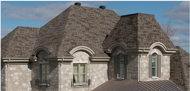
Have you shopped for roof shingles lately? Around these parts these are predominantly what you'll find in the architectural asphalt shingle category (above) and they just weren't appealing to me.  I'm not fond of the high contrasting multi-tones which look very 'patchwork' and unnatural to me and I really wasn't a fan of the heavy black line that was common on many - meant to simulate shadow lines and create the illusion of depth but I felt it just looked very faux even from a distance.

This is an example of the patchwork effect I felt many of the architectural shingles looked like. : /   Often you may not realize by looking at the display board how multi-coloured and contrasting the overall effect will be.  I drove around and looked at local installations of specific shingles so I could see the effect in person and it was always surprising how much different they looked from the sample and how much their appearance changed depending on the slope of the roof, time of day and colour of the house itself.

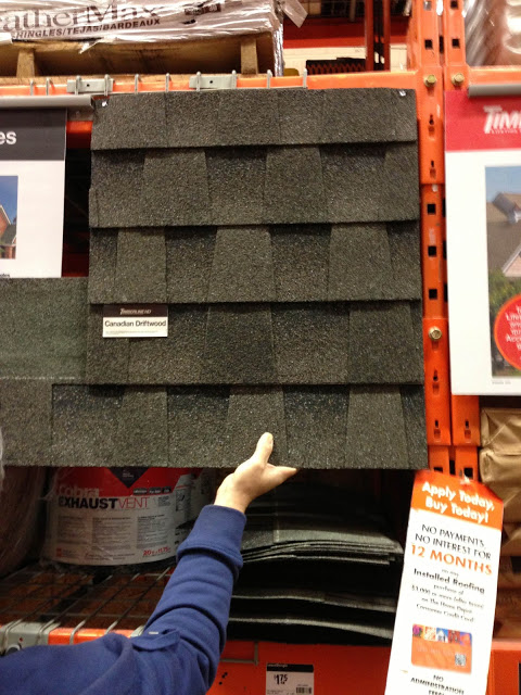
I was looking for a very warm medium dark grey with subtle tone variations, easier said than found. Until I came across this one (above) on line which looked like it ticked all the boxes so we headed to Halifax to check them out in person.  Of course the display sample looked quite different from the current stock on the shelves (common) so we bought several sheets and brought them home...something I highly recommend doing.

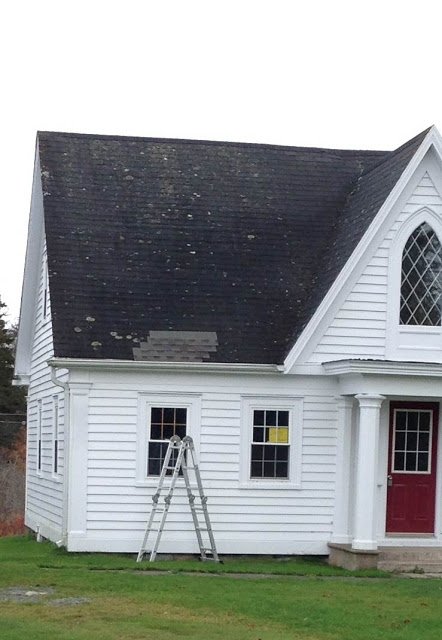
We tried them out on the back of the house, and looked at them at different times of the day....

And we tried them out on the front of the house.  Decison made.  Timberline's HD Canadian Driftwood was our pick.

Early on in the installation, our first glimpse of what a larger area of these shingles would look like....

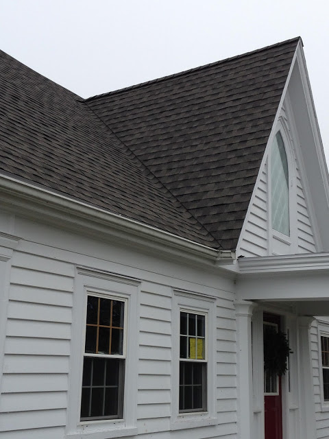
The front of the house now complete and we were really happy with the texture and colour.  It doesn't look "patchworky", the subtle tones of grey look more as if they are naturally weathered as opposed to multi-coloured or simulated.

As the sun was setting you can see how the sunlight effects the colour and shadows at various times of the day.....

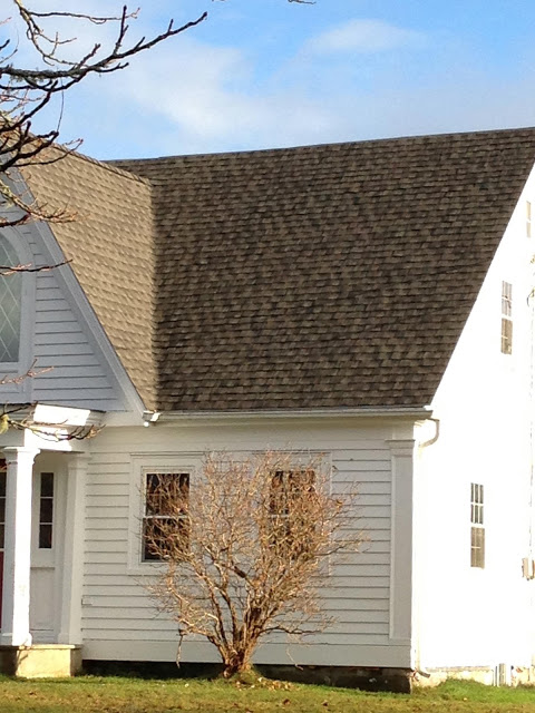
You can really see the textural effect the architectural shingles add to the roof.  Its certainly not a substitute for cedar shake but I think the tones and dimension of these have that natural look to them that I was seeking.

And dusted with an early morning frost,,,if you squint your eyes,,they almost,

almost

might be mistaken for cedar shake.  ; )  Good choice.

But the best part of all is,  NOW we can move forward with the rest of the house renos!!!

All Photos by:  Carol Reed

Special Delivery: MMD

Illustration by Michelle Morelan

In this electronic era of emails is there anything more exciting than opening up your "real life" mail box to find a package inside with beautifully handscripted writing on it,,,,,,the type of writing that can only belong to an artist or craftsperson - the sight of that alone makes your heart race thinking about what could possibly be inside!

I immediately recognized the writing of my friend, the uber taltented Vancouver based designer/illustrator/artist on the custom monogrammed envelope.

Michelle Morelan

.  (You may also know her from her popular blog A Schematic Life).  I felt like a kid at Christmas as I opened up this surprise package.  Before I tell you more about the contents, I have to share the opening up of the package with you because it was a treat in itself.  The packaging was a perfect example of someone who lives by the credo of good design, in all the details.  The stationary was worthy of its own moment of appreciation.

Inside the postage envelope was a handwritten letter on a beautiful piece of folded custom letterhead, the back of the paper was a patterned monogram logo print, unfolded, the inside was an off-white linen texture with embossed monogram logo on the top.  Exquisite.  In addition to that was an envelope in the same off-white linen paper.  As if the exterior of the linen envelope with embossed logo and modern grey font wasn't beautiful enough, opening it up revealed the inside of the envelope was lined in the patterned monogram print too.  A really lovely detail!

This monogram print was on the back of the letter head and inside of the envelope.

Inside this envelope was a card, on heavy grey stock.  Partially folded over one blank side for personal messages, and exposing a large tone on tone logo print on the other.

After I finished swooning over Michelle's gorgeous stationary, and being moved by her hand written words,,,,i choked up completely when I unwrapped this very special gift from Michelle, a little something for my new home on the East Coast.

My new old house, illustration by Michelle Morelan.

Its an illustration of my new old house on the East Coast, drawn by Michelle of course, and mounted in a vintage frame that she found at a local flea market - I'm crazy about the frame! She remembered me telling her one time I had some artwork in antique gold frames.  The fact that she's a special friend and one of the most talented architectural illustrators of our time,,,,makes me feel so lucky - its now one of my most favorite things and I'll cherish it always.  It'll have a special place in my home somewhere near my desk to remind me of this talented woman I admire and inspire me to sketch more.  : )

Thank you Michelle with all my heart.  From the east coast to the west coast - xoxo.

Also, kudos to the talented team at the multi-disciplinary design firm

Meade Design Group

who designed Michelle's cards/stationary (and website design).  Beautifully done.

All Photos by:  Carol Reed

Lucy


Lucy.


Changes have a way of happening in multiples.  There have been a lot of changes around here lately.  One of them is Lucy.  This is Lucy (photo above).  Out of the blue this little black and white fuzz ball showed up on my back porch 3 months ago, desperately crying from hunger,,,,all skin and bones, she wrapped herself around my ankles and my heart in an instant.  Her timing couldn't have been worse, or, more perfect if you're a cat looking for a beachside home.  We were in the middle of packing up a house in Toronto and moving it all to the East Coast.  She was homeless and decided she wanted to come with us, she literally forced her way into our home and made it clear she wasn't leaving.  She could care less we already had a cat.  She wanted what he had and nothing was going to stop her.  Apparantly word on the street was that we were headed to a house on 5 acres complete with an old barn and she wanted to hitch a ride.  Her plan worked.  After taking her to the vet and nursing her thru her shots and being spayed,,,I was completely and hopelessly attached and couldn't possibly part with her or give her up to anyone, so of course she came with us to Nova Scotia.   Our 11.5 year old tabby wasn't so thrilled.  We weren't so thrilled about the prospect of a two day long road trip with them, which was pretty much a nightmare but we made it.


Elliot

The two cats are polar opposites as far as personality goes and its been fun to watch them slowly become friends.  It was stressful and chaotic keeping them separated from each other for the many weeks that we had to but as I told myself it was better than her living on the streets.  It took a long time to name her and for months she was simply called Kitty. So impersonal.  Her personality is so dominant I just couldn't think of a name that suited her character.  She's what I call a cartoon cat...the epitome of every stereo typical cat characiture.  She's a bully and a sucky baby at the same time.  She's a girl but she's about as graceful as a bulldog (no offense to bulldogs!).   She's kinda gawky looking and with her broad stance and her pipe cleaner stick legs she's quite hilarious to watch when she runs.  She's only 10 months but she's a survivor,  every time we let her outside she quickly returns with a "present" she's caught.  She knows how to fend for herself, she's fearless.   We now call her Lucy as named by a brother who was staying with us over thanksgiving.  She seems to suit it.  She bullies and torments our 11.5 year old Elliot just like Lucy did to Charlie Brown.  


This is where kitty was living until I took her in.   She was living in these bushes 24/7 all by herself, never leaving our yard.


I've come to see how beautiful she is and even though she was completely unexpected and totally a surprise in our lives, it seems like she fits into our new house here like she was made for it.  I have so many black and white accessories in the house, she really looks like just another one.   The diamond shaped black and white markings on her face and chest mimic the gothic window on the front of our black and white house.  She matches.  So yah, we think she's kinda special like she was meant to be here and now we can't imagine life without her.  Everything happens for a reason.


For a street cat Lucy's adapted to life indoors pretty quickly.  She's a cling on.  This is her regular position.  She wants to be on our laps every moment of the day.  Its become a bit of a problem especially when trying to work.  She'll stay on your lap for hours or until you pick her up and move her.


From sleeping in the bushes to sleeping in our bed - she's lapping up the luxury.  If ever she isn't on one of our  laps, she's on our bed.  She looks almost regal in this shot, which is funny because she really isn't at all.   Her nose was badly bruised and scraped up from her days on the 'street'  but its healed nicely now and she's put on some pounds.


Although I am insanely head over heels crazy about my older cat and this new little one (they are my *babies*)  I vowed when I started this design blog I would  keep my crazy cat pictures to a minimum.  But I do feel that pets are one of the most important elements that make a house a home.  This little one is the newest addition to our home and as you'll see in an upcoming post she's the reason behind many design decisions and changes we'll be implementing into the reno plans.  


All Photos by:   Carol Reed