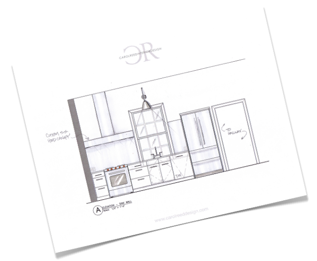


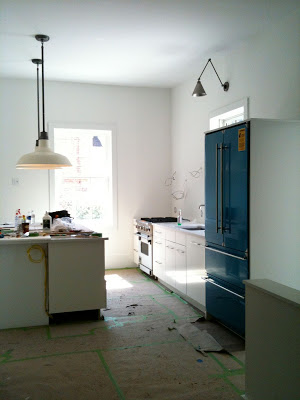
Kitchen in progress.
On a personal note its been a crazy month and a half for me as my life has been split between two provinces - me in Toronto, BF in Nova Scotia, packing up one house and office in Toronto and moving into (while renovating!) another in Nova Scotia. Between travelling back and forth, sharing one computer and not having any service on my web phone for the past 6 weeks meant that my blogging and tweeting was seriously neglected. So now that we're finally both in one place (Nova Scotia) and we have most of our technical challenges sorted out,,,I'm just gonna jump right back in where I left off!
My last visit to the cottage bungalow project was a chance to oversee some of the finishing details and address any last minute oversights or changes that needed to be done prior to move in. It definitely doesn't look like it from the photos below but the homeowners were scheduled to move in just a couple of weeks after this visit.

Kitchen in progress.
I love how the kitchen is flooded with sunlight, the extra high ceilings and the sculptural effect of the articlating light over the sink. The fridge is still covered in protective plastic, the floors are still covered up and the back wall of the kitchen is awaiting its custom stainless steel hood and stainless back splash.
Kitchen in progress.
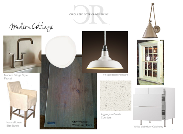
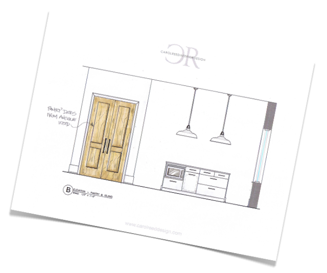
The custom side panels for the island were being installed later this same day, so far I was extremely happy with the proportions of the island. We're contemplating raising the pendants one rod length - with threaded rods we can't get them exactly the height we want so we work with the rod lengths provided, here they're shown installed at their longest. After the range hood is installed we'll make the final call. You can view some concept sketches and the finish boards and the rest of the kitchen design in this previous post.
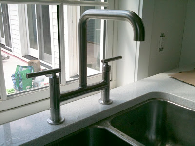
Kitchen sink and faucet.
This time I lost the battle of the kitchen sink. Despite my preference and recommendation for a large single bowl sink in this layout, the homeowner wanted a sink and a half and there was no changing her mind. Plan B was a custom designed sink and a half with small radius corners and deep bottoms, but this eventually was vetoed for an in-stock, ready made version, shown above. In this close-up photo its deceiving but there is a wide 5"+ trough behind the counter to accommodate the low window. The counter continues wrapping down the back of the kitchen sink and across to the wall/window. Despite the off centre sink divider, I opted to install the faucet on centre with the overall width of the sink which would keep it on centre with both the window and the sink cabinet.
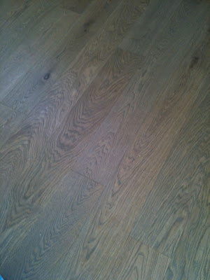
Flooring throughout.
The floors throughout the entire house except for the washrooms are a beautiful wide plank, european white oak in a subtle grey wash with an oiled finish. This was the first time I had actually seen any part of the floor uncovered since their installation and the only room I was able to admire them in was the master bedroom. I couldn't resist taking off my shoes to get the full experience, they feel like butter under your feet!

A black dome pendant makes a modern statement in the dining room.
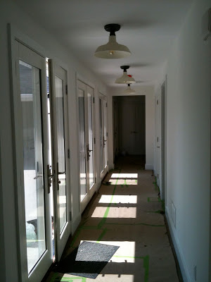
Hallway to Bedrooms.
The main hall that links the front living spaces to the bedrooms and bathrooms. The long series of glass doors lead out to a large patio and flood the hall with light. The white on white scheme continues here with a series of white semi-flush barn lights along the ceiling. I love the pattern the sunlight creates on the floor.

Guest Bathroom in progress.
One of two guest bathrooms. On this day the vanity had just been installed so you can still see a temporary support on the underside of it. The bathroom is a good example of the pure simplicity the homeowners desired, the room is completely tiled (but one wall) in matte white 12" square tiles. The shower drain is a recessed trough so the floor is continuous. A piece of original artwork to the left of the mirror will be the showpiece of the room, and a selection of a few well chosen accessories will give it the finishing touch. Well that, and a pair of wall lights! Although the end result looks simple, I can tell you this was one of the most time consuming bathrooms I've ever detailed,,,,the alignment of everything was painstaking.
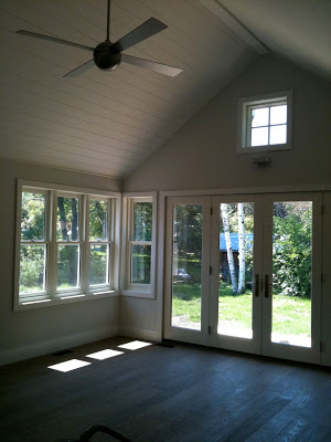
Master Bedroom.
The master bedroom has beautiful views to what will be the back garden. You get a glimpse of the gorgeous grey washed oak floors and the effect of the oiled finish, its beautiful here with pale silver walls and crisp white trim. One of my all time favorites, the Ball fan, (its one of 3 in the house) will help balance the air flow of the vaulted ceiling.

Master Ensuite in progress.
The master ensuite is a continuation of white on white simplicity. A floating quartz stone vanity counter spans the room from one end to the other, the same matte white 12" tile is used on floors and shower walls as was used in the guest bath. The wall space above the tub is reserved for a colourful, large scale canvas painting by the homeowner.

Master Ensuite Vanity in progress.
This is the top half of a white lacquered storage cabinet being installed over the countertop, it will have a divider down the centre and a pair of tall doors, each one opening to either sink for his and hers. A lower section of cabinetry with 2 deep drawers will be installed directly below this.

The view of the master bedroom as you exit the ensuite.
As I mentioned in previous posts about this project, the homeowners have an extensive collection of antiques and artwork (she's an artist) so the intent of this white on white, clean lined interior was to provide a canvas for their pieces. I am thrilled with the progress thus far and how all the design details and decisions have turned out. I can't wait to see the fireplaces completed and their furnishings moved into this new space, we will be filling in with some new purchases too. If I don't get a chance to visit again before Christmas, my next photo update will have to wait until spring as these homeowners will be heading to Florida for the winter.
All Photos by: Carol Reed