An Artful Lunch


I was in NYC last week to attend site meetings at my Upper East Side renovation project and to meet up with my good friend Michelle Morelan from A Schematic Life who was visiting from Vancouver.  Michelle and I spent several days together enjoying shopping, dining, theatre, and attending some design events but the highlight of my week was our day trip to Westchester to visit our friend, the incredibly talented artist/illustrator Patricia of PVE Design.

The entire day was a 'pinch me' day of the best kind!  It started off at Grand Central Station (Oh my, I could spend a day in there easily) where we picked up a bottle of chilled proseco and a bundle of bright orange roses before boarding a train for a scenic 35 minute trip along the Hudson river.


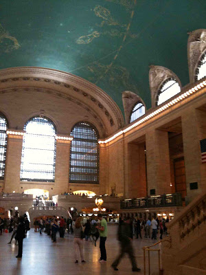
The main concourse at Grand Central Station.  Next time, I'm bringing my good camera and spending a lot more time here.  So much to take in...the architecture, the shops, restaurants....I spotted an oyster bar restaurant with Saarinen style tulip tables and chairs. : )


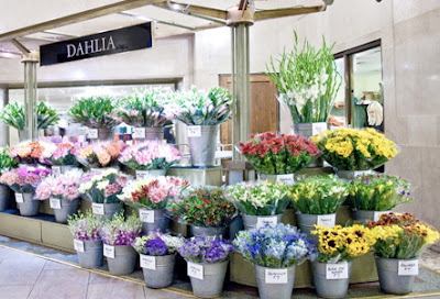
Dahlia's flowers in Grand Central is fantastic, a huge selection of fresh seasonal blooms and the best prices I've seen anywhere.  All bouquets from $5 to $15.  Irresistible.


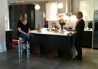
Michelle and Patricia in Patricia's gorgeous, 'almost complete' new kitchen.  New stools are in the works and a seating area will occupy the spot where I'm taking this photo from.  I LOVED the floor tiles from Walker Zanger which looked like polished concrete and how she's layered them with antique rugs.


Not only did Patricia pick us up at the train station and give us a driving tour of her charming Village full of character homes (seriously I was expecting to see Martha Stewart at any moment!) but she had the most amazing lunch planned for us.  It was all organized ahead so when we arrived we could make lunch together, it was sooo much fun putting together these dishes - honestly this was the most beautiful and delicious dish I have ever eaten.  Its going to be my new go to favorite.


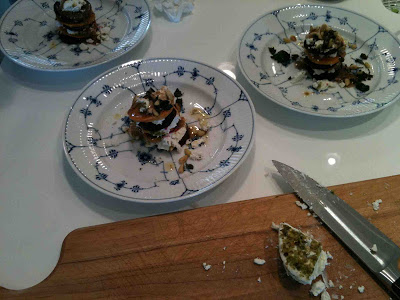
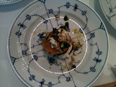
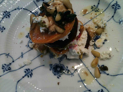
The recipe from my memory; roasted sliced beets, roasted sliced sweet potato, layered napoleon style with goats cheese in between.  Topped with sauteed beet greens, pine nuts in olive oil and a sprinkling of freshly grated nutmeg.  TO DIE FOR.  Plated on vintage blue & white dishes from Copenhagen and set with her wedding silver cutlery.  I promise to get the actual recipe from PVE and post it below.

   After lunch Patricia took us on a tour of the historic Sunnyside estate, home of Washington Irving, located on the Hudson river and just a few minutes from her home.  I purchased a compilation of some of his stories and look forwarding to reading them now especially after being in the room he actually wrote them from.  I wished I had taken photos inside the house, it had a wonderfully simple, timeless kitchen and I was crazy for the various pantries.  An entire walk-in just for cookware and serving ware, another one just for china and crystal.  Sigh.


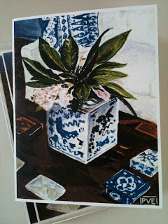
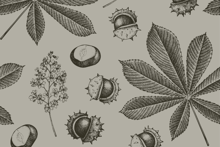
 "Absolutely Beautiful Things" by Patricia van Essche.


As if she hand't spoiled us enough already, Patricia gave each of us each a box of note cards made from her original artwork.  I love love love these, I'm always so drawn to blue & white so everything about this image grabs me.  This particular painting is called "Absolutely Beautiful Things" and was inspired by the blog of that same title written by Anna Spiro.  What I love most about these cards, is giving them - and telling the recipient all about the card's artist and my friend PVE.  (BTW, If you'd like some of these cards they're available on Etsy or by contacting PVE directly.)

Thank you Patricia for chauffeuring us, for lunch, for the Sunnyside Tour, and especially for the tour of your own beautiful home including your spectacular new studio space (polished concrete floors!!), its absolutely stunning.  It was a thrill for two Interior Designers to hear you describe how your newly designed spaces have had such a transformative impact on your life, to us, that's the true value of great design we wish everyone could experience.  You are a gracious host and a beautiful person in every context of the word.  This visit left me feeling uplifted and inspired in many ways just when I was feeling a need for a boost. 


Style at Home: Modern Rustic

May'12 - Balcony Package - Reed.jpg

Style at Home Magazine | Photography:  Donna Griffith, Styling: Margot Austin

I've anticipated the arrival of the May 2012 issue of Style at Home for the better part of one year.  This issue features one of my favorite projects, a rooftop deck in mid-town Toronto, that I worked on in the summer/fall of 2010.  You can read about the design plans here . The deck, along with the interior of the home was photographed by Style at Home magazine last June and the homeowner and I have been waiting all these months to see the results of that 2 day long photo shoot.  So I am beyond excited to see this space published and to share with you the brilliant work of photographer Donna Griffith and stylist Margot Austin (who showed up before the light of dawn to capture these images!!) - thank you both!

Carol Reed Design - Modern Rustick Rooftop Deck 2.jpg

Style at Home Magazine | Photography:  Donna Griffith, Styling: Margot Austin

Carol Reed Design - Modern Rustic Rooftop Deck 2.png

Style at Home Magazine | Photography:  Donna Griffith, Styling: Margot Austin

UPDATE: Click here to view a copy of the full feature.

For a peak at some of the prep work that went into the shoot check out this post I wrote last summer a few days after the shoot.

Here's a few more photos taken a couple of weeks before the magazine shoot as I was loading in the accessories and the installer was hanging mirrors and lanterns.

CarolReedDesign-ModernRustic-Rooftop-Deck-Table.JPG
CarolReedDesign-ModernRustic-Rooftop-Deck-1.JPG
CarolReedDesign-ModernRustic-Rooftop-Deck-2.JPG
CarolReedDesign-ModernRustic-Rooftop-Deck-3.JPG
CarolReedDesign-ModernRustic-Rooftop-Deck-4.JPG

Not seen in the photos above is a servery that's located inside and overlooks the deck space (you can see the windows of the servery above), this photo was taken back in the fall of 2010, from outside looking into the servery where Kara (the homeowner) was prepping some flowers. The servery is outfitted with a stainless steel counter with integrated sink, wine fridge and dishware storage. 

NYC Reno: Progress & Boy's Bath


The past couple of months construction on the NYC family reno project has been moving along at a rapid pace.  I've painstakingly overseen the precise placement of plumbing and electrical rough-ins, in some cases we were scrutinizing 1/4 inches.   More recently, over the past two weeks I've overseen the stone tiles being sorted thru, picked-out and installed.  The paint samples are about to go up,,,,kitchen cabinetry is being installed and very quickly, very suddenly it all seems like the entire home is coming together all at once.  Its visible, tangible progress for the clients when all the 'beauty' starts appearing, a major turning point in this long process.

There are 3 bathrooms in this "3 apartments into 1" conversion, however, the tiny footprint of each of the original bathrooms had to remain as is.  These compact size bathrooms consumed an unimaginable amount of time in planning out the details to the precise inch.  On top of that, sourcing vanity/console options that are no larger than 18" and trying to maximize storage when recessing niches or cabinets into the wall space was limited - it was a challenge!

The most challenging of them all for me was the Boy's bathroom.  It's original layout had a tub/shower unit which we would replace with a walkin shower.  What you can't really see clearly in these concept sketches is that the room has quite a few jogs, including a dropped bulkhead in the shower not depicted in here at all.  The clients desire was to do this bathroom in all ceramics or porcelain tile. Not usually my preference especially when the cost of the ceramics or porcelains can be equal to the cost of a marble.  I recommended we do a marble mosaic floor tile paired with a simple ceramic on the walls.  Just that bit of marble would add a luxe edge along with texture and pattern.  I'm not a fan of decorative tile borders and inlays or using a multitude of various tiles in a bathroom for the sake of adding some 'wow'.....an approach I find just too decorative and trendy.  I think the tile should provide the basic bones to the space, evoke the vibe you are going for and add a sense of long lasting quality.  If using a ceramic, I go for timeless white or colour block an entire wall in an accent colour. If you use a natural stone, the statement is simply in the stone itself, no enhancing needed, leave the decorating to the towels, accessories and artwork.  A common exception I make is the use of a contrasting band or pencil liner.


The sketches shown in this post were really really preliminary and done at the concept stage waaay back in August of 2011.  (For this post I've stripped them of dimensions and notes.)  The intent of these was to illustrate to the client how we could use a basic and classic ceramic tile shape but still add some detail.  We considered doing a combination of a dark blue vintage style (handformed, crackle finish) 2" x 8" floor to ceiling wall tile behind the sink and toilet, then tiling the shower walls in white field tile with frame borders in the same blue tile.  Even though they had told me they didn't want 'subway' tiles, they really loved this. (variation of this above and below)


There is a jog in the wall where the shower glass screen is so this provides a natural transition spot to change to a different wall tile inside the shower. A small carrara marble mosaic floor tile is continued thru to the shower floor, the shower sill would be carrara slab, on the wall not visible is a recessed soap niche also made of carrara slab and outside the shower is a full height small storage closet. Completing the space is contemporary plumbing fixtures and vintage style lighting.


One of the most common apprehensions clients have is floor to ceiling wall tile.  I personally don't understand the resistance, especially in a bathroom -  and true to that these homeowners were uncertain about taking the tile all the way to ceiling behind the sink so the final decision was half height.  


Months later when all the final specs and detailed design drawing were completed I can tell you the final design is not like ANY of these concepts!!!  ; )  You'll have to visit again to see sneak peaks of the installation.  You'll see we ended up with a modified version of this last sketch above, except we're going with a different type of sink all together and we're using Select White Thassos marble on the walls. ( The sink and toilet will also be in the reverse location.)


This young boy's bathroom will exude the fresh classic crispness of navy and white. Whatever walls are not clad in white tile, will be coated in a deep navy paint. All the polished chrome will sparkle against it and the white will look extra fresh.  What I love most about this foundation is that navy is such a 'neutral' you can chose from a myriad of accent colours for your accessories be it yellow, purple, green or red.


Check out the full back story and before photo  here.
See the before and after floor plans 
and my concept for the architectural details here.


All Drawings by:  Carol Reed Design