bathroom design

E-Design Bathroom: From Concept to Sneak Peek

CarolReedDesign-LM-Ensuite-EDesignConcept.jpg

E-Design Bathroom Concept

Lindsay contacted me through my e-design website

rearding their 3rd floor master suite, located in a century home in the beaches neighbourhood of Toronto, it was a large full floor bedroom with sitting area.  Her goal was to turn the sitting area into a new master ensuite.  The wish list included; double vanity, freestanding tub, walk-in glass enclosed shower, a separate water closet and….create space for a walk-in closet in the planning of the new ensuite.

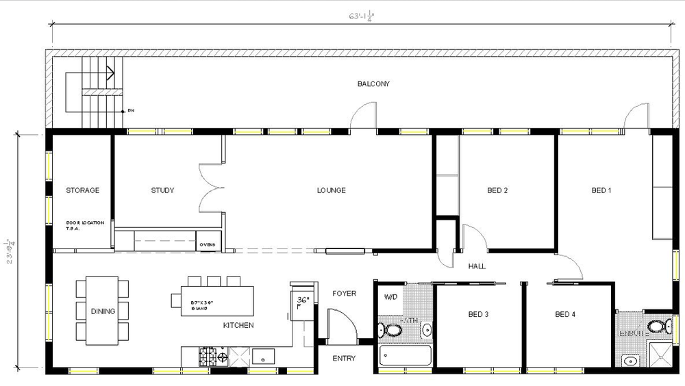
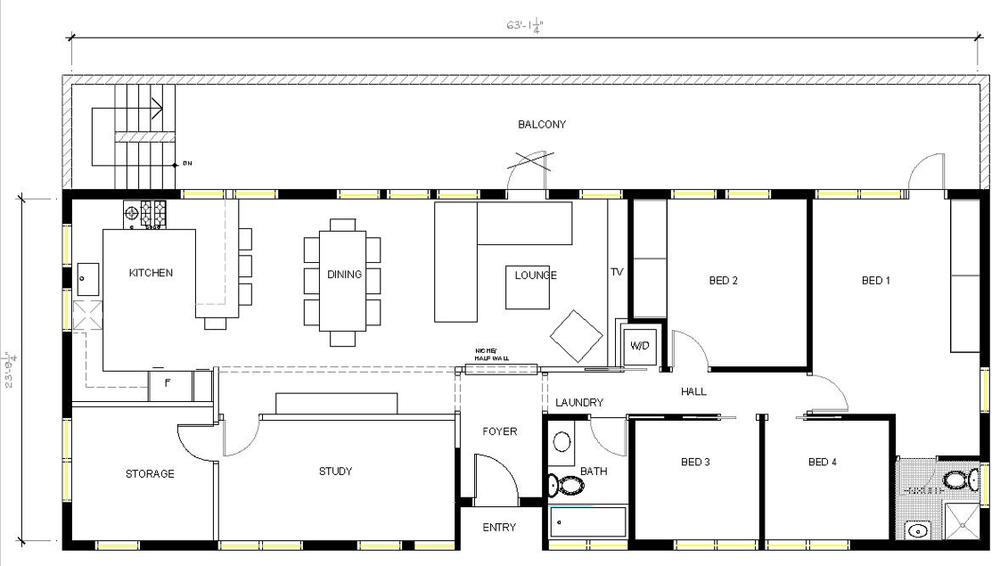
Before Plan - Master Suite

The before plan was a wide open space divided by a staircase and there was a low sloping dormer ceiling in the soon to be new ensuite area.   The staircase had a half wall on one side and a frameless glass guard railing on the other.  Spaces with sloped ceilings are always a challenge for most people to visualize because the plan view is deceiving, there appears to be lots of floor space but in reality the useable floor space is much less. Wherever the sloped ceiling dips below 5or 6', its not considered *useable* floor space because there isn't standing room, its not completely useless space but its not useable for anything that requires standing up, like showering or using a sink or using a toilet.  In a bathroom with sloped ceilings the layout and placement of fixtures is largely dictated by these slopes - the plumbing fixtures all need to be located where there is full ceiling height or at least standing height clearance.  

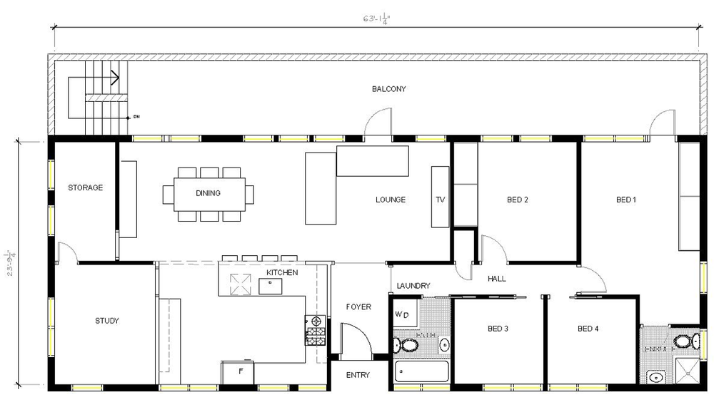
The initial space plans quickly determined it wasn't feasible to fit everything in this space that Lindsay had hoped.  The top of the staircase landing is only 24" wide so accessing the ensuite from the landing side of the staircase was out of the question - this meant the only access for both the walk-in closet

and

ensuite would have to be on the far side of the stairs.  I 

could 

get everything including a walk-in closet in the floor plan but ultimately Lindsay decided she didn't want to walk-thru the closet to get to the bathroom.  So we'd need to give up either the walk-in closet or separate water closet....  

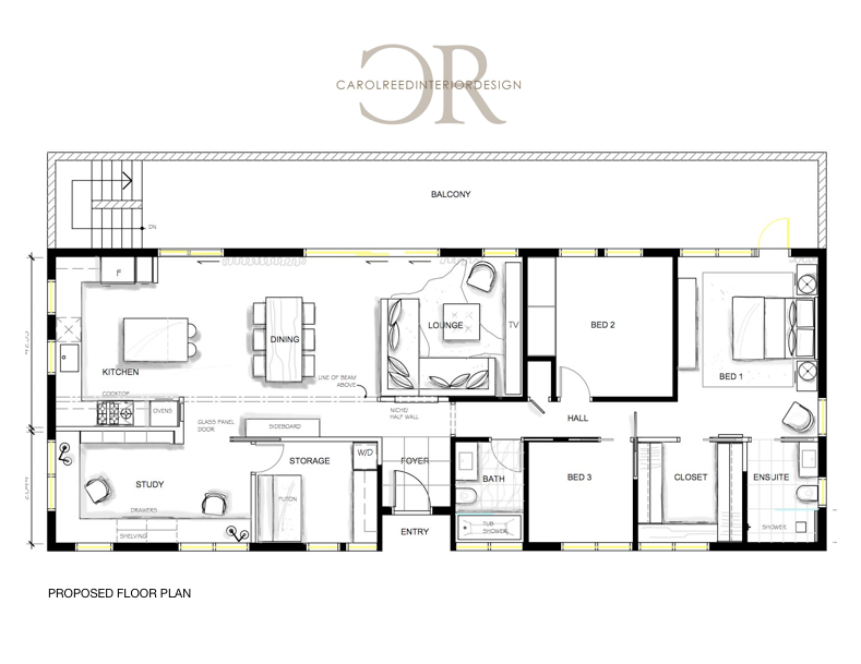
Layout option A reflects this compromise and came really close to ticking all the boxes.  The bathroom was spacious with the luxury of a separate tub centred in a dormer window and... a water closet.  While there is no walk-in closet the proposed wardrobes offered more space than the existing closets, but would require losing the long glass railing in order to fit a wardrobe wall.  I envisioned the wardrobes creating a beautiful wood veneer "wall"  backing onto the stairwell, stopping short of the ceiling to let light flow thru and also keeping the glass guard on the one end again to let light into the stairwell, possibly with mirror doors on the wardrobes too.  The glass guard rail though was not something Lindsay wanted to give up.  I would chose closet space or at least a half wall with drawer storage versus keeping a glass guard rail because storage is so very important and keeps your space/life organized.  However, I do understand how important it was for them to keep the glass, we moved on to explore more options and ended up at this final plan….

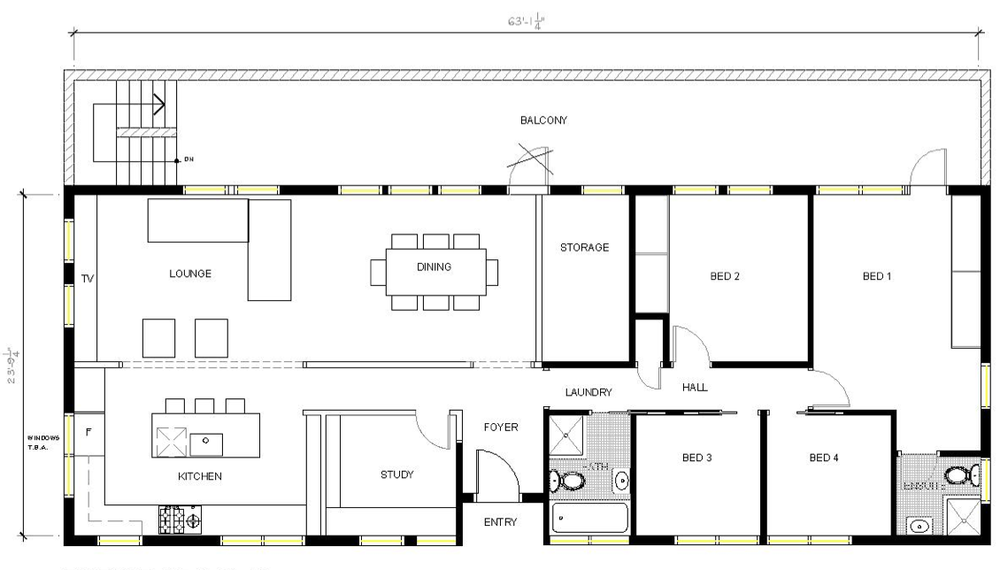
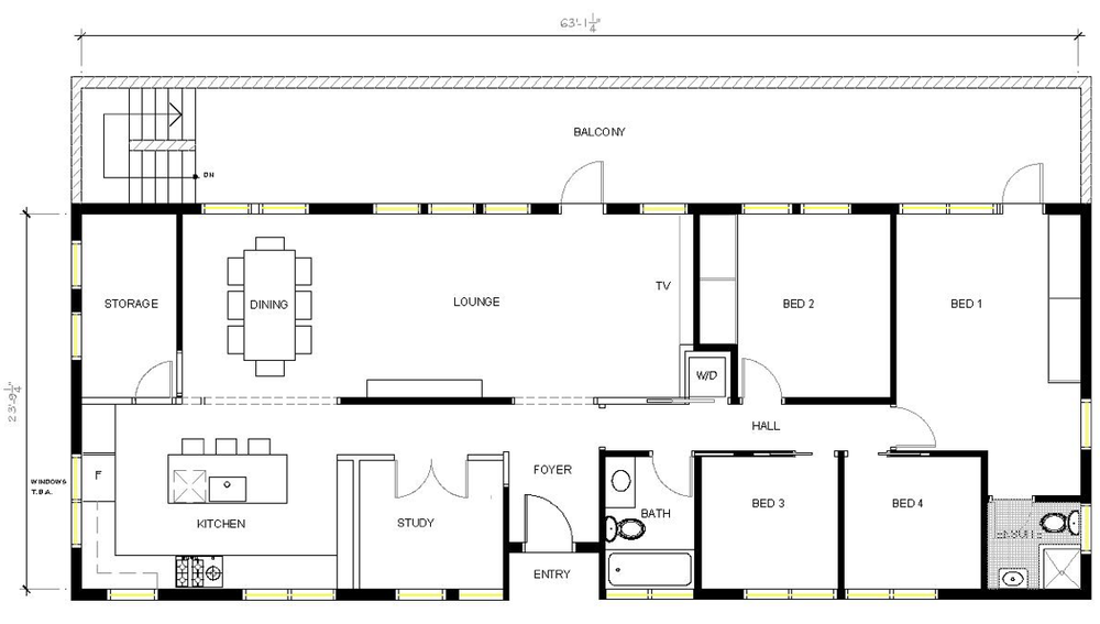
The ensuite was made a bit smaller to accommodate the closet location and thus the final plan doesn't have a water closet or walk-in closets but they were compromises Lindsay and her husband were happy with.  The closet space was great (deeper than the old closets) and the new ensuite was still spacious and bright with a large window, a new skylite,  interesting sloping ceiling and some built-in shelving. 

CarolReedDesign-LM-Ensuite-EDesignConcept.jpg

The concept board illustrates the fixture and finishes I recommended based on Lindsay's style survey and her desire for modern elements, white marble and rustic warm wood, in addition to these choices I also provided alternate options for each selection.  The vanity would be custom made and the inspiration photo is an example of the style and wood finish (character grade walnut planks). Here's an excerpt from her design summary of how I described the concept:

"

overall I took a contemporary approach using classic details and materials to create a timeless mix of modern and organic elements.

The high contrast of the ‘black’ metal finish with white also gives it an attractive graphic punch that feels modern and vintage at the same time."

"There is a great mix of materials; natural wood, natural stone, glass, and ceramic, as well an interesting mix of textures (both shiny and matte) and metals, paired with various levels of lighting all very thoughtfully applied to give the space great interest and depth. "

The tile options I provided worked with both her style preference and budget.  An elongated white subway tile on the walls, a white marble mosaic on the shower floor and a large format marble tile on the main floor as described in the written summary:

"...the large square in particular can give the effect of slabs especially if tight joints are maintained." 

As an alternate to the marble floor tile I also proposed a narrow rectangular black slate as I described in a written summary:

"This can be a very modern look paired with lots of white on the walls and natural wood, however, I do find that although its modern the dark on the floor is ‘heavy’ looking and a tad more rustic looking. 

To make it a little more elegant in feel, I’m suggesting a plank shape which you can lay in a herringbone pattern."

The concept for the cabinetry and built-ins, I proposed either a rustic walnut veneer that included the character of the knots, or a knotty european white oak. 

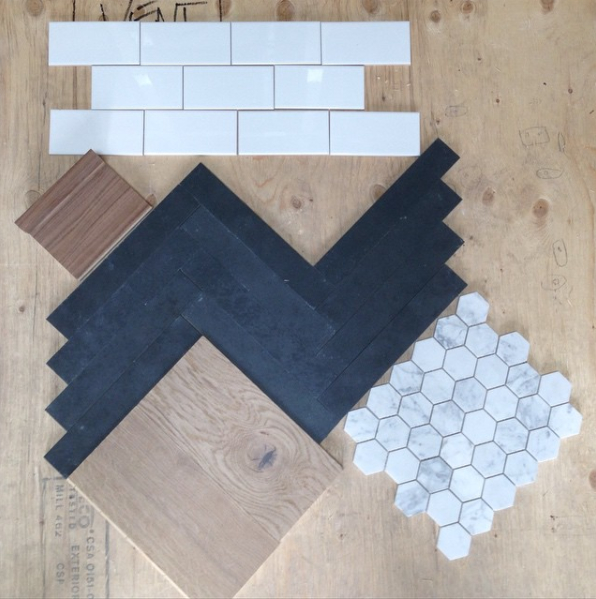
Here's the actual finishes that were chosen pictured here in an instagram photo, Lindsay ended up doing the europoean white oak for the flooring throughout the bedroom.  I believe the hexagon was intended for the shower floor (as per the design plans) but I think in the end it was either omitted or used only in the soap niche.  Can you tell how detail oriented and organized Lindsay is! I love that she has her materials mocked up so you can really see how the proportion of the tile sizes and patterns work with each other and how each material offers a different texture.

CarolReedDesign-LM-Ensuite-EDesign-Elevation A1.jpg

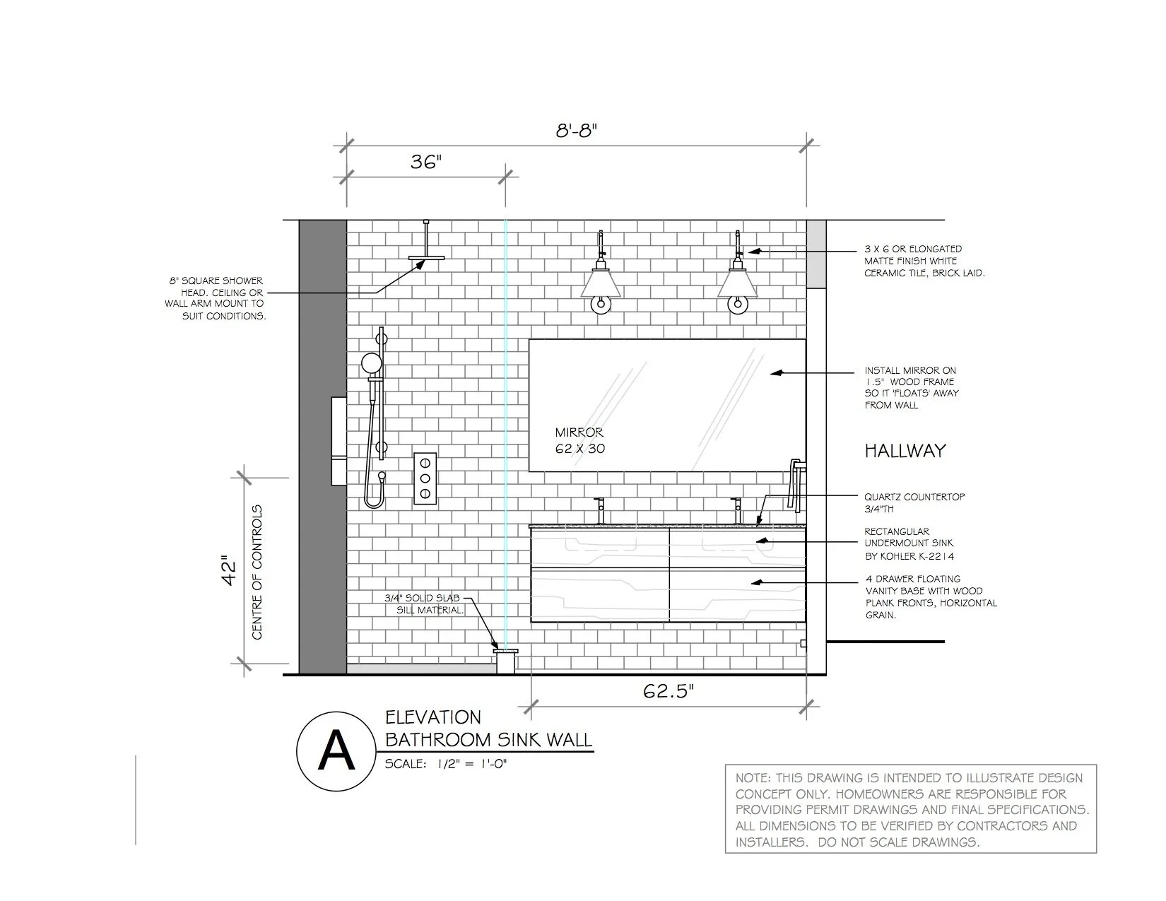
The floating walnut vanity would be custom made per the design elevations.  I provided a selection for a countertop mounted faucet or wall mounted (budget decision!), and a single long mirror would be floated off the wall, like so…..

"Have the float frame part of the mirror made from the same wood as the vanity or paint out in white to match the wall tile."

CarolReedDesign-LM-Ensuite-Progress-1.png

E-Design - In progress, custom floating walnut vanity.

I'm thrilled to see how this installation came together, and especially the decision to go with the wall mounted faucets, absolutely love it!

CarolReedDesign-LM-Ensuite-EDesign-Elevation B.jpg

This option of the shower wall showed the wall tile continuing across the entire wall behind the toilet with a recessed soap niche in the shower and recessed wood shelves under the eaves and a wood shelf ledge above the toilet.  I provided another option of this same elevation with the wall tile stopping just past the shower glass which is in fact the way it was installed.

CarolReedDesign-LM-Ensuite-EDesign-Progress-2jpg

E-Design - The After, view of shower wall

In this instagram image you can see a sneak peek of the finished space with a glimpse of the herringbone floor, recessed wall shelving beside the toilet and the floating walnut vanity. It looks like they opted to forgo a shower threshold which also means they continued the black slate tile into the shower.  My one concern with this decision is that the dark tile could really show soap residue on the surface and in the grout so hopefully that doesn't prove to be an annoyance.

The oval freestanding soaker tub takes prominence centred in front of the large dormer windows and tucked under the dormer roof.  A simple roller shade that operates bottom up will provide privacy and daylight.

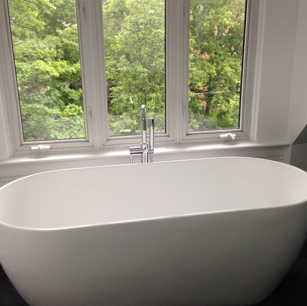
E-Design - After, soaker tub

I'm absolutely thrilled to see the progress of this bathroom renovation and how well the e-design plans were implemented.  With each e-design package there is always room (options) for clients to make decisions on their own and make personal choices and I love seeing which choices Lindsay ended up making and how beautifully its come together.

If you're interesting in E-design plans for your own bathroom or kitchen reno please visit my E-Design website

www.thedesignshop.ca

for details.  

All design drawings/plans:  Carol Reed Interior Design Inc.

Room and sample photos:  via Instagram

Cottage Ensuite: Before & After


Cottage Ensuite - After  |  Carol Reed Interior Design

This client's cottage in Kawartha, Ontario, underwent a complete facelift that included updating 5 bathrooms a kitchen, a bar and a kitchenette.  (You can check out links to previous before and afters of this cottage at the end of this post).  One of the biggest issues to address when planning the updates was that not only did the bathroom finishes look dated, but the style of the bathrooms looked more suited to a suburban house rather than a lakeside cottage.  Dated or not there was a lot of quality there in custom built-ins and solid materials.  No question it was built with every comfort of an all season urban home, as its located in a premium area of high-end cottages.  The main objective in this 'gentle' reno was to work with what was there but infuse a more modern cottage style - while retaining a high quality level of finishes.  I felt this could be accomplished through a series of strategic changes as opposed to gutting everything and starting from scratch. 

For the master ensuite I recommended leaving the walk-in glass shower untouched except for replacing the faucet set from polished brass to brushed nickel and I also recommended leaving all the floor tile which was a neutral taupe ceramic.  This then put the focus of the facelift on the feature wall, a large double vanity that was the centre of attention when you entered the room.  We would also remove the wallpaper and all the wall mounted polished brass accessories leaving us with a very neutral base to work with and allow most of the budget to be directed where it would have the most impact.

Ensuite Vanity - Before
The Before:  The existing long double vanity was superb custom quality and was in excellent condition.  It sported a peachy/tan corian countertop, oval sinks, polished brass faucets (although it doesn't look brass in the photo, all the fixtures in the room were brass), painted knobs, a frameless wall to wall mirror and a dropped bulkhead with recessed pot lights. The vanity was made from solid woods, the framed cabinetry had inset flush door fronts with a bead detail and raised moulding.  There was loads of storage and counter space and each end of the vanity had countertop mounted cabinets that extended all the way to the ceiling - the only negative was it was all very dated looking and lacked that cottage style  the new owners were looking for.


This is what I envisioned for the new finishes and fixtures, keeping in mind everything had to be readily available from the small local town nearby or available for quick delivery from an out of town source.


Cottage Ensuite - Finishes & Fixtures Concept  |  Carol Reed Interior Design

The starting point for the fixture replacements was the hardware.  The pine doors throughout the cottage were all updated with new distressed bronze lever handles that gave them a modern country look.  Continuing with this aesthetic, I introduced new bronze knobs and wall sconces to add contrast and vintage charm to the vanity wall.  For the plumbing fixtures we looked to the shower set first - because we were only replacing the trim not the rough-ins we had to work within the same mfg's product line in order for the new trim to be compatible.  The finish options were chrome or satin nickel, easy choice, the darker 'patina' of the satin nickel is a much better pairing with the bronze so satin nickel it was in a classic bridge style faucet and gooseneck shower head.

Ensuite Vanity - After
The After:  The entire vanity was refreshed with a new coat of paint in a crisp warm white, new low maintenance cararra look engineered quartz counters, new rectangular undermount sinks add a contemporary vibe, satin nickel bridge style faucets add a vintage country vibe as do the oil rubbed bronze hardware which also adds a sharp graphic contrast and ties in with the oil rubbed bronze lever handles on all the existing interior doors.  Other key updates to the vanity wall included; removing the bulkhead with pot lights, replacing the sheet mirror with a pair of framed mirrors above each sink,  installing a crown moulding and breadboard wallpaper on the wall between the upper cabinets and flanking the mirrors with new bronze wall sconces with parchment shades. Painting out the mirror frame, the beadboard paper and the crown moulding the same as the vanity unified the wall and cabinetry to read as one continuous built-in.


Ensuite Vanity - After
On this visit last Spring I was there to do a final walk-thru and make a list of recommended accessories and finishing touches, what would really finish off this room would be a graphic black and cream geometric patterned area carpet and a large woven towel hamper.  (Those should now be in place for this coming season. ) I'd also like to see a more rustic cache pot or planter with something less formal than orchids so we will work on that….


Ensuite - Before
The wallpaper and brass towel rods were removed and all the trim work was painted in the same white paint as the vanity.  


Ensuite Vanity - After

The walls received a new coat of paint in a dark brown/grey, similar but lighter shades of this found in the tile.  This dark colour really anchors the room and it neutralizes the pre-existing wall and floor tiles in a way that a light colour on the wall wouldn't have done.   The earthy colour also added a natural organic tone to the space and really accentuated the painted woodwork and all its charm.


Projects like this can be much more exciting to work on in ways that designing from scratch or all  new aren't, also evident in the way people are so drawn to Before & After story's.  Its literally a transformation before your eyes, making something out of nothing per say.  Taking a space that is uninspiring and working with it rather than ripping it all out - this is when vision and seeing potential really comes in to play and when the true value and power of design is realized.

For more Before and Afters of this cottage reno check out the following links below for older posts:


All Photos by:   Carol Reed


The Australia Project - The Evolution of a Space Plan

Design Plans and Kitchen Concept for the Australia Project, by Carol Reed Interior Design

While its not out of the ordinary

for me to travel a few hours drive to a clients weekend retreat or summer cottage, or even have the opportunity to fly back and forth to work on a project in Manhattan… being asked to design a whole home renovation on the other side of the world is not a request I get every day.  In addition to my full-service projects I've always oferred a selection of limited e-design services for homeowners across North America but I limit this type of consulting to single rooms only.  Last year I made an exception when I took on the whole home re-design of a residence in Australia, as a hybrid full-scope/e-design.

One of the homeowners whom I knew from Toronto is an expat now living in North South Wales, Australia.  She’s a newlywed (married an Aussie!) they're first time homeowners of an older style bungalow in need of a modern overhaul. They both travel a great deal for work so embarking on a home renovation would require the ability to do much of the consulting virtually - and this is where I came.  We knew each other when she lived in Toronto and she has been in some homes that I had designed, there was the comfort level of working with someone from home, and knowing I had experience in long distance projects.  They reached out and a couple of skype meetings later we began the process of re-designing their forever home.

Kitchen and Dining Before.

Before we could delve into new finish materials, design details or furniture, we had to start with reworking the floor plan.  Here’s a look at the floor plan I started with. Its single storey, with no basement, and an attached garage (to the left side of the house), the back of the house and balcony overlook a beautiful green conservation area.  The windows across the front and sides of the house are partial height, the windows across the back extend to the floor.  Lengthways from one end of the house to the other, the ceiling slopes up to a centre peak.

The house was very divided with lots of interior doors and there is no basement or attic space.  The main objective was to update all the fixtures and finishes as well as create a more open concept  living, dining, cooking space. A dedicated storage room had to remain as well as a home office large enough to accommodate two workspaces.  Lastly a new master suite was on the must have list.  As for finishes, they wanted sleek, modern, all white, and natural wood floors with the addition of colourful artwork and accessories.  

When I first reviewed the plan and the exterior photos, my instinct was to move the kitchen and dining areas to the back part of the house so they could enjoy the view and direct indoor/outdoor access.  Below is a look at the final layout we arrived at….

The new plan provides them with a long open concept great room, with slope cathedral ceiling and views overlooking the conservation area.  New retractable doors will allow them to have an expansive opening to the exterior and new sliding doors directly off the kitchen so they can access the bar-b.   The den has ample room for both of them, an oversize sliding glass pocket door allows them to close it off when they have company.   The laundry is combined with the storage room and will have a futon for overflow guests who need a place to crash (beyond the two spare bedrooms).   The main hall bath gains a vanity with storage and a tub shower combo, the master ensuite gets a sleek walkin shower with trough drain and floating vanity and the 4th bedroom was converted into a maser walk-in closet.

I know from experience often the first reaction people have when they see floor plan is to critique it, and often wonder "why is that so big, or why is that so small" or think "what if we move this here and that there?".  I think that's natural and expected, especially if you weren't part of the planning process in getting from a to b.  Its the reason I don't ever present a client with just one layout - because even if they love it, they'll wonder if they are overlooking any other possibilities. There are some Designers who believe its best to present one solution only, but this method never served well for me despite how confident I might be with any given plan, I believe clients have expectations of being offered choices.  I like to present only the best options and let them be involved in making choices from there.  There is never just one way to slice up a space and the possibilities can vary greatly in budget and personal preference.  Below is a glimpse of where I started reviewing layouts with them and where we ended up at the final new layout. 

_ _ _

The first concepts were based on their idea of moving the laundry out of the kitchen and into the main hall bathroom (stacked units) in lieu of the existing shower stall.  Besides the obvious disadvantages to this placement, it had some benefits worth considering.  (At this point we weren't exploring the master bedroom changes until the living areas were determined.)

This concept was the least amount of change, but still offered lots of improvement with a new centre island kitchen opened up to the living room.  Initially this was the extent of the renovation they had envisioned before contacting me - a new kitchen with a bigger opening to the living room.

Some more walls came down in this layout to further open up the kitchen, dining and living rooms and get more exposure to exterior views and light.

Next even more walls came down.  Sections of the centre wall needed to remain as its the main supporting wall.  Although not noted in this sketch the laundry would again be in the bathroom. What was lacking at this point was a larger home office (Study) and the laundry situation was still being debated.

The next three concepts explored the idea of placing a stacked washer dryer to replace the hallway linen closet, allowing us to add a larger vanity with storage into the main hall bathroom with the tub/shower combo. 

This one was getting there but the main concern was still the Study was too small, and ideally I wanted to explore the idea of putting the kitchen along the back of the house instead of the storage room….

This was getting really close to where we finally ended up but the need for a larger laundry area was being realized. 

And this was the

almost

final layout.  The laundry was combined with the storage room, and also a futon for the occasional overflow of guests. When we began the space planning the intent was that all the windows and exterior doors in the house were being replaced and the exterior re-clad in a new finish.  We intended to work with all the existing window locations as is but the homeowners were also investigating if they could increase the amount of windows across the back living room wall.  But because of the bush fire hazards in their area, their local by-laws (and property insurance) restricted them from changing their window configurations/sizes at all.  Which meant this kitchen plan, requiring modifying a window to work with the fridge,,,was out.    

So one more round of tweaks led to this final layout below (also shown earlier in the post)…...  

 The final kitchen layout ended up being a U shape with centre island.  After the engineer's review, we had to also incorporate a supporting stud wall immediately to the left of the sliding doors beside the fridge so this area got squeezed a bit smaller.  This new plan gives them one large living and entertaining space with cathedral ceiling, direct access to the balcony and wonderful views.  The double office has lots of natural light, and its wide entrance flows off the main room, and their bathrooms and closet space were upsized and enhanced. 

So I hope you enjoyed this peek into the space planning process and how we arrive at any particular final floor plan with a client.  Taking the client thru this process assures them they have made the best possible decisions and they move forward with confidence, even if the scope of the renovation doubled (!).   Following this space planning we developed the details for the kitchen and baths and selected all the new interior finish materials and fixtures compiled into a set of working drawings (which involved working in metric and learning some new jargon!).  I''ll share more of the design concepts in another post.

 G'day ; )

All drawings and images by:  Carol Reed Interior Design Inc.