


Dining Room Concept: Part of a Whole Home Makeover
A past client reached out to me last fall seeking help with planning cosmetic updates to their home, the updates would apply to the entire main floor and above grade lower level, similar to a split level style of home. The house located in a suburban subdivision had the original builder standard finishes which were looking dated and lacked any architectural features or character. One the of the most obvious challenges with the house’s design was that it was mostly open concept but with awkward transitions from one space to the next, ie; a change in flooring that didn’t align with any walls or doorways and tall vaulted ceilings comprised of varying angles and bulkheads with no trim work, symmetry, or alignment with doorways, walls or windows. Sometimes it takes a set of fresh eyes to point out design challenges or ‘flaws’ that exist but you didn’t know or understand how they were negatively effecting the space or how they would impact your attempts to improve or decorate them.
An master design plan would need to be created to address these challenges while incorporating a new kitchen, all new flooring throughout, fireplace makeover, staircase updates, entry way updates, lighting updates, as well as proposed new built-ins and millwork. After assessing the floor plan as a whole, I developed design concepts for each room/area. This post is a glimpse at the proposed design for the dining room.
Existing photos of dining room below.
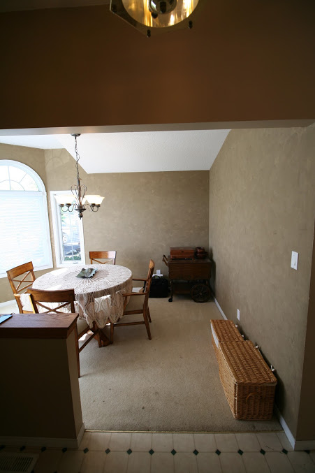
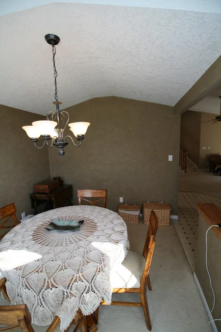
The dining room posed a challenge that I see often with builder homes - a lone room that’s located off the main entry/foyer making it islolated from the rest of the layout. In this case it had an awkwardly small half wall separating it from the front ‘hall’ and was not directly accessible to the kitchen nor open to the living room. Although it had tall arched windows and a partially vaulted ceiling (more odd angles) it was small in size and could only accommodate dining seating for 4 or 6. Because of this, my clients always used the large open concept, eat-in kitchen for all their entertaining while the small dining room was used only as overflow seating (usually for the kids). They love to entertain and host larger gatherings, they also love to read, have family game nights (board games) and occasionally work from home.
Design Concept: My recommendation was to continue using the large extendable kitchen table for daily meals and entertaining, and make the small front dining room more useable and beautiful for day to day use by designing it as a library slash dining room - a place for their book collection, a place to do homework or work from home, a place to play board games and it would also be wonderfully flexible for entertaining - to set up a bar and appetizer buffet or coffee and deserts. Stylewise, i was striving for a timeless blend of contemporary with traditional arts and crafts references and a practical mix of high and low.

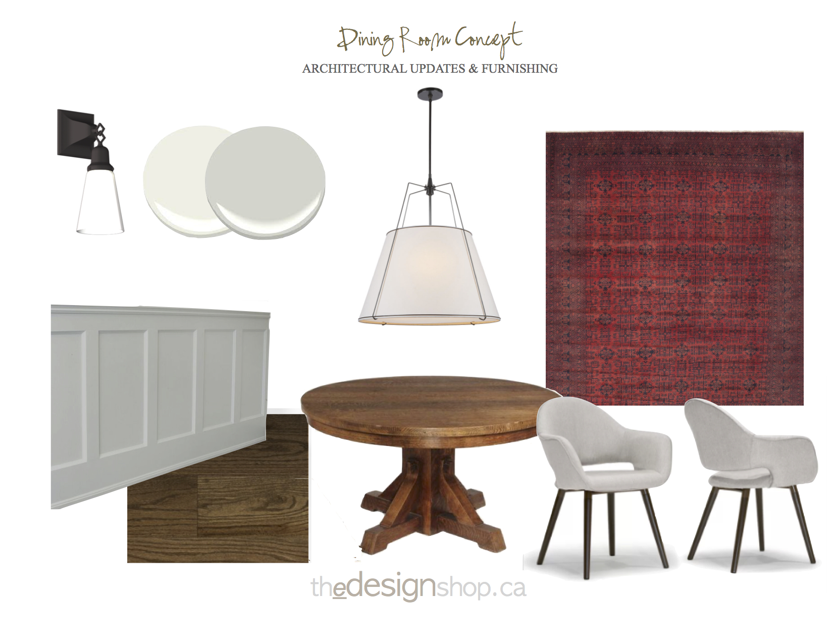
Dining Room Option 1
E-Design Room Concept By: Carol Reed Interior Design Inc. www.thedesignshop.ca
Concept Option 1 : First, I addressed the physical details of the space. To add architectural interest I proposed eliminating the small half wall and building out a double thick, double wide entry trimmed out with new, substantially sized casing. Adding partial height panelled wainscot with a simple cap would add character to the room and a nod to the craftsman style the homeowners were hoping to evoke, painted in a fresh warm white along with all the other new trim throughout the house. To minimize the visual busy-ness of the angles at the ceiling line, and not draw more attention to the colonial arched lines of the windows I opted to keep the paint colour above the wainscotting a light neutral,,,this keeps it low contrast and thus doesn’t draw your eye to the irregular ceiling line as would happen with a dark wall/light ceiling paint colour. The room gets lots of daylight and so the goal was to just enhance the volume of ceiling height but not emphasize the opposing angles and arches.
In addition to the new millwork the room would feature new wood flooring in a medium rich brown to replace the broadloom, a new large contemporary conical pendant, a pair of glass and bronze wall sconces, a traditional wooden pedestal table (with extendable leaf ) modern club-like upholstered arm chairs, and a richly coloured, patterned wool area rug. The light grey paint colour is a sophisticated and fresh compliment to the warm wood tones of the floor and furniture pieces.

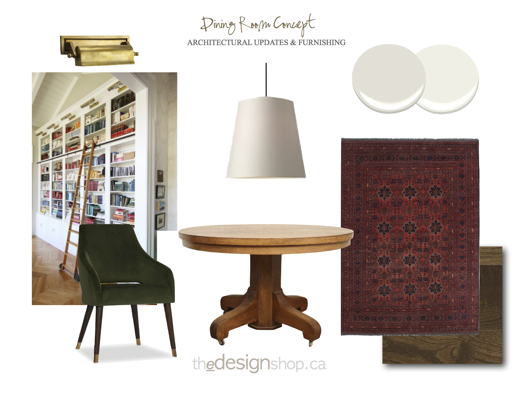
Dining Room Option 2
E-Design Room Concept By: Carol Reed Interior Design Inc. www.thedesignshop.ca
Concept Option 2: This concept is a variation of the first, but the subtle changes offer a distinctly different look. The cased entry into the dining room would be built with an approximately 16” wide nib wall on the one side to allow for wall-to-wall book shelving across the back wall of the dining room. (From the foyer looking in - this would be the wall on the right hand side.) In lieu of panelled wainscotting around the room this tall wall-to-wall shelving will add architectural character and create a library for their book collection. Topping the units would be articulating traditional brass library lights, highlighting the wall of books and emphasizing the ceiling height. In this scenario I opted for lush forest green velvet modern arm chairs with brass capped feet,, which really amp up the cozy factor and evoke that library mood. Again a large scale conical pendant light adds simple contemporary form and creates wonderful atmosphere suspended low over the table. The earthy colours, natural wood, millwork and built-ins are a subtle reference to the arts and crafts aesthetic these clients love so much but without trying to inject arts and crafts details in a home that’s not built in that style. Additionally if space allowed I would add a built in window seat.
Both concepts offer solutions that are easily attainable with light construction work (not extensive) but the net effect will add distinct purpose and function to the room while creating a beautiful and inviting view to guests. Adding character through new millwork and builtins gives a high-end custom look to the interior without a high-end investment. The isolated nature of the room (from the rest of the floor plan) now becomes an appealing feature as a respite for homework or intimate cozy game nights or small dinner parties. On top of all that its also sure to make a stylish first impression.